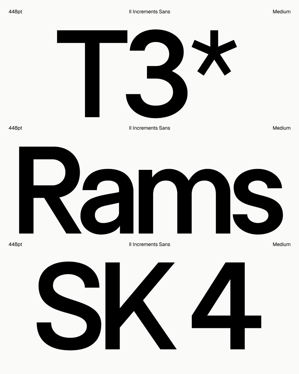
Influenced by functional modernism and the philosophy of reducing form to its essential elements, it combines clean geometry with technical precision. The result is a timeless sans serif designed to feel calm, honest, and quietly confident in use.
Fonts in use: II Increments Sans
Integrated across the UI and identity of @VWFNDRcamera — a new camera app for intentional photography.
Design: @nuevo_tokyo
Fonts in use: II Increments Sans
Integrated across the UI and identity of @vwfndrcamera — a new camera app for intentional photography.
Design: @nuevo_tokyo
REAL PHOTOGRAPHY MUST REMAIN IN PEOPLE'S HANDS
Today, we are launching VWFNDR™ + MBL, a compact camera for everyone.
A camera you always carry should work like a camera, not as a computational filter, not as an AI image generator, but as a tool for intentional photography.
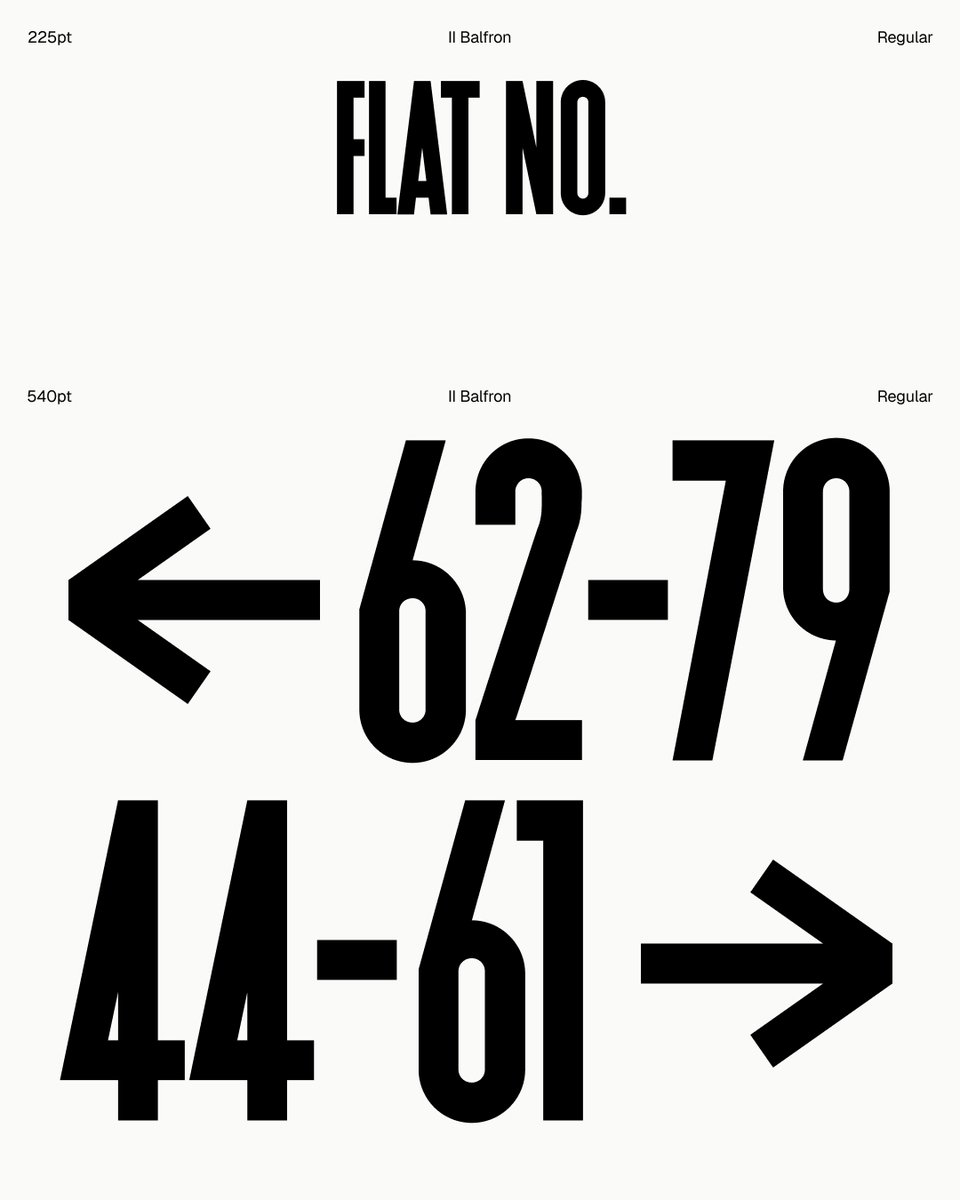
Inspired by Ernö Goldfinger’s east London tower block, characters are set within a structural grid, while unexpected angles embody the brutal principles of the original concrete profile.
Much like Goldfinger’s utopian housing ideals, the font is best viewed at large scale.
I’ve been chipping away at this labour of love recently, II Increments Sans. It’s starting to feel about right, then more glyphs, more weights, more styles.