Spotted in the wild at storytime: Mynaruse Royale on Song of the Stars. A kids' book title has to charm the child and survive the fortieth read-aloud. This one does. https://t.co/tbH1VqUwi9
#FontsInUse#Mynaruse
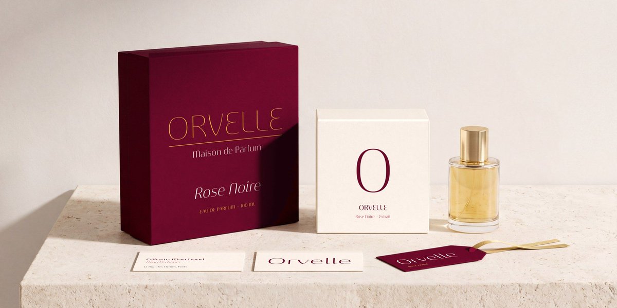
A geometric sans raised on retro scripts: Pauline Light draws each letter in slow, rounded brush strokes and lets tall ascenders supply the naive charm. Best in titles, where sweetness reads as confidence.
#RofTheWeek#typography#typedesign#insignedesign
Sancoale Contrast is here: a high-contrast sans in 48 styles. Eight weights, three widths, italics, and the same bones as Sancoale and Sancoale Gothic. Now on MyFonts: https://t.co/FQl1mx0EmX #SancoaleContrast#typography#newfont
Five Cs, then an Arabic 2 with a long tail: 1502, in Roman numerals for as long as anyone could be bothered. Brushed capitals on a glazed altarpiece at the Rijksmuseum, Amsterdam, naming Sister Caterina, who had it made.
#FoundLetters#typography#typedesign#insignedesign
Spotted in the wild by a friend at a Bryce Canyon exhibit: Cabrito in the small print under the headline. You have to lean in. That's what supporting roles are for. https://t.co/Xo1XUqDRdn
#FontsInUse#Cabrito
Few letters carry so little ink and so much nerve. Mandrel Didone brings tall x-heights, sharp serifs and nine weights with italics, for headlines that intend to be noticed without raising their voice.
#RofTheWeek#typography#typedesign#insignedesign
Royal prefix first, in larger capitals. The ship's actual name waits politely on the far side of the funnel. Z.M. Ramtorenschip Schorpioen, a builder's half-model at the Rijksmuseum, Amsterdam.
#FoundLetters#typography#typedesign#insignedesign
Spotted in the wild close to home: Aviano Sans at the Offices at Warehouse Row, a Chattanooga institution since 1904, sounding like old brick and new offices at once. https://t.co/qbInP33jgI
#FontsInUse#AvianoSans
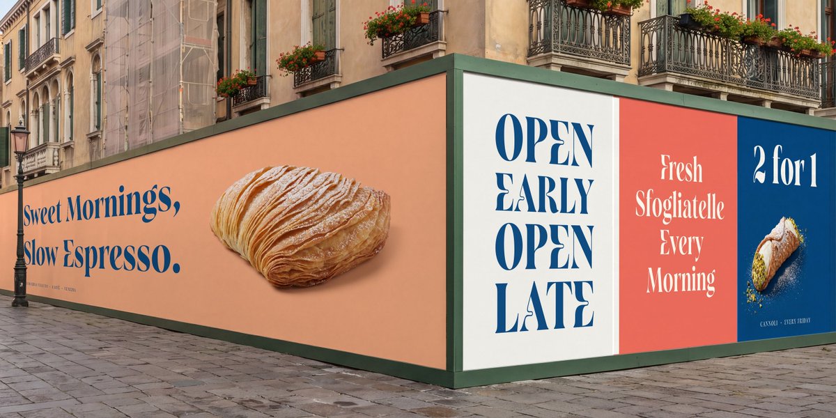
Plenty of designers have tried to find room in the crowded neutral sans market. Grayfel survived drastic revisions and came out with humanist proportions, friendly kerning and three widths of seven weights each.
#RofTheWeek#typography#typedesign#insignedesign
Coffee, sugar and tea, spelled out in white capitals with no curves allowed, not even on the S. Green enamel canisters in a houseboat kitchen in Amsterdam, Netherlands.
#FoundLetters#typography#typedesign#insignedesign
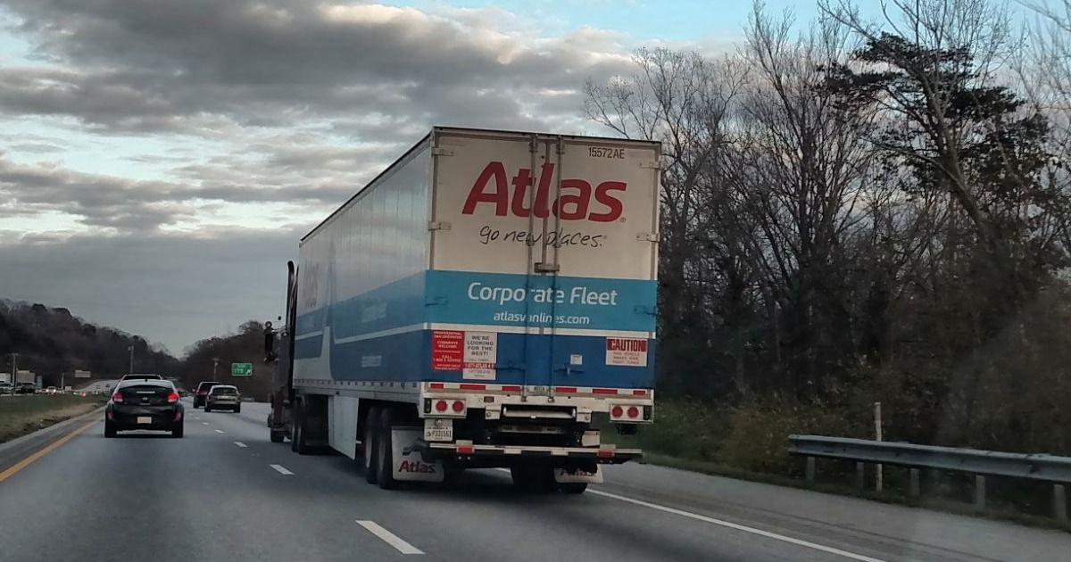
Spotted in the wild on the interstate: Senlot on an Atlas Van Lines trailer. The real test of a sans is reading it through a windshield. Passed. https://t.co/rrM8Nqq09x
#FontsInUse#Senlot
Three widths, one voice.
Bencanto in Condensed, Normal and Extended, each in eight weights with true italics.
https://t.co/lTRicW3WQA
#Bencanto#typography
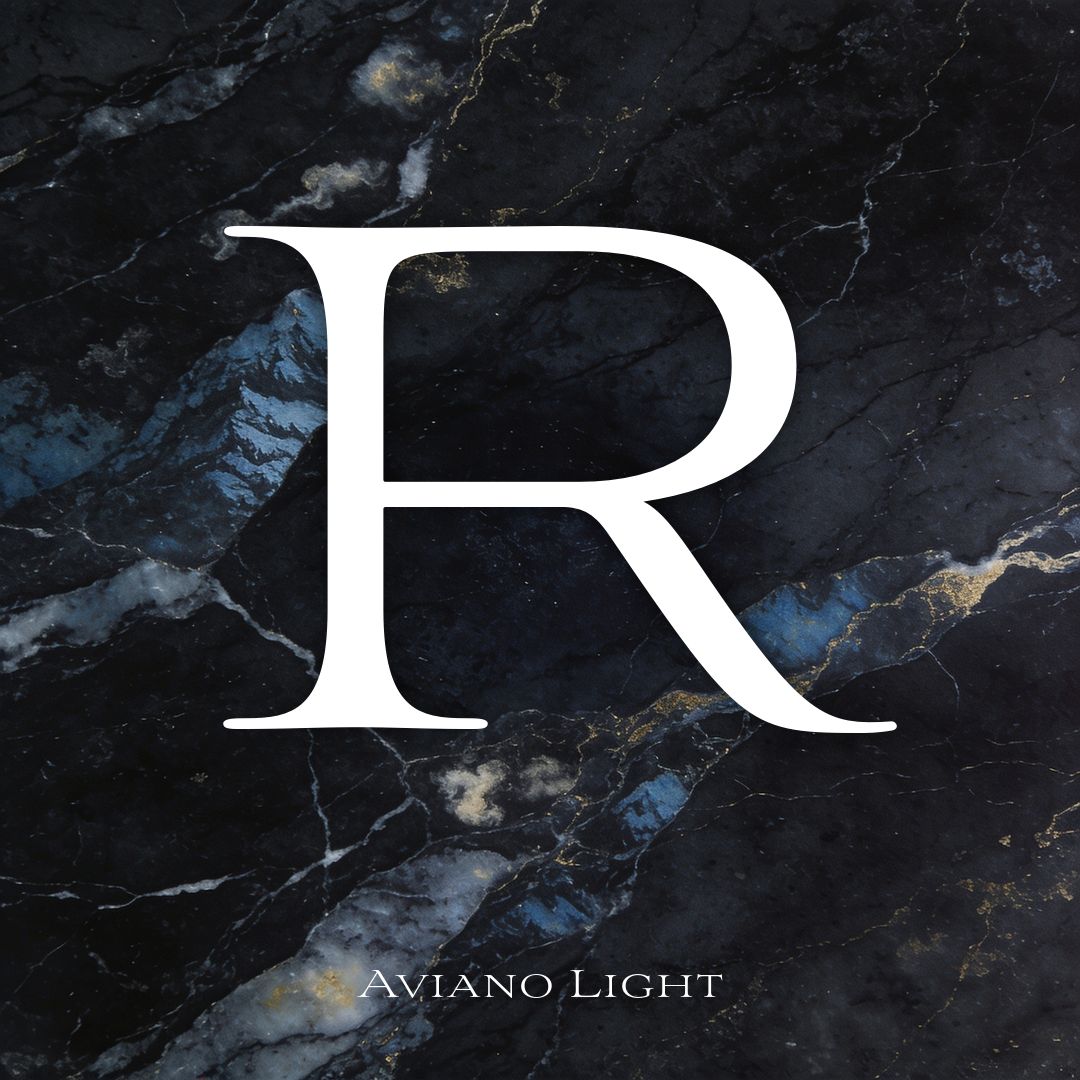
Classical capitals, stretched wide and fitted with serifs sharp enough to sign treaties. Aviano Light is the alternative to Trajan for anyone who has seen enough film posters, with forty ligatures and old style figures in tow.
#RofTheWeek#typography#typedesign#insignedesign