Ko ko ko ✊ GM ✨💫
After selecting a flight, users are guided to the Flight Details screen, where they can review key information and policies. With clarity established, they proceed to the Passenger’s Details screen, where personal is securely entered.
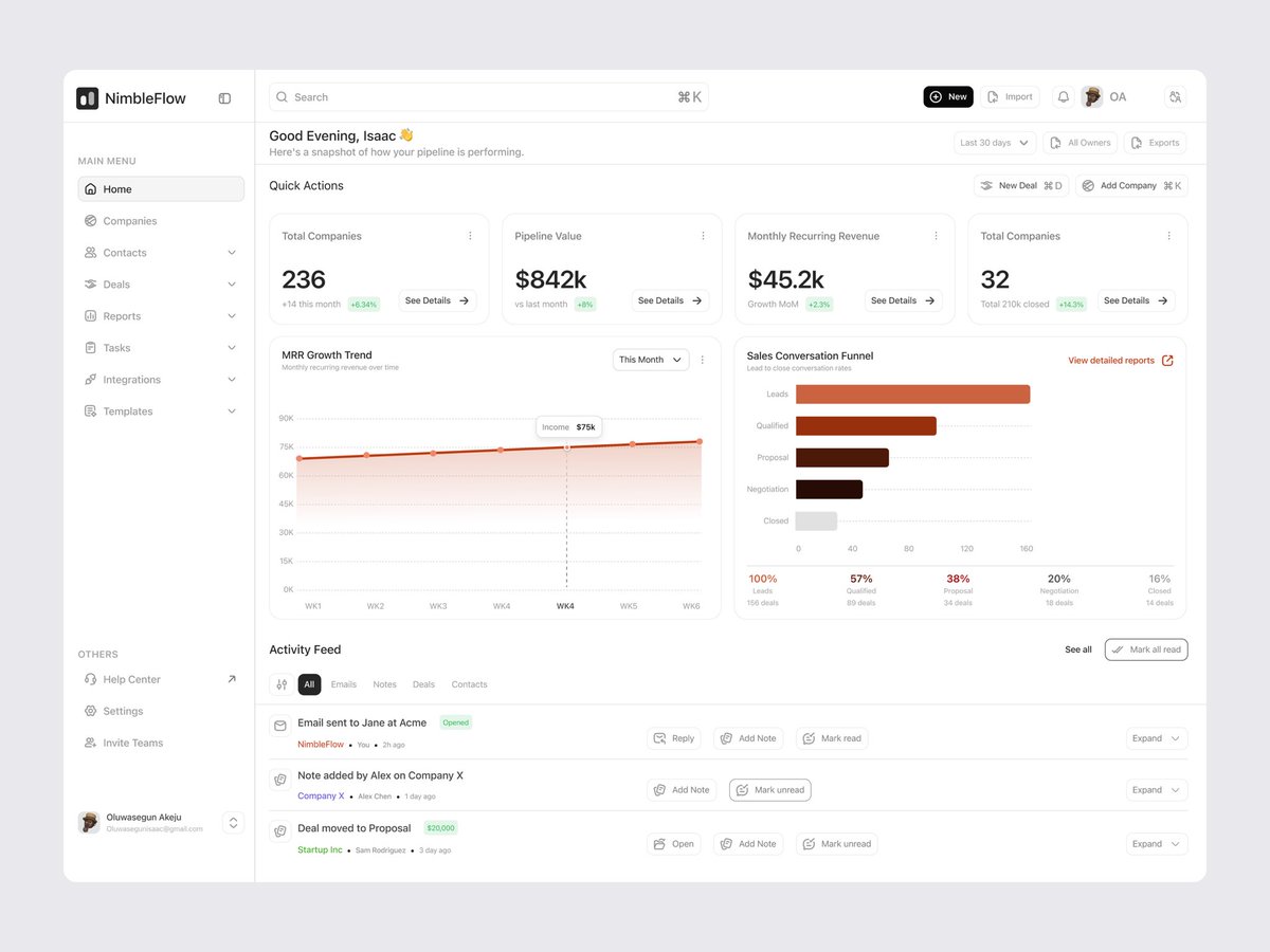
NimbleFlow is a clean, data-driven CRM dashboard designed for clarity, speed, and smarter decisions. It offers real-time visibility into pipelines, MRR growth, and conversion rates through intuitive visuals and an interactive funnel.
What do you think?
Hello Twitter,
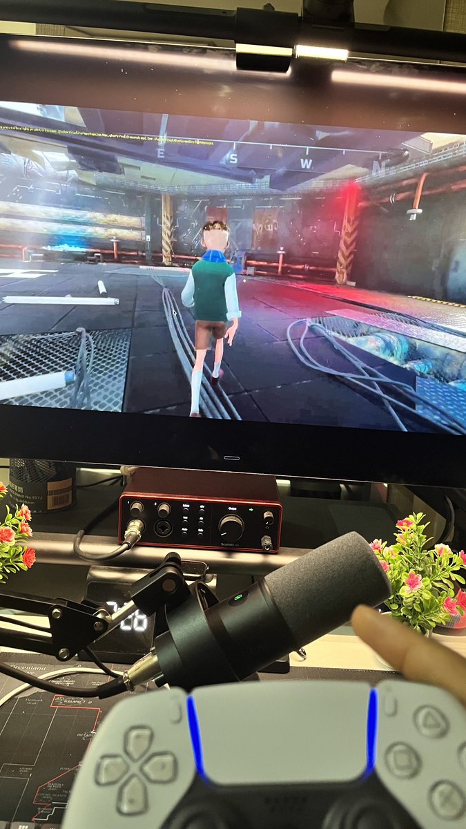
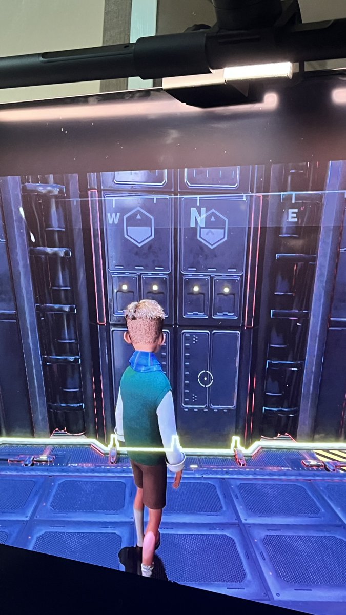
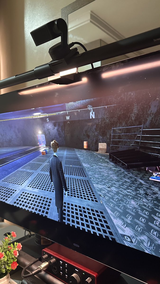
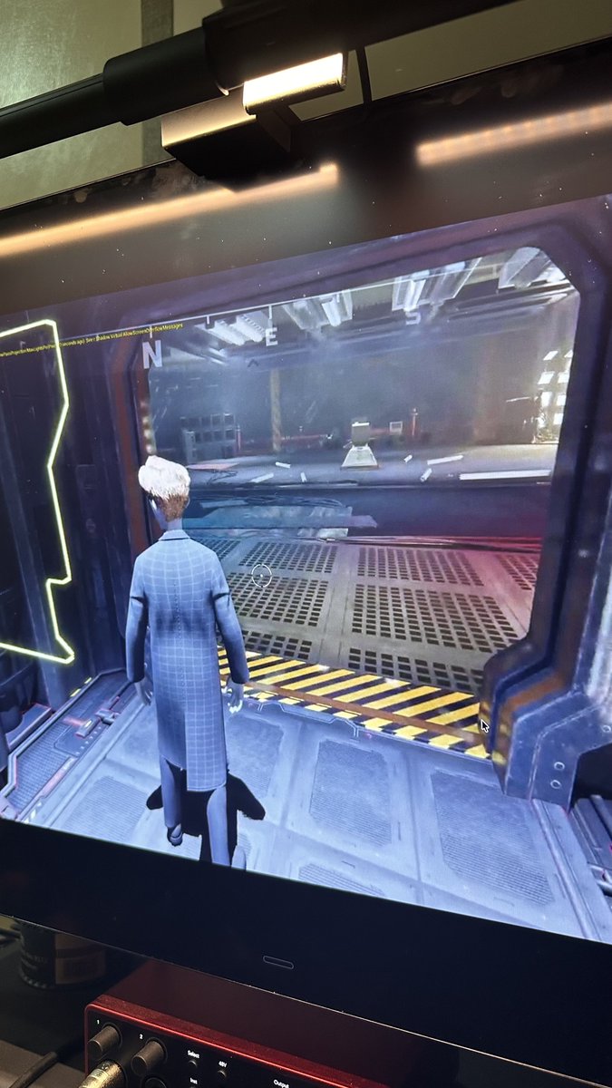
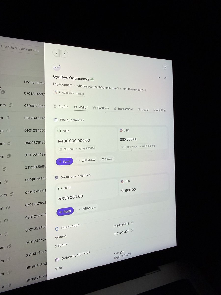
Four months ago, we announced @Mazerance to the world.
Today, here’s a first look at what we’ve been building with teams across Australia, Singapore, Spain, and Nigeria.
We’re just getting started, and we’d love your support on this journey that will take years.
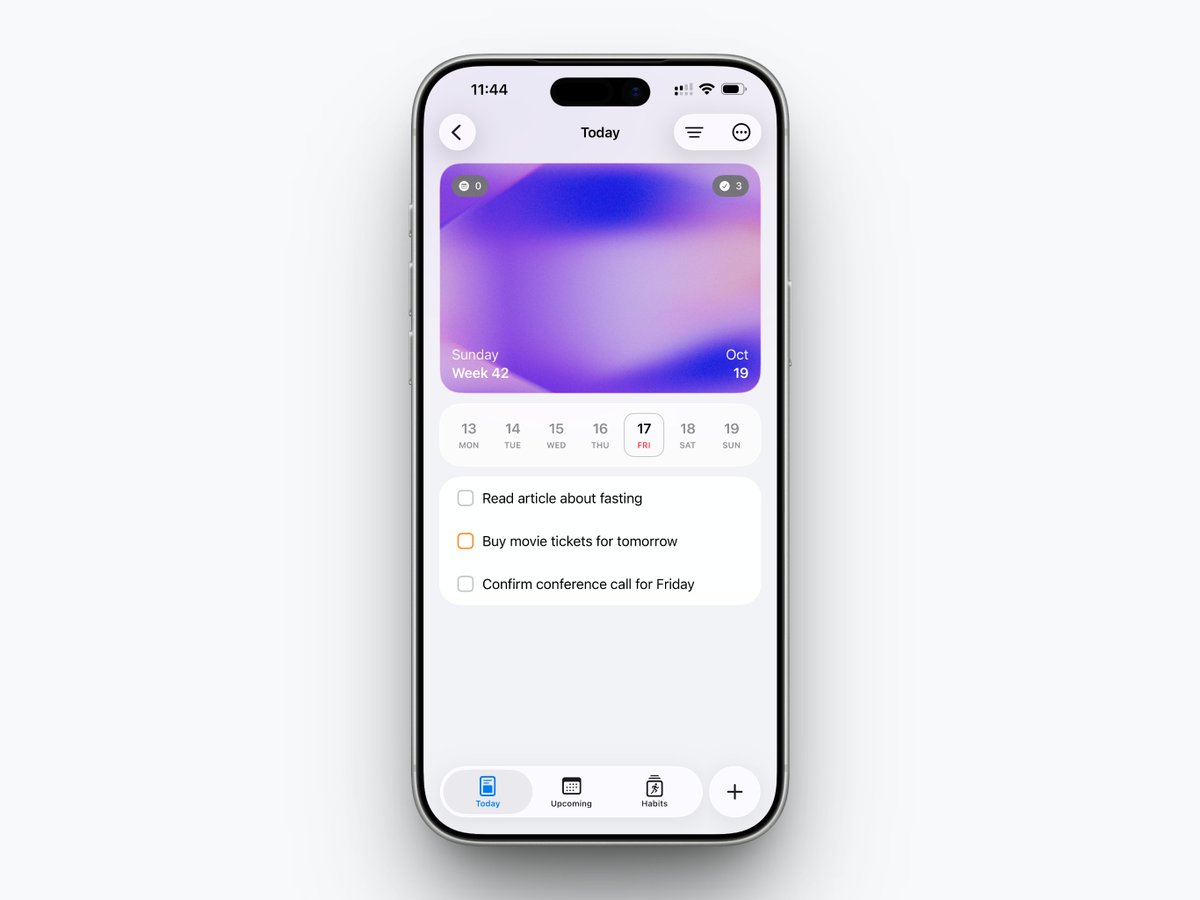
I mostly use neutral color for "Delete Actions"
I would only use red when there may be loss of data or some other irreversible scenarios.
Not all "Delete" operations are equal, treat them as such - this is so that your users don't outrightly lose sensitivity due to urgency-overload.