UX/UI | Visual experience Designer | Webflow Developer | Web Designer | «I'm smart enough to know that I'm dumb!» A veces escribo uno que otro Blog Post.
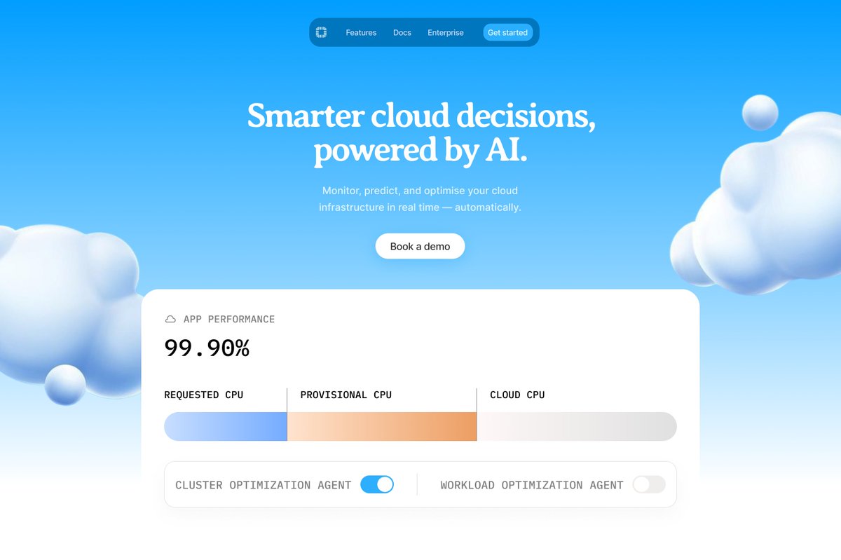
The best AI companies are trying not to look like AI companies.
Fast Company found hexagons appear 4.6x more often in AI logos than in any other industry.
Jasper (Jarvis), Lovable etc. all started with that purple-to-blue gradient dark background look.
It made sense at first, when AI was new, looking like an AI company was a credibility cue. You “should” look like AI…
Tailwind's creator humorously apologized for making the indigo default button color. "every AI-generated interface on Earth turned purple."
With everyone spinning up AI wrappers companies that over-promised and under-delivered, that once, still, popular aesthetic unfortunately now carries a reputational baggage.
There is a reason surviving, and thriving, brands are doing the opposite.
Granola's rebrand last month: a deliberately imperfect, hand-drawn "swirl” / “G" with a $1.5B valuation.
Out recent favorite Claude: warm pastels, hand-drawn logo
Mistral: a cute and cool looking pixelated rainbow "M" with an 8-bit gaming aesthetic.
None of these look like “AI companies”. Some debated the new Granola looks like wellness center.
ElevenLabs play their brand around Chladni patterns, those vibrating sand pattern when a tone is played. Two vertical lines that also read as a pause button etc.
Harvey the legal AI, looks just like a senior law partner's letterhead. Zero hint of “AI”.
The “non-AI look for AI startup” branding opportunity is still relatively wide open I’d say.
Fast acting AI founders who build genuine brand distinctiveness today are definitely going to have an advantage, where most competitors are still dazzled by how much time they saved with generated identity.
Some starting points that immediately set yours apart from 90% of your peers.
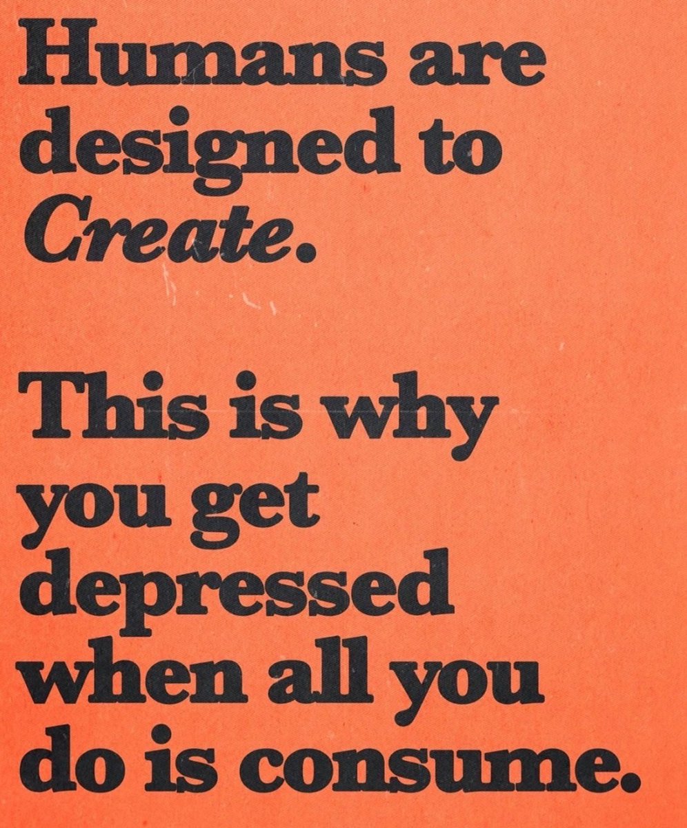
- Serif font
- Negative space
- Photocopied textures
- Warm palettes
- Analog elements
Or like most AI founders, feed this post into AI!
I'll never understand why anyone would want to replace design discovery with AI.
"I need you to create me a moodboard for this [insert brief]."
You're getting such a clinical and airtight snapshot of what AI thinks is right for the project.
There's beauty in falling into the rabbit hole of Cosmos, Pinterest, or whatever you use for inspiration and finding styles that you would never have considered could work, but they do.
Why would you rob yourself of all this cool exploration?
There's a place for AI, product and brand photography comes first to my mind (if the client doesn't have a budget).
But we all got into design to explore, push creative boundaries and make something super cool.
AI should never replace creativity, ever.
After I finish a design project,
the last thing I want to do is open Figma again just to make a post image.
I usually default to a plain screenshot.
That’s why I built Reframe.
(Entirely in @Figma Make!)
Paste any image — and an entire grid of layout options generates instantly.
Pick one.
Edit.
Copy.
Post.
No extra layout.
No extra steps.
Made for the @contra x #FigmaMakeathon
Try it in link below👇
@jjconti Había una analogía que me gustaba y era "Todo mundo quiere ser fotógrafo, pero no todos se toman el tiempo de realmente serlo" o bueno algo así XD
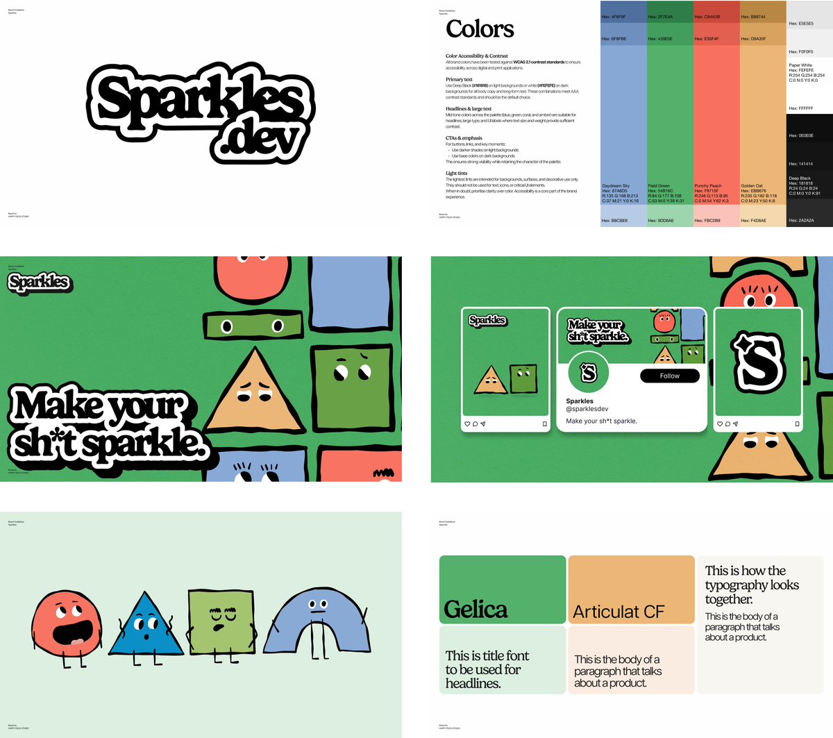
Here's how branding for @Sparklesdotdev was made:
1. The name
This is the only project where we helped with naming. We gave the founder alternatives, but it ended up being Sparkles.
We told the founder that if you're called Sparkles, you need to own it. So we built the entire brand around it.
2. Understood who it's for
Sparkles is a dev tool, but not for developers. It's for non-technical people, marketing, and support, so they can contribute to a product without knowing anything about code.
Think Canva for non-designers, not Linear for engineers. The brand had to feel warm, approachable, and playful. Not aggressive dev tool energy.
3. Research
The founder didn't give us keywords or inspiration, he gave us creative control. We did all of it ourselves. Competitors, visual references, direction, all us.
4. Inspiration
The main reference was Clay, a playful brand with personality. Then I went to Pinterest, looking at mascots, minimal characters with character.
My daughter has these magnetic building tiles at home. That's where the building block aesthetic came from. Combine that with road playmats, Klay, and minimal mascot characters, that's the vibe.
5. Concepting
Luke did the logo, I drew the mascots on my iPad. Then we collaborated on everything else.
Funny thing is, this is the first concept we presented that was the final one.
For sure, Sparkles has the best branding out of the YC25W batch by a long shot.
i want visualizations to feel more organic, less sharp and perfect. like a well-worn hologram. this three.js visualization uses a few tricks - particles arranged in rings instead of a grid, variable density that decreases with height, and falloff opacity
Eso es lo que me pregunto, mientras muchos pregonan que ya no son necesarios y que el diseño no importa, porque estas grandes compañias si tienen un gran diseño y no generado por AI? jaja