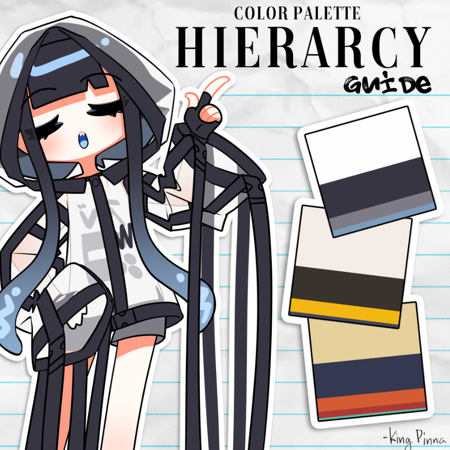
I accidentally started a Vtuber trend so I thought I’d make a more in-depth guide on balancing a color palette! 🤓🎨
When I initially made those squares for a few of my friends, I mentally consolidated most palettes into 4 categories: primary, secondary, accent, and complimentary. The ratios follow the “big, medium, small” rule of composition which aids in the balance of the palette feeling more cohesive overall. This is NOT a hard and set rule. Keep in mind composition and color theory is just that: theory. In the end, the best choice is whichever choice you like the most!
The purpose of these squares is to establish a simple palette for branding purposes, I think the ratios of color are just as important as the colors themselves.
Further explanation + visuals in the thread!
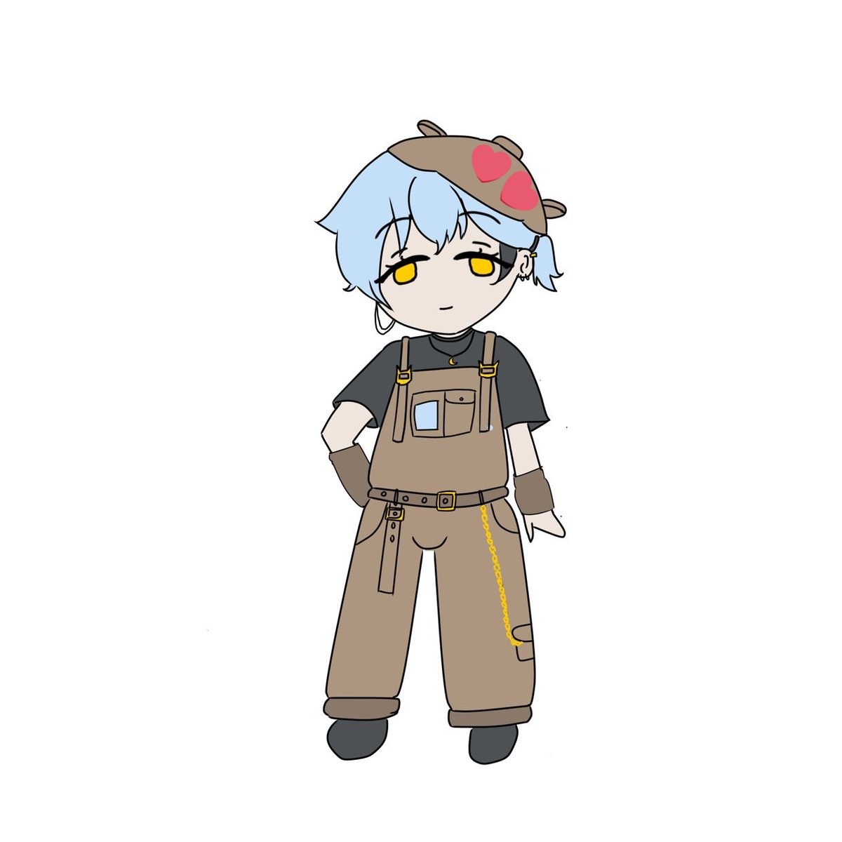
![ito_iann's tweet photo. [ Dumb PFP YCH ] Commission Open!
Genuinely love drawing these simple dumb PFP AHAHAHAHA, anyone interested can DM me~
Price: $1 (Paypal) @ RM5 (Local Bank/TnG)
#commissionopen #ych #malaysia https://t.co/CrEWaCNEs1](https://pbs.twimg.com/media/HDC47zLaMAIFfaZ.jpg)
![ito_iann's tweet photo. [ Dumb PFP YCH ] Commission Open!
Genuinely love drawing these simple dumb PFP AHAHAHAHA, anyone interested can DM me~
Price: $1 (Paypal) @ RM5 (Local Bank/TnG)
#commissionopen #ych #malaysia https://t.co/CrEWaCNEs1](https://pbs.twimg.com/media/HDC47wvaMAA9IvF.jpg)
![ito_iann's tweet photo. [ Dumb PFP YCH ] Commission Open!
Genuinely love drawing these simple dumb PFP AHAHAHAHA, anyone interested can DM me~
Price: $1 (Paypal) @ RM5 (Local Bank/TnG)
#commissionopen #ych #malaysia https://t.co/CrEWaCNEs1](https://pbs.twimg.com/media/HDC47wJa8AA8IF1.jpg)


![ito_iann's tweet photo. [ Dumb PFP YCH ] Commission Open!
Genuinely love drawing these simple dumb PFP AHAHAHAHA, anyone interested can DM me~
Price: $1 (Paypal) @ RM5 (Local Bank/TnG)
#commissionopen #ych #malaysia https://t.co/CrEWaCNEs1](https://pbs.twimg.com/media/HDC470FasAAL_Au.jpg)


![ito_iann's tweet photo. [wip] today's stream was so cute >< おつらび! Still a sketch, I don't know if I'll finish it or not🙂↔️
#らびらぶあーと https://t.co/BAoUVkoWei](https://pbs.twimg.com/media/HGWe9uza8AEeYUK.jpg)
![BAKERYOONN7's tweet photo. [ Sketch ] Quick sketch of @/ito_iann with messy fringe cause I saw the hairstyle on Pinterest and immediately wanna try and draw it XD https://t.co/41raIFa3gh](https://pbs.twimg.com/media/HFrZUhIaUAADReu.jpg)
![ito_iann's tweet photo. [ sketch ] Recent sketch that I did of ito cause I've been pushing Valorant rank lately with my trio~ https://t.co/aNA3QUoV8g](https://pbs.twimg.com/media/HFrZBt6akAANv8-.jpg)