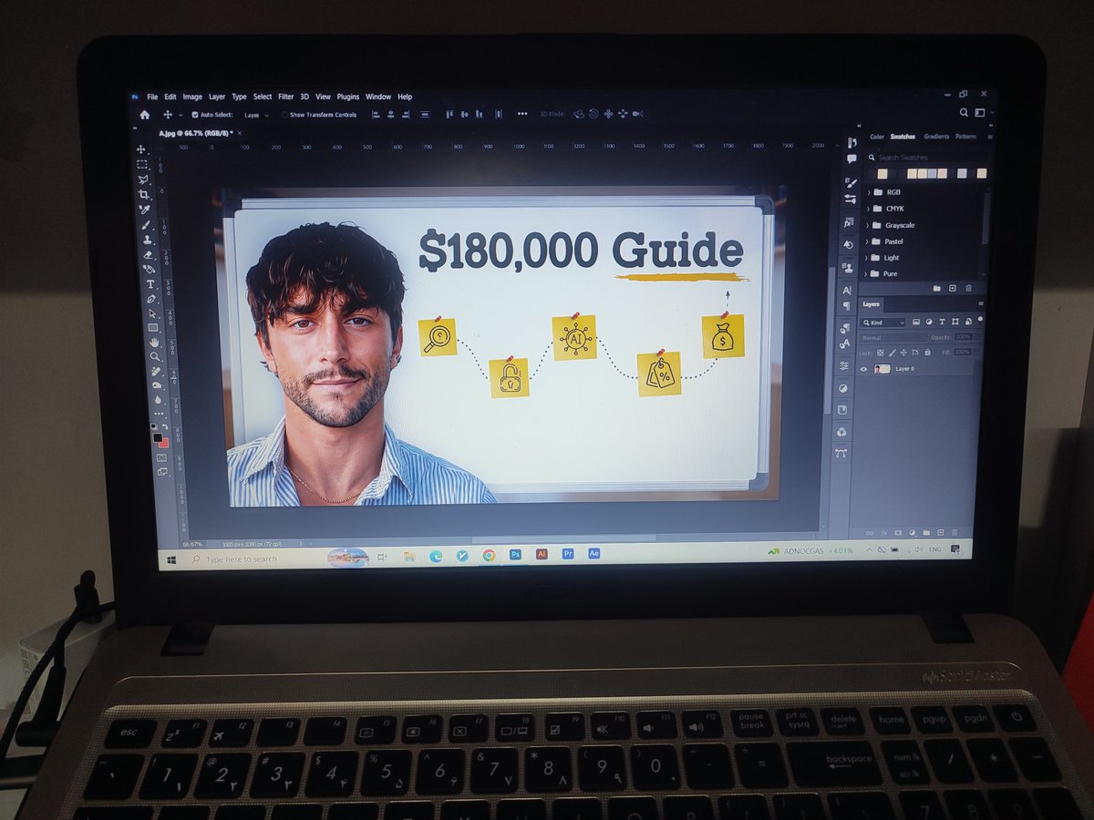
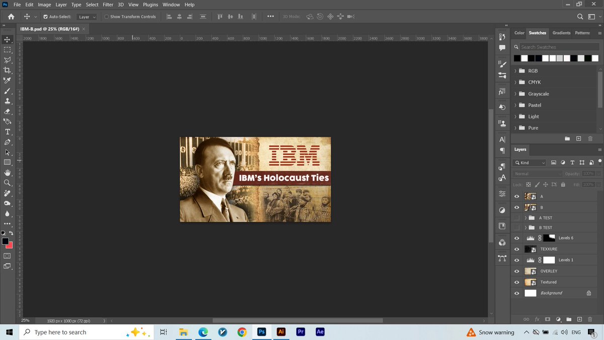
15 Days, 15 Thumbnails (13/15)
The result of an incredible working with @mosi_sm🔥🫶🏻
Nothing beats getting feedback like this after putting in the work.
Thank you for the amazing trust 🤍
Day 3 of making better YouTube thumbnails 🤞🏻✨.
Use contrast to guide attention!
Highlight the key elements and make them stand out. Don't make everything compete for attention.
Where does your eye go first? 👀
Day 2 of making better YouTube thumbnails 🤞🏻✨
Less is more.
Too many elements can distract viewers from your main message.
Focus on 3 key elements:
- A clear subject
- A short, powerful headline
- One supporting visual element
Every element should have a purpose.
Keep it simple. Make it clear. Get noticed.
@MuteeAutomation From my perspective as a thumbnail designer, the winning content is the kind that combines a great thumbnail with a great video and valuable content. It should outperform content that's generated with AI without any real strategy and actually stand out and succeed.
Redesigning a thumbnail isn't just about making it look different.
These are the key things that matter:
→ What's the main idea?
→ What should viewers notice first?
→ Is the value clear in a split second?
Here's my take on a real estate thumbnail redesign.
What stands out to you?
If you think your thumbnails could be better, DM me and I’ll help you improve them 📩!
What really matters is the right packaging:
A good thumbnail + a strong title + making sure the first few minutes of the video deliver on the promise and don't mislead the viewer.
All these elements work together to make a video successful, not just a good thumbnail.
I stopped scrolling because this thumbnail
looked SO AI!
This video from Jack Pembrook showed up in my feed
The thumbnail looked very AI to me
That’s what I noticed first lol
But my eyes jumped straight to the title
"Can I Escape America's Poorest Town with $0?"
And you know what? My brain said "Let's give this one a chance”
cause the idea was genuinely interesting
How would someone survive in a potentially dangerous place with no money?
But what I found even more interesting was
how quickly the video delivered on that promise!
Within the first 30 seconds:
- He enters the town
- Gives a quick introduction to the place.
- And knocks on the first door.
No long, boring explanation
The video quickly puts you inside the situation we clicked to see.
The thumbnail creates curiosity
The title gives it context
and the first 30 seconds proves the promise and make you want to stay
Does an AI-looking thumbnail make you less likely to click?
[Day 28 of 40]
@Hashirscales Looks great , but I think the face could be improved, and it would be even better if the subject were looking straight ahead, directly at the viewer.
@jerrythumbnail That could be a great idea too! My thought was to Catch viewer's attention to the main topic of the video by using Gemini itself in both the logo and the headline. Thanks for sharing your feedback! I’ll definitely give your idea a try. 🙏🏻✨
Day 2 of making better YouTube thumbnails 🤞🏻✨
Less is more.
Too many elements can distract viewers from your main message.
Focus on 3 key elements:
- A clear subject
- A short, powerful headline
- One supporting visual element
Every element should have a purpose.
Keep it simple. Make it clear. Get noticed.
New challenge: One tip a day to make your next thumbnail better.
Day 1:
Zoom out until your thumbnail is at 25% of its original size.
Can someone still understand what's going on in less than a second?
If not, you probably need to simplify your design.
Remember, people scroll fast. Your thumbnail needs to grab attention and make sense at a glance.