デザイナーの目から見た、AG!(新しい学校のリーダーズ @japanleaders)の10年。
オリジナルポスター4作品。AIは一切不使用。使ったのは、Adobe、直感、そしてAG!が歩んできた10年間のカルチャーそのもの。
これまでDrake、AKB48、SKE48、そして史上最大級の仮想通貨($SPX)にも携わってきた立場から見たAG!は、もはや「アイドル」ではなく「アイコン」である。
その理由を、以下に語らせてください🧵👇
10 years of AG! (Atarashii Gakko!) through the eyes of a designer.
4 original posters. No AI. Just Adobe, intuition, and a decade of cultural context built by AG! themselves.
As someone who's worked with global artists (Drake, AKB48, SKE48) and arguably the biggest crypto coin to ever exist ($SPX), I don’t see Atarashii Gakko! as idols - I see them as icons.
Let me show you why🧵👇
@asobisystem@88rising
@clemfandango563@user_baproll@1d34h4z4rd@unclemungy I think it was No.1 Vietnam whale @chadtom_eth who announced his fealty to $SPX early September 2023 via Twitter, which then kicked off a /VIETNAM_IS_BUYING and /VIETNAM_AND_BRAZIL_RELATIONS_STRONG chain in the telegram and it’s just kind of stuck ever since?
@wildmayonnaise@CognisphereX is this the non-existent John Cena chart you’re after? I should have gone with Papyrus or comic sans for the font maybe but eh😂
@user_baproll@FirstofAKind10 this is a @THEBIGONEGG (raredrops) classic edit.
I remember because although I really wanted to, I wasn’t allowed to post it from the $SPX main X account because of perceived violence😂
@MikeFlipthe500 no problem🫶 if I’d have known it would be in such high demand, I would have dropped it 4-5 months ago when I made it and sent it to Murad for use in his TikToks😂
PS: I’ve put the transparent background PNG and SVG in the $SPX memes channel on tg, too🙂↕️
@Cryptic_Mang @CowellCrypto I’ve been summoned.
all I’ll say is, you’re lucky there’s only a few hours left in the day for it to be classed as officially ruined😂
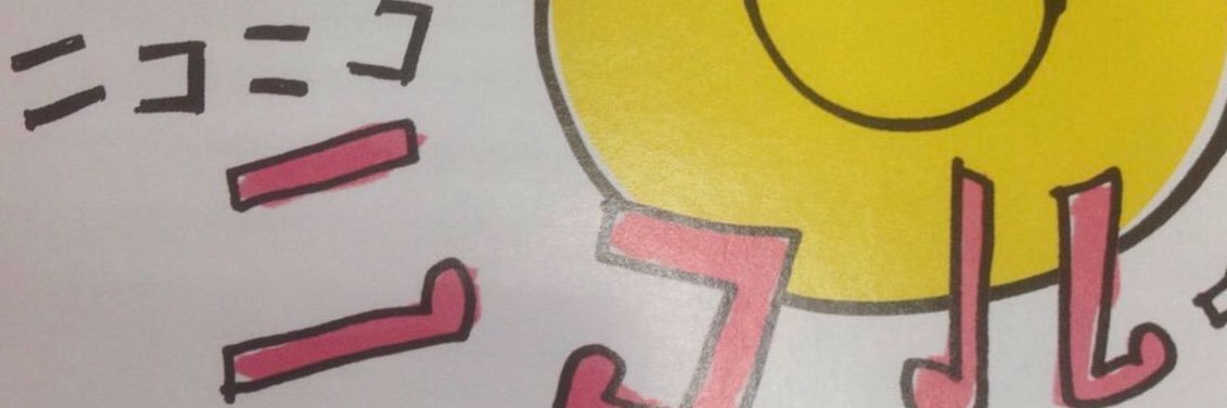
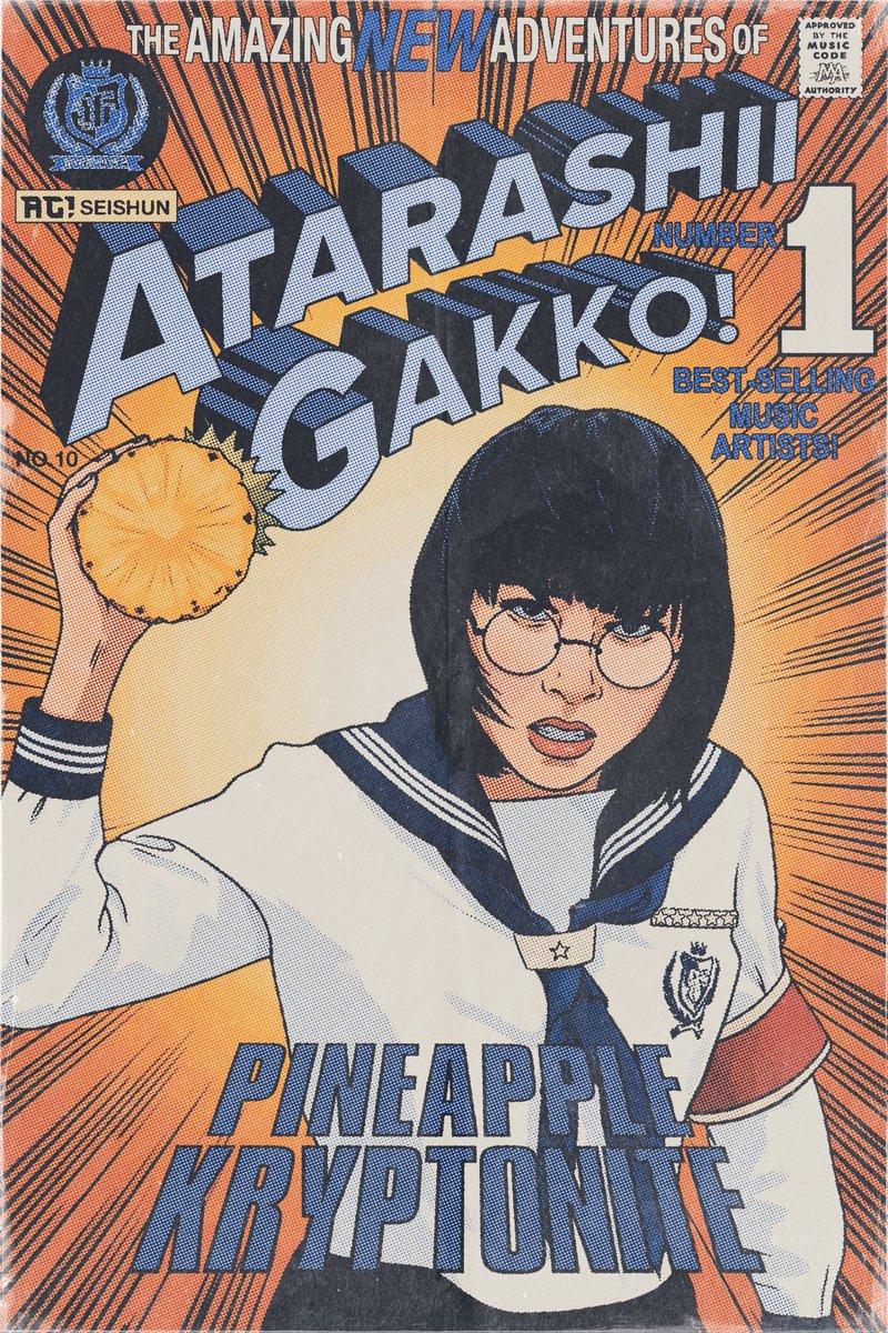
ポスター4「10周年記念」
AG! × 無限
このシリーズの中では、おそらく一番“ストレート”なビジュアル。でも、コンセプトとしては最も集大成的な一枚です。
以前から温めていたアイデアがあって、それは「無限(mugen)」という日本語。言葉としては「終わりがない」「限りがない」という意味ですが、英語で表記するとー
mu:gen= music × generation
つまり、「音楽でつなぐ、世代を超えた存在」という意味を持たせました。それこそが、AG!。
一過性のブームでも、刹那的な“瞬間”でもなく、何度でも繰り返されるループ。語り継がれていくレガシー。
だから今回は、AG!の4人を円状に配置しました。それは“終わらない輪”であり、彼女たちが放ち続けるエネルギーの象徴でもあります。背景に広がる校章も、単なるブランドロゴではなくー
脈動。心音。AG!の音楽とダンスの“核”として、絶えず彼女たちを生かし続けるもの。
AG!は、時代に合わせて変化するだけじゃない。彼女たちは“時代そのもの”を超えていく。
永遠に、青春の象徴であり続ける。
💙♾️🤍
POSTER 4: 10th ANNIVERSARY
AG! × 無限 = mu:gen
Of all the posters in this series, this one might be the most visually straightforward, but conceptually, it’s where everything comes full circle. I had the idea a while back to play with the word 無限 (mugen) - a Japanese term meaning “infinite”, “never-ending”. But when you break it down into mu:gen, it becomes something more:
> mu (music) × gen (generation) > = Music for generations.
That’s what AG! represents. Not a passing trend. Not just a“moment.”But a repeating loop. A legacy.
So for this piece, I placed the members of AG! in a perfect circle, symbolising an unbroken cycle. A closed loop of energy, youth, and spirit that never fades. Behind them radiates the school insignia, not as a brand mark, but as a pulse. A heartbeat. The thing that makes them eternal.
Because AG! doesn’t just evolve with time.
They are timeless - forever the representatives of seishun.
💙♾️🤍
デザイナーの目から見た、AG!(新しい学校のリーダーズ @japanleaders)の10年。
オリジナルポスター4作品。AIは一切不使用。使ったのは、Adobe、直感、そしてAG!が歩んできた10年間のカルチャーそのもの。
これまでDrake、AKB48、SKE48、そして史上最大級の仮想通貨($SPX)にも携わってきた立場から見たAG!は、もはや「アイドル」ではなく「アイコン」である。
その理由を、以下に語らせてください🧵👇
10 years of AG! (Atarashii Gakko!) through the eyes of a designer.
4 original posters. No AI. Just Adobe, intuition, and a decade of cultural context built by AG! themselves.
As someone who's worked with global artists (Drake, AKB48, SKE48) and arguably the biggest crypto coin to ever exist ($SPX), I don’t see Atarashii Gakko! as idols - I see them as icons.
Let me show you why🧵👇
@asobisystem@88rising
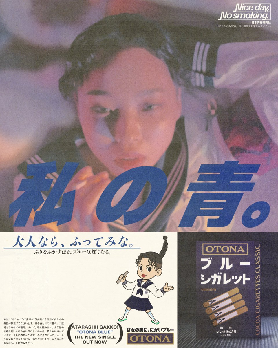
POSTER 3: “OTONA BLUE”💙🍬
AG! × Orion × Cabin
This is hands down my favourite - because if I was going to pay homage to a single track, it had to be the song that introduced AG! to the world: Otona Blue.
Rewatching the MV, I kept noticing a recurring prop: Orion’s iconic cocoa candy cigarettes. The whole video has this soft, hazy atmosphere - almost like a late-80s Japanese ad.
And that’s when it clicked.
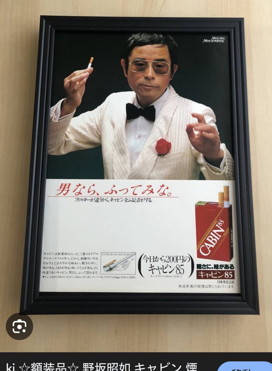
I started digging into vintage cigarette campaigns from that era, and CABIN kept standing out, especially their tagline:
「俺の赤」- “My Red” Brash. Masculine. Defiant. So I flipped it:「私の青」- “My Blue” Soft. Feminine. Bittersweet.
Because AG! might be a girl group - but they’re also the blueprint for a new era. Icons, not idols.
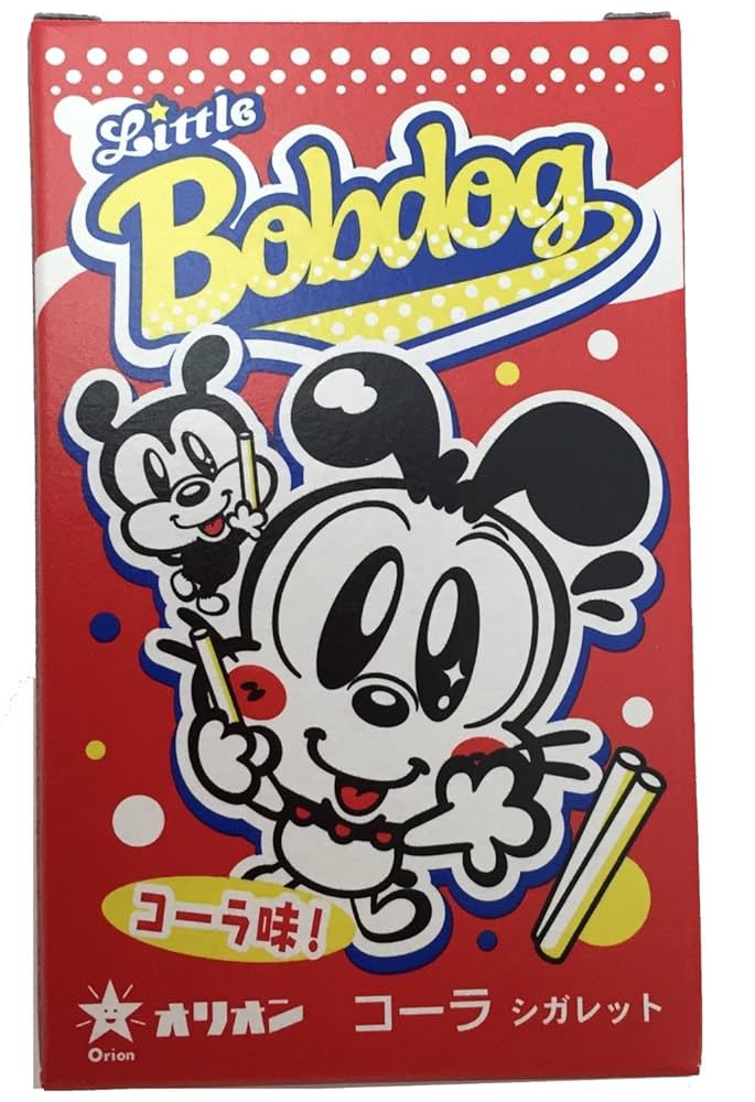
Since Rin-san (@dsk_rin) is the main visual here, I wanted a mascot that felt mischievous and nostalgic—like a kid pretending to be cool with candy. I drew from Little Bobdog and Peko-chan to create a playful wink to the past.
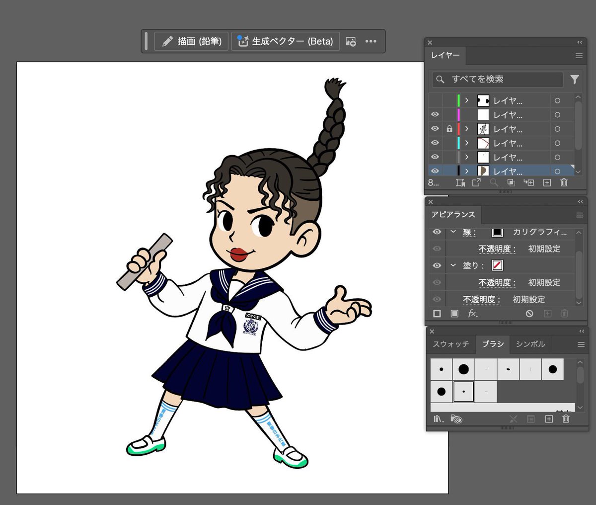
Design-wise, I used Illustrator (thank god lol) for the Rin mascot and also rebuilt the Orion box from scratch, with a twist:I turned AG! into tiny kokeshi-doll candy cigarettes - each one styled to match their uniforms.
Orion’s box usually says “大阪名物” (a famous Osaka product), so I swapped in the first kanji from each member’s hometown and kept “名物” to suggest: They’re each their prefecture’s most iconic export.
Other text swaps:
「男なら、ふってみな」→ 「大人なら、ふってみな」
(If you're a man, take the lead → If you're an adult, try leading)
「軽さに、味がある」→ 「甘さの奥に、にがいブルー」
(There’s flavor in lightness → Beneath the sweetness, a bitter blue)
“Nice day, nice smoking” → replaced with an anti-smoking message, because obviously… candy only. lol. 🍬🚭
And finally - the heart of the design - my reinterpretation of the Otona Blue lyrics as fake ad copy:
“This product is a simulated taste of youth—where fantasy and longing collide. It’s sweet enough to steal your breath. Sharp enough to make you look twice. And yet… behind those cold eyes is the fragile bud of a blue heart still chasing a love it hasn’t yet met. Not ‘someday.’ Right now. That’s what this box is for. For the ones pretending to be grown-up…Here’s your Otona Blue.”