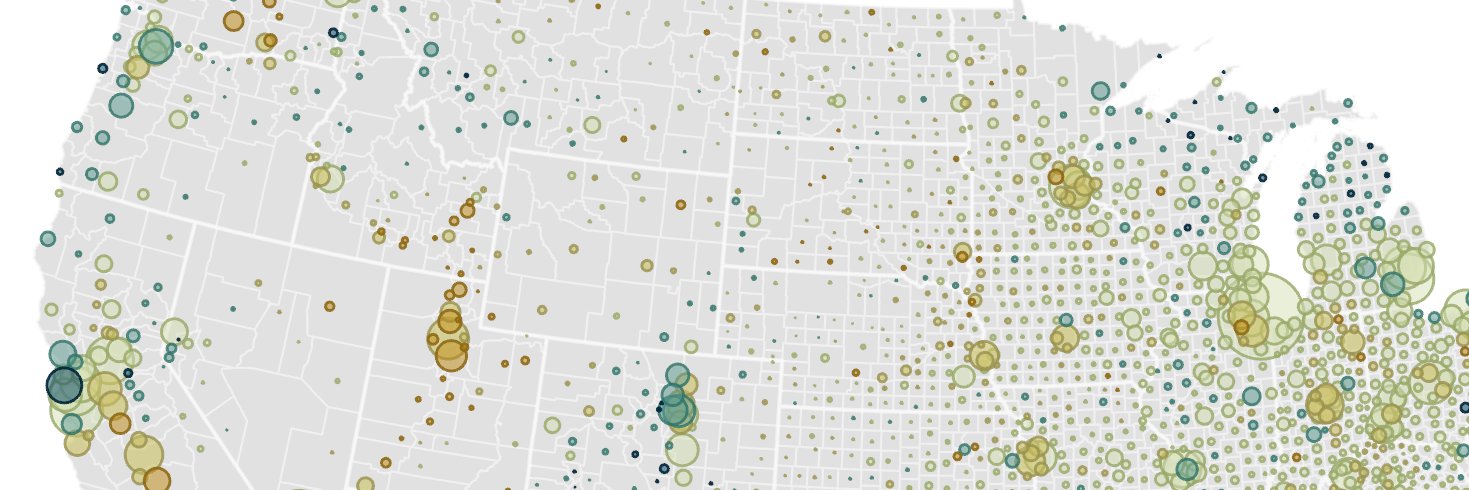
Ever notice how noisy a standard choropleth map can look?
Bivariate proportional symbol maps--using symbols that vary by both size and color--can convey all the same info that a choropleth map does but in better proportions, in better locations, and with much less noise...
@fmaddenNBA It also underscores the massive importance of 3P% variance. The whole sad story starts with a series loss where the Heat went 45% from 3 with nearly every player greatly exceeding their career %.
Jrue, a career 37%, had the most 3PA of anyone in the series... and shot 29%.
@lymanstoneky@mnolangray But the book is *also* very much about how Chicago usurped St Louis’ place, directly addressing the vision St Louis had for itself and how and why it failed
@_fat_ugly_rat_ We'd hear A LOT fewer complaints about the EC's imbalance relative to population if we solved its much bigger problem: winner-take-all elector assignment... which is nowhere in the Constitution. (It's only the Senate where the Constitution *really* hammers the big populations.)
@kennethskates@statmuse Best net rating in the reg season last year!
(> 600 min played, among trios who are still intact... Hartenstein/Hart/Brunson were slightly higher)
@nathanmarzion Around half, down a bit from recent years. Too many stretches where it felt like we were set up for disappointment and weren't learning much due to injured players, weird/new coaching, and generally inconsistent play.
Did you know you can chat directly with our data experts? Join us for our next Virtual Office Hours session on Wednesday, April 24 from 10 - 11:30 AM CT. You can pop in any time, but you do need to register. Hope to see you there! https://t.co/KNbtH1GN9b
@marcfbellemare DENSITY currently uses:
- 2000 densities for 2000 decennial samples
- 2010 densities for 2005-2021 ACS samples
- 2020 densities for 2022 ACS sample (just released today!)
...
Ever notice how noisy a standard choropleth map can look?
Bivariate proportional symbol maps--using symbols that vary by both size and color--can convey all the same info that a choropleth map does but in better proportions, in better locations, and with much less noise...
New @ipums blog post:
Bivariate Proportional Symbol Maps, Part 2
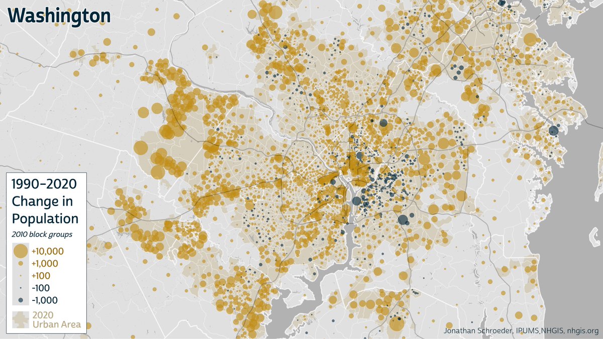
Defaults get you only so far. ArcGIS Pro's defaults could give you the map on the left. I step through how to improve on this, along w/ several other design tips & instructions...
https://t.co/WA7yf7UiDj
I share a few examples to demonstrate the advantages of bivariate proportional symbol maps in a new @ipums blog post: https://t.co/hYF102N5tc
I'll also share a follow-up post soon with some design tips and instructions.
Ever notice how noisy a standard choropleth map can look?
Bivariate proportional symbol maps--using symbols that vary by both size and color--can convey all the same info that a choropleth map does but in better proportions, in better locations, and with much less noise...
🚨 New Data Release! 🚨
-> 2018-2022 ACS summary tables
-> Time series extended to include 2018-2022 ACS
-> 2022 GIS boundary files
Check it out at @ipums https://t.co/05YFWk9Tto