Debating the "Good morning, [name]" greeting at the top of this dashboard.
→ For it: warmth, personalization, sets the tone the second you open the app.
→ Against it: it's the most valuable space on the screen and it's showing zero data.
Part of me wants live numbers up there instead.
For anyone who designs dashboards: does a greeting like this earn its spot, or is it a waste of prime real estate? Honest takes welcome.
Built a small Bannerlord mod that paints allied kingdoms blue on the world map
→ Problem: vanilla only colors your kingdom green and enemies red. Allies look the same as strangers.
→ Fix: allies now paint blue at a glance.
→ Compatibility: vanilla, TOR, anything with formal alliances.
→ Setup: drop into Modules. Save-safe, install mid-campaign.
Up on Nexus. The UI binding system fought me harder than the actual logic did.
Specific dated events beat generic category pitches on X ads
So I killed the generic targets and put all three of my ads behind one event: Summer Game Fest, June 5-8
Three angles testing against each other:
→ Hype angle: "Summer Game Fest is almost here"
→ Schedule angle: "Five showcases, four days, all on different platforms"
→ Watch party angle: "Nobody watches SGF alone, every big streamer is reacting live"
Same event, three different reasons to click, so time to find out which one actually moves people
We'll see by June 8
Testing a few new WhosLive ads this week.
We’re running three different creative angles against the same core idea: people want one place to find what’s happening live across platforms.
The first test is focused on:
🎮 Summer Game Fest
🏆 Esports
📰 News & Politics
Same product, different entry points.
The goal is to see which use case clicks fastest with people: major gaming events, live sports-style competition, or real-time news coverage.
Trying to stay disciplined and let the data tell us where the strongest pull is.
Will share what we learn.
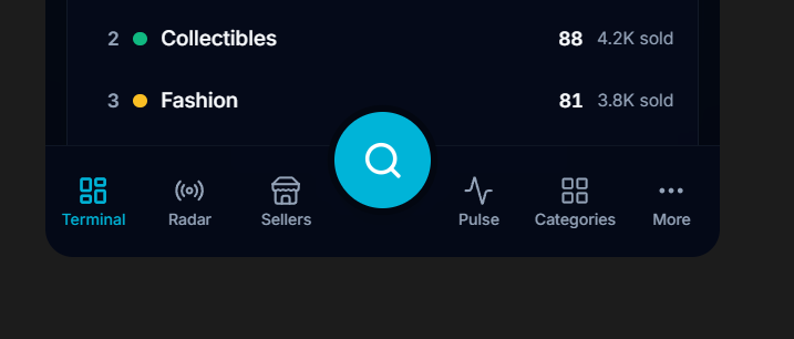
Playing around with some UI/UX ideas for a mobile nav bar
Curious what people think about this approach:
Bottom nav with the main sections, plus a larger center search button as the primary action
Does the center search feel useful and natural, or does it feel too heavy / distracting?
Would love honest feedback from anyone who thinks about mobile product design
Spent the day refining the engagement layer at WhosLive
→ welcome notifications
→ welcome email flow
→ 3-touch win-back sequence
→ weekly newsletter
→ x engagement engine, 24/7
Cleaner timing, tighter exclusions, and better copy across all of it
The Sandy fires are unfolding in LA right now
Discover and watch live coverage from local reporters, on-the-ground streamers, and breaking news outlets
Featuring YT coverage from @smokenscanent
Stay safe LA
https://t.co/4qOIbfEJRP
Scroll is coming to WhosLive
A highly-requested feature from our community since V1 is on the way. A vertical feed for live content
One swipe, one stream after another. Twitch, YouTube, Kick, Rumble, all in one place
Coming soon
Demo Day 2026 is in the books.
We just shared the stage at @TheIdeaVillage's VILLAGEx Demo Day in New Orleans.
From a Discord side project to building the discovery and intelligence layer for the live internet.
We're nowhere near done.
Anthropic is running a 24/7 Claude livestream 🎵
AI, music, and live content are starting to collide in real time
Discover @claudeai on WhosLive:
https://t.co/meG2F1pIbc


![jakefuss7's tweet photo. Debating the "Good morning, [name]" greeting at the top of this dashboard.
→ For it: warmth, personalization, sets the tone the second you open the app.
→ Against it: it's the most valuable space on the screen and it's showing zero data.
Part of me wants live numbers up there instead.
For anyone who designs dashboards: does a greeting like this earn its spot, or is it a waste of prime real estate? Honest takes welcome.](https://pbs.twimg.com/media/HKdz71AXcAAy0eX.png)