I love the cover design of the Czech journal, Typografia so much, that I filtered them all through to one page: https://t.co/zFL0kEFSgA #typography#typografia
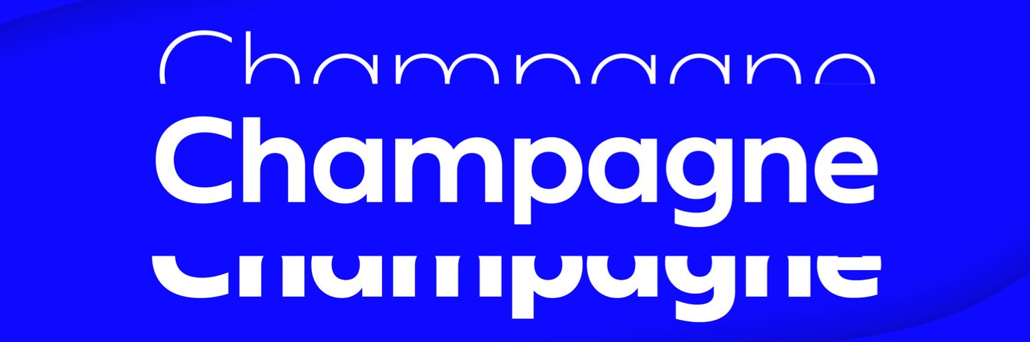
@JAM_Type brings us Toma Sans, influenced by the geometric-style #sansserif faces that were popular during the 1920s and 30s. A friendly, functional #sansserif family with seven weights plus matching italics, Toma Sans is now 50% off!
Shop Now: https://t.co/HxTKjwa2Ks
JT Marnie by @JAM_Type is influenced by the geo style #sansserif faces from the 1920s and 30s. JT Marnie is well suited for headlines and small blocks of text, particularly in advertising and packaging.
Get it HALF OFF now and impress your clients: https://t.co/QMZrtClxOp
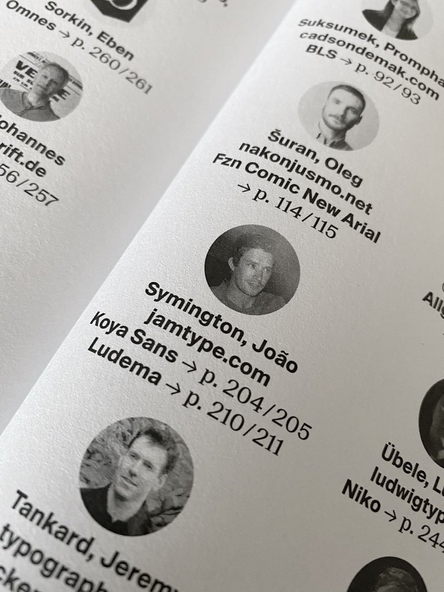
Two of our type families in @slanted_publishers wonderfully designed #yearbookoftype
KOYA SANS -> p. 204/205
LUDEMA -> p. 210/211
Get a copy of the book and get our fonts at https://t.co/8ttc4PoeAo
#font#typeface#design#graphicdesign#creative
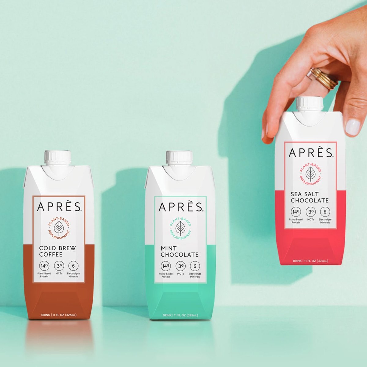
Many thanks to drinkapres for using our Andis typeface on their beautiful packaging and website! Looking good and we love their delicious protein drinks!
Yummy!!! =) https://t.co/m373V3u3yC