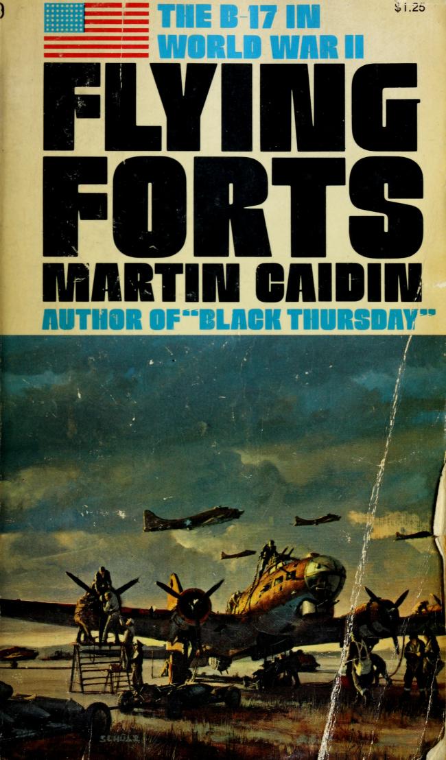
@JesseThorn Before they closed up the shop, I had an amazing opportunity to visit Colby Poster Printing Co., who were responsible for most of those fluorescent split-fountain show cards. Photos of the facility and some of their work here: https://t.co/qfABb6XDcg
@starwarsfonts@Mantia@LTypI House Industries eventually bought the entire Photo-Lettering archive and digitized a lot of the photo faces. I think the Simian release happened before the acquisition, but that was definitely part of the reference material. (2/2)
@starwarsfonts@Mantia@LTypI Bringing this full-circle: the original Planet of the Apes logotype was lettered by the incredible Ed Benguiat, who worked for Photo-Lettering, Inc. Not sure of the timeline, but PLINC then offered it as full font (“Planet”). So less lack-of-imagination, more named-after. (1/2)
@StarWars5W@starwarsfonts@FontsInUse Could be! I wouldn’t rule it out. All of these examples *could* even be custom lettered. But I still have a hunch that some version of this face was commercially available at the time as a photo font for typesetting.
@starwarsfonts@FontsInUse Also worth looking into any other identifiable faces used on other covers by Ballantine in the ’70s. If we can narrow down which providers they definitively worked with for photo typesetting, we might narrow down the list of suspects.
@starwarsfonts@FontsInUse Nice catch! In order to produce the overlapping letters and tight kerning, an artist (either at the lettering house or the designer working for the publisher) would have had to do some paste-up work to create the camera-ready art. So some redrawn variations are within reason.
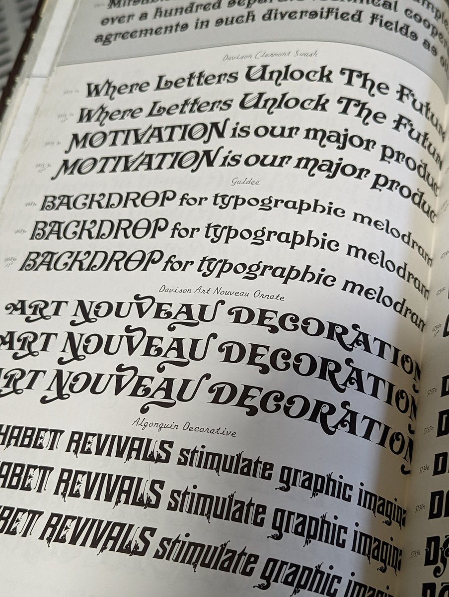
@starwarsfonts Bingo: it’s Davison Art Nouveau from Photo-Lettering. Here is a shot of it in the third Alphabet Thesaurus. @FontsInUse has a page for it that could use some of these examples!