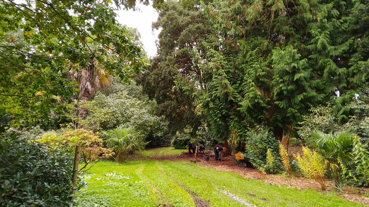
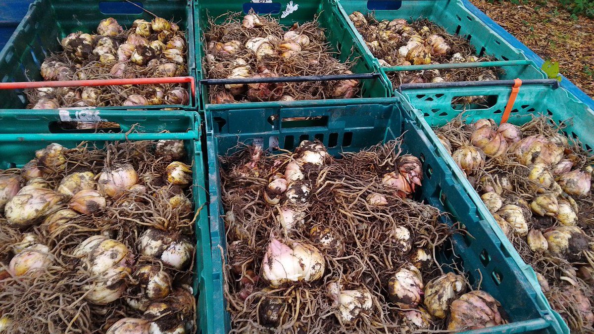
@NTmountstewart Pleasure Gound Team and their volunteers tackling the aftermath of the storm, working hard with the rest of the Mount Stewart squad to make the place safe to reopen.
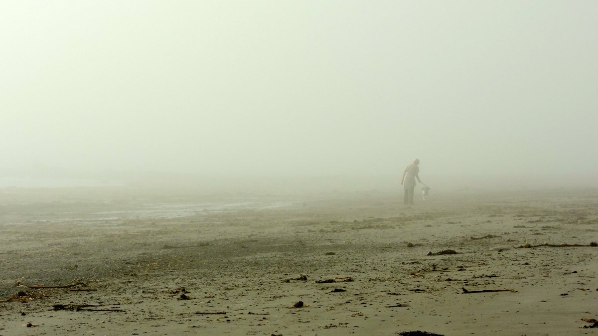
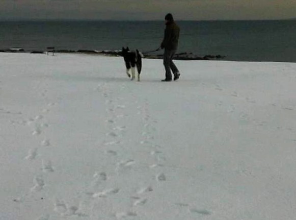
Snow and ice, east coast Donaghadee. Frosty underfoot, pleasant, bright sunshine with clear blue sky. Wednesday volunteering @NTmountstewart@bbcniweather
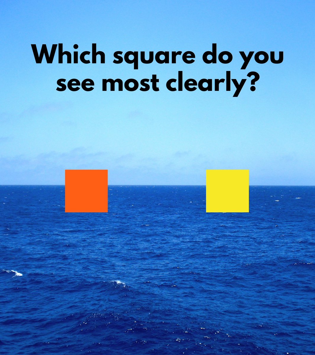
Which square do you see most clearly: orange or yellow?
Normally yellow is the most visible colour: it grabs our attention and we can see it from far away.
Hence warning signs, high-vis jackets, road markings, police tape, school buses, and taxis are almost always yellow.
But yellow isn't always the most visible colour. See, orange is *more visible* in one specific context: when it is contrasted with blue.
That's because orange and blue are complementary colours. This means that, when mixed, they cancel each other out. But, when placed alongside one another, they create a powerful, luminous, highly visible contrast.
And this fact is important because... lots of the world is blue: the sky and the ocean.
Hence lifeboats and lifebuoys and liferafts all around the world are orange — rather than yellow, the usual colour of safety equipment. If you pay attention, you'll notice that most objects relating to safety and caution around the ocean are, indeed, orange.
It's why the Golden Gate Bridge was painted orange — a particular shade which has come to be known as "International Orange" — so that it would stand out more clearly against the water and in heavy fog.
And it's also why astronauts wear orange suits during lift-off and ascent, and when they return to Earth; this makes them much easier to spot if they land in the ocean.
The "black box" recording device in aeroplanes is not actually black; they are legally required to be painted bright orange because that makes them much easier to find when planes go down over water.
The fact that orange and blue are complementary colours was also exploited by the Impressionist and Post-Impressionist artists of the late 19th century.
Think of Vincent van Gogh's Starry Night or Café Terrace at Night, in which he contrasted oranges and blues to create his famously vivid swirls of colour and light.
Claude Monet, too, in his paintings of Haystacks and of Venice, frequently used the complementary contrast between orange and blue because of the clarity and luminosity they produced.
Many things in the world are a coincidence, but the fact that lifeboats, space suits, the paintings of Vincent van Gogh, and the Golden Gate Bridge are all orange is not one of them.
The £600 energy support for NI will be paid in January. Direct debit customers get it automatically into their bank account. Other customers will be sent a voucher to redeem the £600 payment, with further details of how they will work and what ID will be required set out shortly.
@jsni@bbcweather Pretty sure is nothing historic Johnny as there is another mark just up the road. A carpark with greenery attached so automatically Google label it with a garden. As Jeremy would say, and that's my answer. 👍😃