Did you know you can adapt our large-image toolkit to #Django for solving geospatial and medical image challenges on the web? Here's how: https://t.co/T7lqbbCTbi #geospatial#medicalimages
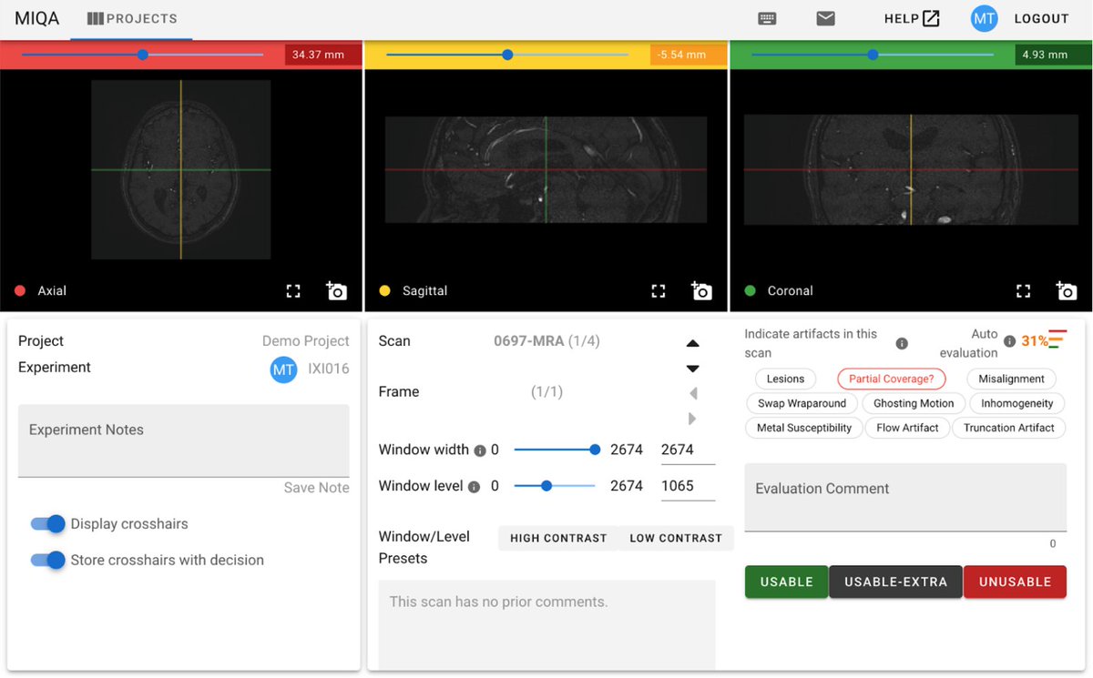
We're excited to launch MIQA, a cloud-based #medicalimaging application that leverages modern UI/UX and deep learning techniques for efficient and accurate QC processing. Being #opensource, it can be extended and customized for research or commercial use https://t.co/pWTFwf2nFR
@kentcdodds This assumes there is a grand unifying theory underlying JS style convention, but as in physics it will likely remain elusive for a long time. I laud your efforts though.
#Viime is an #opensource web application that pulls #metabolomics data from different sources, integrates the data, and enables analysis and #visualization. Thanks to these these interactive tools, medical researchers can truly understand their data! https://t.co/uOnQDukYWT
I present The United States Wheel of Quarantine, a visualization of state quarantine rules that will likely be out of date by tomorrow. Thx @CNNTravel for collating info. https://t.co/jZCq4NtQlb
To address the high volume of data related to #COVID19, our #DataAnalytics Team developed an open source web-based #visualization app. The interactive map enables users to visualize every confirmed case and reported death within the U.S. Give it a try! https://t.co/frYleaY3h2
Our Director of Data and Analytics @jeffbaumes teamed up with his 13-year-old son to participate in the #COVID19#hackathon. To fight misinformation, they developed a Q&A website where experts can answer people's questions about the virus. Check it out! https://t.co/i0frqSgwcK
@thehowie@NateSilver538 Yep, and currently around China's sustained high rate per day (the gray on the left). Remember confirmed cases vary based on testing rates and are not the accurate total infections that day.
Same plot splitting up US into individual states. China is missing from this plot since I don't have China province population data integrated at this point.
Can't think of a better way to show current healthcare system strain than deaths per capita (Y axis) on a linear axis.
Built from https://t.co/sFypryzbEb. See also the original from @recifs which has other features.
@recifs Nice. Note that I don't think "total" and "province" are accurate on the "per 100k" axes. I hard-coded those to not be available when a "per" axis is selected. Total can be especially misleading, since it totals the per 100k making it look much larger than it should.
@recifs Agree. I was thinking a log-based slider, but I like the "top N populous" selector idea. Another idea is to sort countries by population in the multi-select and you can just do a shift-click to select high population countries.
@recifs Excellent plot. I added a few features in my fork:
- Trend line interpretation text
- Historical trend line
- Filter by country
- Group by total
https://t.co/sFypryzbEb
Should you put the polar coordinates of a complex number into the complex sine function? Probably not, but it's interesting to look at.
https://t.co/A2zXWx5f8v