Review the brain from a 360-degree viewpoint 🔄🧠
Examine brain structures from a 360-degree viewpoint, make various incisions and slices, read more about the areas, and download images of the brain.
Access our 3D Brain Atlas here: https://t.co/2eiqTVWhDy
CSS Trick 🤙
You can create these tab bar controls by using :has() to count the number of tabs ⭐️
.tabs:has(input:nth-of-type(3)){--count: 3;}
.tabs:has(:checked:nth-of-type(3)){--active: 200%;}
.tabs::after{ translate:var(--active) 0;}
Let's break it down in this <noscript>! 📼
Couple of CSS :has() tricks here combined with custom properties 😎
First things first, lay out the tabs using display: grid. This gives you a way to create equal-width tabs 🙏
.tabs { display: grid; grid-auto-flow: column; }
Then you use :has() to count the number of tabs and store that in a custom property 🤓
.tabs:has(input:nth-of-type(3)) { --count: 3; }
.tabs:has(input:nth-of-type(4)) { --count: 4; }
Using the cascade, the last valid :has() gives you the number of tabs 🫶
Using the tab count, you can size the tab indicator. For the tab indicator, use the tabs pseudoelement:
.tabs::after {
content: "";
position: absolute;
height: 100%;
width: calc(100% / var(--count));
}
See how you can use --count to determine its size 📏
Next, use :has() to determine which tab is active or :checked with input [type=radio]
.tabs:has(:checked:nth-of-type(2)) { --active: 1; }
.tabs:has(:checked:nth-of-type(3)) { --active: 2; }
You can use a zero-indexed translation here. If the second input is :checked, set --active: 1, then translate the pseudoelement on the tabs to that position 👉
.tabs::after {
translate: calc(var(--active, 0) * 100%) 0;
}
Or you could set active to the translation:
.tabs:has(:checked:nth-of-type(2)) { --active: 100%; }
Setting the custom property allows you to use the index elsewhere if you need it 🤙
The final piece is using mix-blend-mode 👀
The tabs have a black background-color, the pseudoelement is white, and the label text is white. When you use mix-blend-mode: difference on the pseudoelement it will give this effect that the text transitions from white to black sliding across 😎
.tabs::after {
color: hsl(0 0% 100%);
mix-blend-mode: difference;
}
You can totally mix up the colors here though and go with a different effect. The mechanics of how you can use CSS :has() is the main point here 🙏
As always, any questions, suggestions, etc. let me know
@CodePen link below! 👇
(There's even a @tailwindcss play for this one too 👀)
For you aspiring Vision Pro designers!
🥽 New Human Interface Guidelines for Vision Pro (we added ~60k words of wisdom!!)
https://t.co/0yb3ruUJYp
🎨 Figma Vision Pro design kits
https://t.co/AKnnqd9MHg
🍏App icon tool (for previewing juicy 3d icons)
https://t.co/vApLWx6TjP
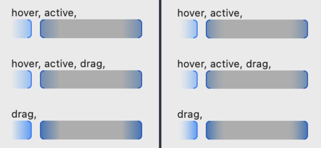
You can reduce the number of DOM elements and DOM operations _by a lot_ and speed things up as a result by highlighting things with the CSS Custom Highlight API (https://t.co/1wvwIUrjGh).
I wrote an essay called "Grid World" for the latest issue of The HTML Review (https://t.co/aOsPER98Oe). Read it here: https://t.co/9I3O8tiqD4
I had a really fun time creating the graphics that accompany the essay!
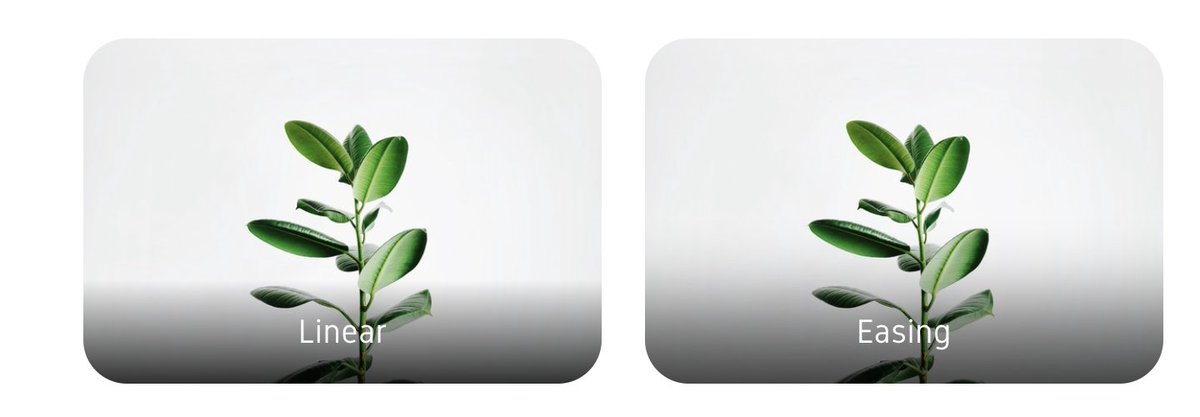
It never crossed my mind that you could ease a gradient, and and how much better it looks - until Tobias did it for Rotato's new timeline
https://t.co/ISt76Otz9x
Apple Maps makes it so easy to get around Tokyo. I just scan the buildings around me with my iPhone 14 Pro camera to generate walking directions exactly as they appear.


