Otro más del montón.Tratando de hacer la diferecia. Amante de las letras, las figuras y sus canciones. Adulador empedernido, del amor y sus fracciones.
Aparte de la humildad , lo que más enaltece a un joven es respetar a los mayores. Nunca usar tema de edad para descalificarlos por eso o burlarse de ellos . En todos los ámbitos de la vida . El joven que usa ese método se empequeñece.
La mayoría de los hombres pasan por alto la forma más sencilla de mejorar su aspecto.
Todo lo que necesitas es un producto: Vaselina.
Aquí tienes 7 trucos con vaselina que transformarán por completo tu aspecto (y tu vida):
// Hilo //
En 7 meses puedes ser irreconocible.
Solo necesitas obsesionarte con estos 11 hábitos.
Y a finales de agosto del 2025… todos querrán saber qué hiciste.
(Los últimos 3 lo cambian todo).
10 DURAS Verdades Sobre las Mujeres🔞
[ Los secretos más oscuros de las mujeres ]
HOMBRES, NO se pierdan esto.
Echa un vistazo al hilo:
1. Las mujeres son criaturas celosas por naturaleza.
Los negocios aburridos son los que 𝗺á𝘀 𝗱𝗶𝗻𝗲𝗿𝗼 𝗴𝗲𝗻𝗲𝗿𝗮𝗻.
Es muy simple, y aun así el 99% de la gente sigue buscando los complicados.
Así que, por favor...
Elige uno de estos 10 𝗻𝗲𝗴𝗼𝗰𝗶𝗼𝘀 sosos pero lucrativos ⤵️
JORDÁN PETERSON.
Uno de los psicólogos más conocidos, Sus opiniones sobre temas políticos, culturales y de identidad de género han generado controversia.
12 mensajes suyos no aptos para todo mundo sus palabras te pueden incomodar:
When learning Time Series, I struggled to understand Time Series Decomposition. In 3 minutes, I'll share 3 months of research on Time Series Decomposition. Let's go!
1. What is Time Series Decomposition? TS Decomp is a statistical method used to deconstruct a time series into several components, each representing underlying patterns in the data. There are 3 key components: Trend, Seasonal, and Residual. Let's break them down.
2. Trend (Step 1): Trend is the long-term movement of the series. Typically we use a smoother (LOESS, LOWESS) or moving average to calculate the trend. The key is that it removes the seasonal variation from the time series.
3. Detrended Time Series (Step 2): We remove the trend component from the time series. This has the effect of making the time series "stationary" (well sort of). Stationary just means the detrended series no longer goes up or down but is centered.
4. Seasonal (Step 3): The seasonal component captures regular patterns of variability within specific, fixed periods, such as daily, weekly, monthly, or quarterly fluctuations. The seasonal component is commonly calculated by using an average or median value at a seasonal frequency (e.g. daily, monthly, etc).
5. Residuals (Remainder) (Step 4): The irregular component, also known as the residual or noise, represents the random variation in the data that cannot be attributed to the trend, seasonal, or cyclical components. These are unforeseen variations that do not follow a predictable pattern.
There you have it, my top 5 concepts on time series decomposition.
The next problem you'll face is how to apply data science to business.
I'd like to help.
I’ve spent 100 hours consolidating my learnings into a free 5-day course, How to Solve Business Problems with Data Science. It comes with:
300+ lines of R and Python code
5 bonus trainings
2 systematic frameworks
1 complete roadmap to avoid mistakes and start solving business problems with data science, TODAY.
👉 Here it is for free: https://t.co/YXG4pL97ZN
And if you'd like to learn Time Series at a deeper level, I have a course: https://t.co/O40JbCkPh1
If you like this post, please reshare ♻️ it so others can get value.
This is the best new AI tool for research.
Just upload a PDF file, ask a question, and get an answer in seconds.
It's like ChatGPT, but built for researchers.
Try it for free.
Bayes' Theorem is a fundamental concept in data science.
But it took me 2 years to understand its importance.
In 2 minutes, I'll share my best findings over the last 2 years exploring Bayesian Statistics. Let's go.
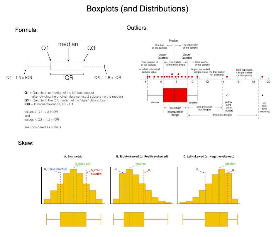
Boxplots are one of the most useful tools in my Data Science arsenal. In 6 minutes, I'll teach you 6 years of using box plots for EDA and problem-solving. Let's dive in.
1. What is a boxplot? A boxplot is a standardized way of displaying the distribution of data based on a five-number summary: minimum, first quartile (Q1), median, third quartile (Q3), and maximum.
2. Invention: The boxplot was invented in 1969 by John Tukey, as part of his pioneering work in data visualization. Tukey's EDA emphasized the importance of using simple graphical and numerical methods to start understanding the data before making any assumptions about its underlying distribution or applying complex statistical models. The boxplot emerged from this philosophy. Tukey's boxplot was designed to be a quick and easy way to visualize the distribution of data.
3. Usage: I use boxplots during the exploratory phase. First, I assess correlations to an outcome I am interested in. Then I explore the top features during Exploratory Data Analysis (EDA). Boxplots are heavily used in my EDA.
4. Key Features of Boxplots: In one quick visualization, boxplots display distribution summary, outliers, skewness, and it facilitates comparisons between multiple groups or categories.
5. The Box: The box spans from the first quartile (Q1) to the third quartile (Q3). This range, known as the interquartile range (IQR), contains the middle 50% of the data. The line inside the box represents the median (the second quartile, Q2), which divides the dataset into two equal halves.
6. The Whiskers: The whiskers extend from the box to show the range of the data. A common approach is to extend them to the smallest and largest values within 1.5 times the IQR from the first and third quartiles, respectively. Data points outside this range are considered outliers and are sometimes plotted as individual points.
7. Outliers: These are data points that lie beyond the end of the whiskers. They are not part of the bulk of the data and may indicate variability in the data, experimental errors, or novel findings. Explore these!
8. Skewness: If the median is not equidistant from Q1 and Q3, or if the whiskers are of unequal lengths, it suggests that the data is skewed.
There you have it- my top 8 concepts on boxplots. The next problem you'll face is how to apply data science to business.
I'd like to help.
I’ve spent 100 hours consolidating my learnings into a free 5-day course, How to Solve Business Problems with Data Science. It comes with:
300+ lines of R and Python code
5 bonus trainings
2 systematic frameworks
1 complete roadmap to avoid mistakes and start solving business problems with data science, TODAY.
👉 Here it is for free: https://t.co/YXG4pL97ZN
Boxplots are one of the most useful tools in my Data Science arsenal. In 6 minutes, I'll teach you 6 years of using box plots for EDA and problem-solving. Let's dive in.
1. What is a boxplot? A boxplot is a standardized way of displaying the distribution of data based on a five-number summary: minimum, first quartile (Q1), median, third quartile (Q3), and maximum.
2. Invention: The boxplot was invented in 1969 by John Tukey, as part of his pioneering work in data visualization. Tukey's EDA emphasized the importance of using simple graphical and numerical methods to start understanding the data before making any assumptions about its underlying distribution or applying complex statistical models. The boxplot emerged from this philosophy. Tukey's boxplot was designed to be a quick and easy way to visualize the distribution of data.
3. Usage: I use boxplots during the exploratory phase. First, I assess correlations to an outcome I am interested in. Then I explore the top features during Exploratory Data Analysis (EDA). Boxplots are heavily used in my EDA.
4. Key Features of Boxplots: In one quick visualization, boxplots display distribution summary, outliers, skewness, and it facilitates comparisons between multiple groups or categories.
5. The Box: The box spans from the first quartile (Q1) to the third quartile (Q3). This range, known as the interquartile range (IQR), contains the middle 50% of the data. The line inside the box represents the median (the second quartile, Q2), which divides the dataset into two equal halves.
6. The Whiskers: The whiskers extend from the box to show the range of the data. A common approach is to extend them to the smallest and largest values within 1.5 times the IQR from the first and third quartiles, respectively. Data points outside this range are considered outliers and are sometimes plotted as individual points.
7. Outliers: These are data points that lie beyond the end of the whiskers. They are not part of the bulk of the data and may indicate variability in the data, experimental errors, or novel findings. Explore these!
8. Skewness: If the median is not equidistant from Q1 and Q3, or if the whiskers are of unequal lengths, it suggests that the data is skewed.
9. Key Issues: One issue I run into commonly is multimodal distributions (these are distributions with multiple "humps" like a camel's back). These usually indicate a group-wise pattern, which needs to be explored by group.
===
There’s a lot more to learning Data Science for Business than understanding distributions, boxplots, and outliers.
I’d like to help.
I put together a free on-demand workshop that covers the 10 skills that helped me make the transition to Data Scientist: https://t.co/LR39RJ5XKB
And if you'd like to speed it up, I have a live workshop where I'll share how to use ChatGPT for Data Science: https://t.co/EaMpKrJiqX
If you like this post, please reshare ♻️ it so others can get value.


![honordetigre's tweet photo. 10 DURAS Verdades Sobre las Mujeres🔞
[ Los secretos más oscuros de las mujeres ]
HOMBRES, NO se pierdan esto.
Echa un vistazo al hilo:
1. Las mujeres son criaturas celosas por naturaleza. https://t.co/Ybdooq5pNN](https://pbs.twimg.com/media/GVNcQTBW8AAGzoJ.png)









![honordetigre's tweet photo. 10 DURAS Verdades Sobre las Mujeres🔞
[ Los secretos más oscuros de las mujeres ]
HOMBRES, NO se pierdan esto.
Echa un vistazo al hilo:
1. Las mujeres son criaturas celosas por naturaleza. https://t.co/Ybdooq5pNN](https://pbs.twimg.com/media/GVNcRR1XcAAcFdm.png)


![riyazmd774's tweet photo. Everything you can do legally (or almost) with Flipper Zero.
The Ultimate Tamagotchi for Hackers...
[ 🔖 Save this for later ] https://t.co/RGc0FSIgUT](https://pbs.twimg.com/media/GUHb1utawAAzgE7.jpg)