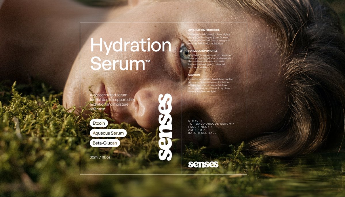
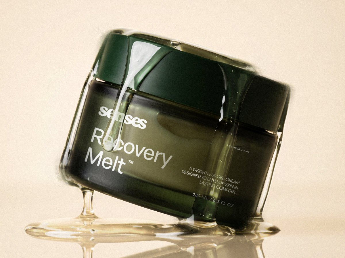
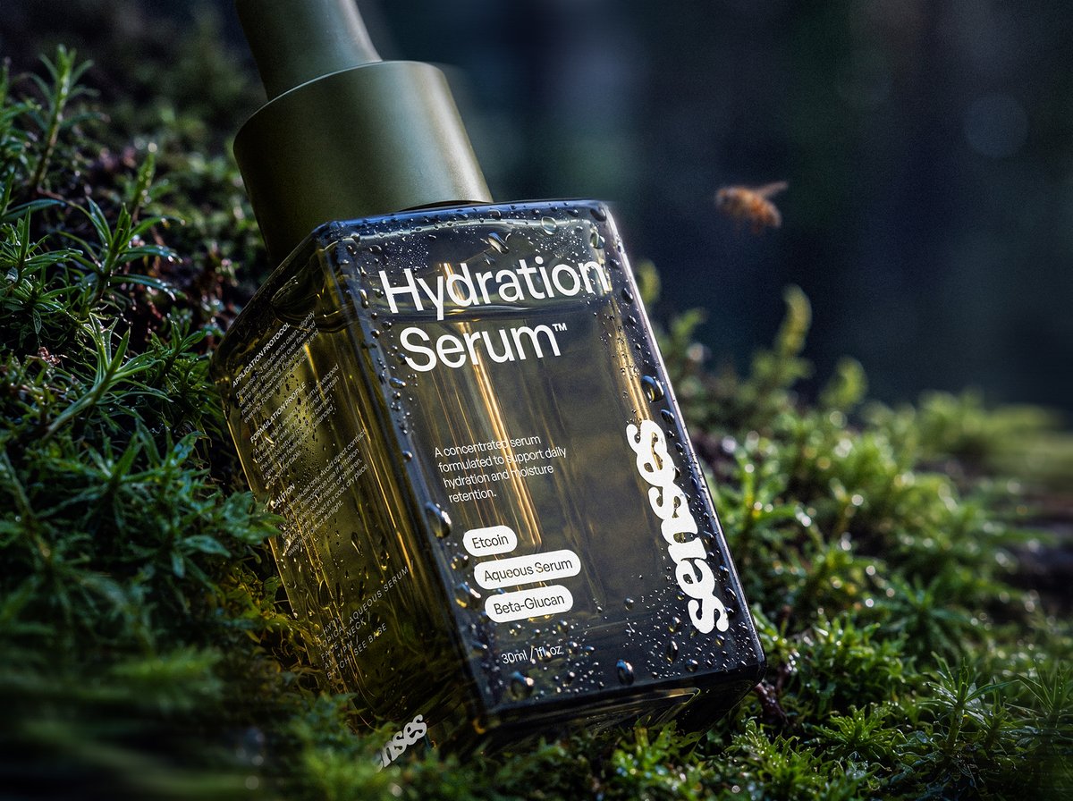
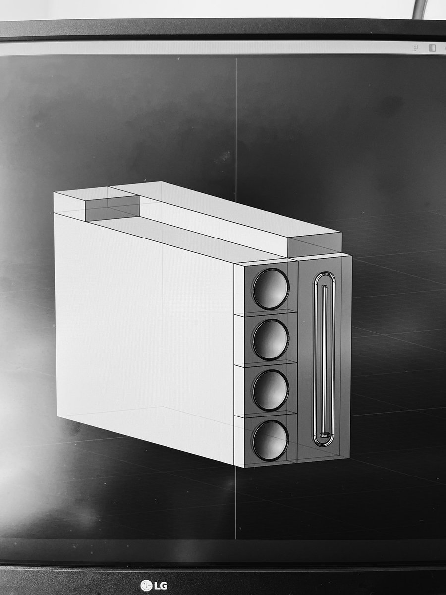
A first glimpse of Senses, a skincare rebrand I’ve been working on. Here's a few highlights from the identity, packaging and art direction.
There’s still more to reveal. Full project coming soon.
#Design#BrandIdentity#Packaging
Redesigning Senses started with a question:
How can a brand feel trustworthy without feeling clinical?
The answer was a system built around contrast: precise type and packaging, paired with tactile photography and texture.
Case study soon.
#design#BrandIdentity#Packaging
A fast look at how Still Human Film Festival evolved from AI-generated experiments into a complete visual identity, with the finished campaign revealed at the end.
@contra@envato#envatochallenge
Archive - 2021
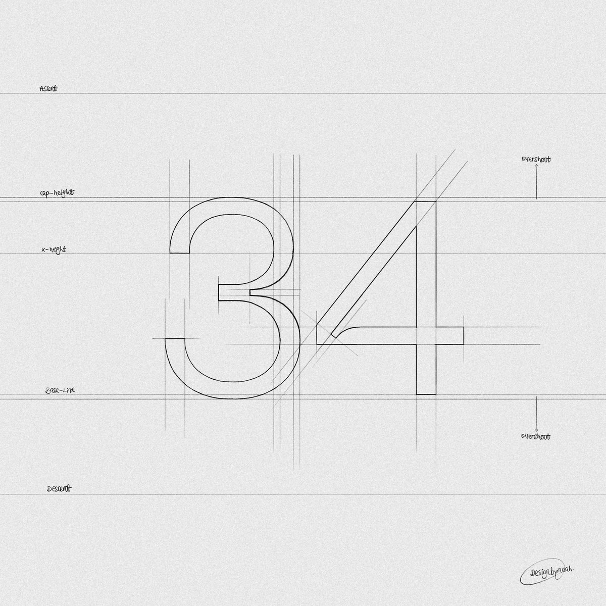
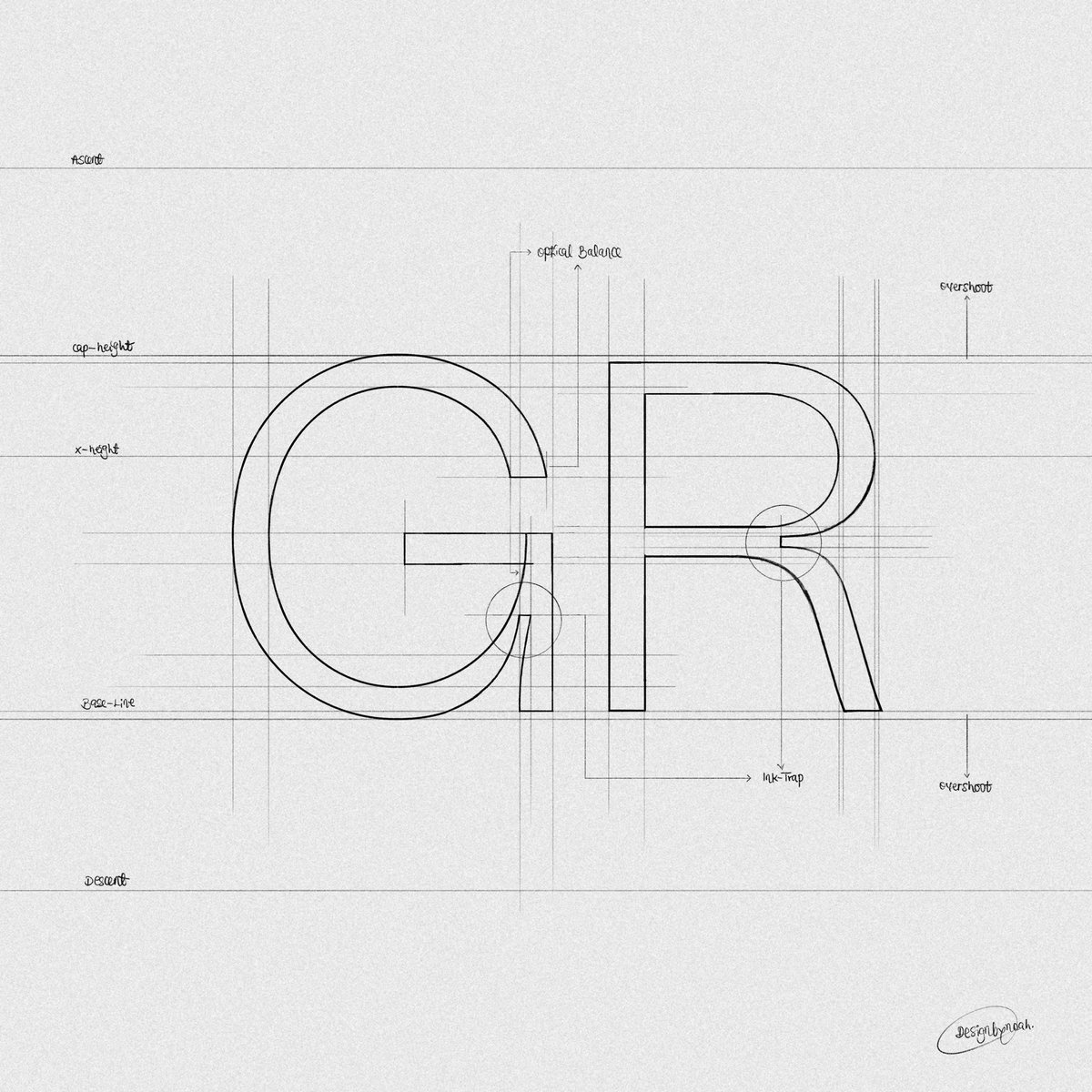
Grid sketches I created for a display font based on grotesk & neo-grotesk typefaces, intended for internal use only.
To me, it's an ink-trapped variation of Neue Hass Grotesk made to save time in the long run, as I always found myself modifying NHG for projects.
Unmistakably pro. Unmistakably Webflow.
Meet our new brand — created to represent the fundamental superpowers of the web and honor the professional and inspiring work of our customers.
Get to know the new Webflow:
https://t.co/6t2zZvqIBl
Get asked a lot how to improve in design, 3D, or Motion. The answer is simple.
Practice.
Create stuff that you want to create.
Be curious how someone made a thing. Try to do it yourself without help.
Repeat.
A lot.
It will surprise you how fast you improve.