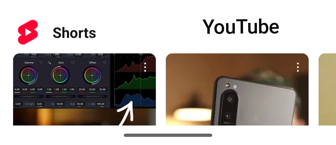
@MishaalRahman The transparency on the home screen context menu needs to be dialed down, please pass on the feedback to make it more opaque and we'll be talking. In my opinion the contrast right now isnt that big between the text and the container and it's not as readable.
@SMOUSE_CG "Thanks for sharing Andrew, I'm going to use a grey sphere in Blender and turn it into a realistic apple using Nano Banana instead of using a Poliigon subscription and download a 3D model from there!😋😊"
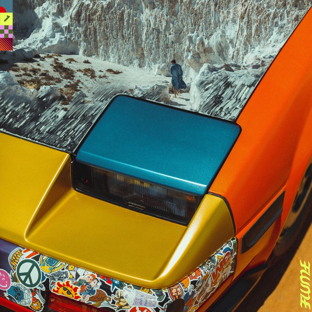
Sometimes it’s upsetting how few people talk about the flume mixtape it’s so perfect and has infinite replay value and a whole companion movie and the best cover ever literally 10/10
@DECODEDVFX great progress, completely ditch the chromatic abberration, it cheapens the shot. would be cool to have some shadow from a cloud on the left side of the house to give it more interest. and maybe lower blur level for the DoF.