Its wild to think that braille isn't a common thing on restaurant menus while it is in ADA standard scenarios. I wonder if braille would just slowly disappear in use if it wasn't being upheld by a regulated standard. #accessibility#designthinking
FONT: Curvature
An exploration of how non-script typography might look without straight lines.
A display type intended to feel light, playful, and friendly.
#typography#font
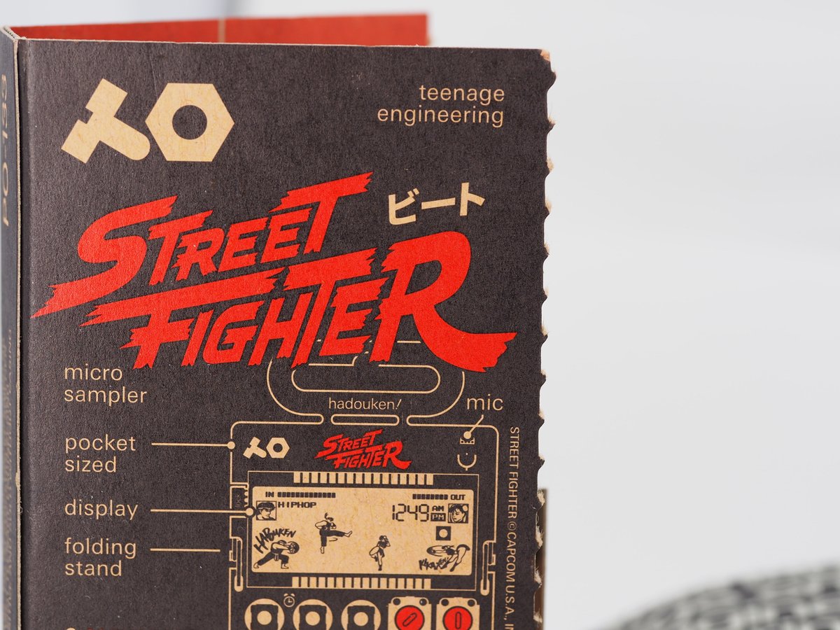
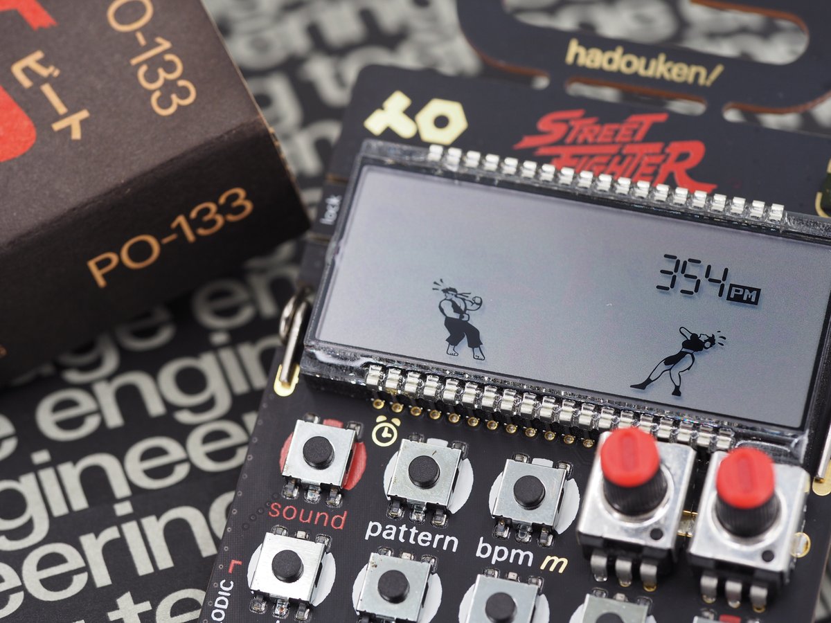
Finally picked up one of the @jugendingenieur and @CapcomUSA_ pocket operators. Great for photos, even better for music. Can't wait to really dig into it!
Recently finished reading David Gibson's "The Wayfinding Handbook" and Andreas Uebele's "Signage Systems + Information Graphics". I gained so much insight on the industry and the complexity of environmental graphic design! #wayfinding#signage#environmentaldesign
I've been immersing myself into #wayfinding recently and I really wanted to experience being lost and use #signage to find my way. Then I remembered that @geoguessr exists, I can get lost anywhere in the world all without leaving my house!
You know what we be absurdly useful in @blender_org? Hotkey displays in the toolbar as seen below. I think the main barricade to learning #blender is hotkey memorization in my experience. #ux
Just did a small write up of one of my favorite projects in my portfolio! It's all about #foodwaste in #canada and an idea to mitigate it!
https://t.co/8cvgILZ02K
Came across @snohetta over the weekend and I don't think I've ever seen such an impressive company project portfolio before. Super interesting and inspirational.
This great article ties into a thought I had yesterday which was "as a designer, what is 'right' when I'm creating something?" I think there times where there are definite wrong answers but I struggle to think of a singular correct answer in #design.
#designthinking
Writing a design case study? Essential tips here from the @uxcollective team + industry expert interviews on how to focus and stand out (psst! don't just go through the motions) https://t.co/Dx8535XrsF
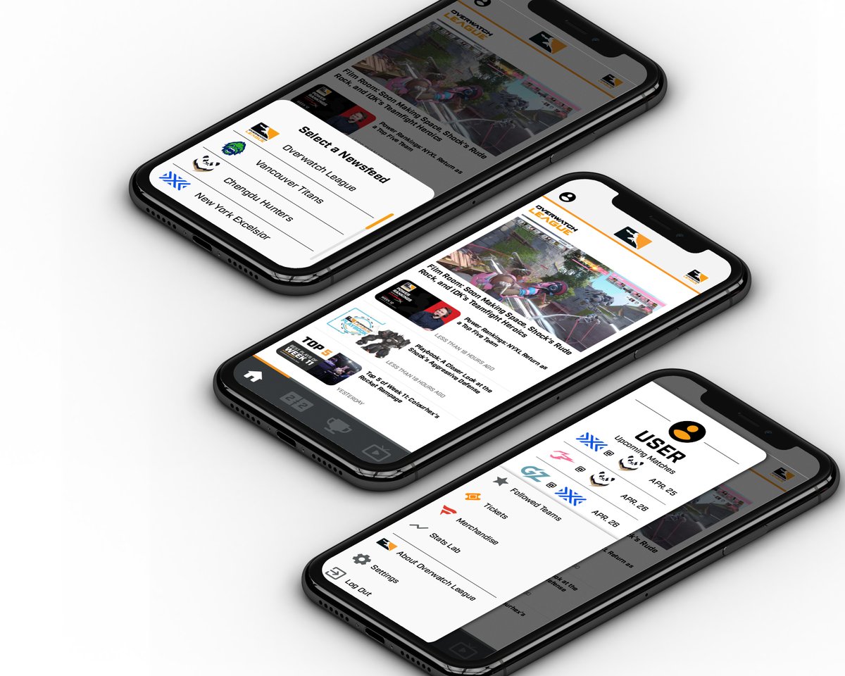
A while back I took a look into the #uxdesign of the @overwatchleague mobile app. I was looking at ways to improve the usefulness of the app by adding more sorting options, personalization, and reworked menu layouts in an attempt to improve #usability.
Interesting to note is the leading teams in each region (@Cloud9 and @G2esports respectively) have among the most moderate breakdown of years played per player.
@MADLions_LoLEN were quite the outlier though with close to a team of complete rookies performing exceptionally well.
I needed to get some infographic practice in so I decided to look into how years of experience affect players in the #LCS and #LEC
A common thought is the LEC is more successful because of their new talent but veteran teams place higher in LEC while its the opposite in the LCS.
I think it may have something to do with the idea of simulating a tactile experience/appearance on a flat screen. Bevels on touch capacitive buttons just remind me of how much I prefer actual tactile buttons.
Took a read through this article and I'm not sure if I really like this neumorphism trend. It sort of reminds me of the style of design that was common at the start of touchscreens.
https://t.co/5RGzqdmu0Z
I've been looking into still life art and 3D modeling recently which has brought a thought to mind.
Do imperfect visuals have a place in the world of web / UI / brand design or should that be reserved for replications of real life like still life paintings and 3D modeling?