This UI has 10 UX problems. 👀
A classic study found that one evaluator spotted only 20–51% of usability issues.
Think you can find all 10?
Play the Heuristic Sweep challenge:
https://t.co/3kfuh5NhCa
#UXDesign#Usability
Your AI agent asks for approval 40 times.
By click #6, are you even reading? 💀
More confirmations ≠ more control.
Should AI ask before every action, or only before irreversible ones?
Make the UX call 👇
https://t.co/3kfuh5NhCa
#AIUX#UXDesign
Same workout. Different font.
Research found that harder-to-read typography made people estimate 83% more time to complete it.
Your UI's font can change perceived effort.
Would you keep the brand font?
Try UX Arcade 👇
https://t.co/3kfuh5NhCa
#UXDesign
Two coffee cards. Both need 10 purchases.
One starts at 0/10.
The other at 2/12.
The second group finished faster.
That's the Endowed Progress Effect.
Now imagine your onboarding progress bar.
Would you start at 0% or show earned progress?
🎮 https://t.co/3kfuh5NhCa
Ever pulled a door that said PUSH? 💀
That's a Norman Door.
The handle says one thing. The sign says another.
Apps make the same mistake with confusing buttons and icons.
Good UX makes actions obvious.
Test your UX instincts 👇
https://t.co/3kfuh5NhCa
A $100 ticket becomes $118 at checkout.
In a StubHub experiment, hiding fees until checkout increased spending by about 21%.
Good for revenue. But good UX?
Would you show fees upfront or at checkout?
Make the call 👇
https://t.co/3kfuh5NhCa
You saw it once. Would you recognise it again?
A classic memory experiment found remarkably strong recognition for pictures.
UX takeaway:
Don’t make users remember what the interface can show them.
Recognition > recall.
Test your UX judgment:
https://t.co/3kfuh5NhCa
Nobody read the manual.
They just started using the product.
Sound familiar?
Good UX doesn’t depend on people studying instructions first. It helps them learn by doing—and helps when they get stuck.
🎮 Test your UX judgment:
https://t.co/3kfuh5NhCa
#UXDesign#ProductDesign
One wrong input. A system that let it through. A very expensive mistake.
People make slips. Good UX catches the dangerous ones before they become consequences.
Would your design have stopped it?
🎮 https://t.co/3kfuh5NhCa
#UXDesign#ProductDesign
Your brain may prefer a familiar bad outcome over an uncertain one. 🧠
That’s loss aversion.
In UX, the real test isn’t the happy path. It’s what happens when things go wrong.
Explore the decisions with UX Arcade 👇
https://t.co/3kfuh5NhCa
Same fields. Same labels.
Even spacing: 2.5s
Grouped spacing: 0.5s
That’s Proximity.
Things placed near each other feel related. Sometimes you don’t need another border—you just need better spacing.
https://t.co/3kfuh5NhCa
#UXDesign#Proximity#UXArcade
What was that exact blue again?
From memory: 2.1s
From Recent: 0.5s
That’s Recognition Rather Than Recall.
Don’t make users remember what the interface can simply show them.
https://t.co/3kfuh5NhCa
#UXDesign#UXArcade#Usability
Same “Continue” action.
Small + far: 2.3s
Big + close: 0.5s
That’s Fitts’s Law.
Smaller or farther targets demand more movement and precision.
Don’t just read the principle. Feel it.
https://t.co/3kfuh5NhCa
#UXDesign#FittsLaw#UXArcade
36 buttons vs 5.
Same task: find Play.
More choices = more decision work. That’s Hick’s Law.
The fix isn’t always removing features. Prioritize the important ones and tuck the rest away.
https://t.co/3kfuh5NhCa
#UXDesign#HicksLaw#UXArcade
“Saved.”
Cool. Where?
A successful export isn’t enough if the user has to hunt for the file.
Good UX follows the whole task: show the destination, let people change it, then confirm where it went.
https://t.co/3kfuh5NhCa
#UXDesign#UXArcade#SplitfireLabs
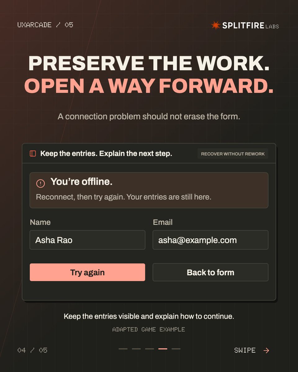
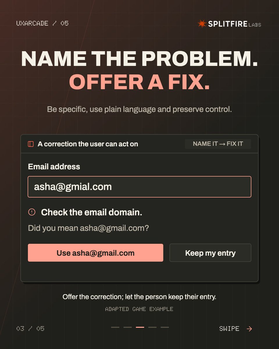
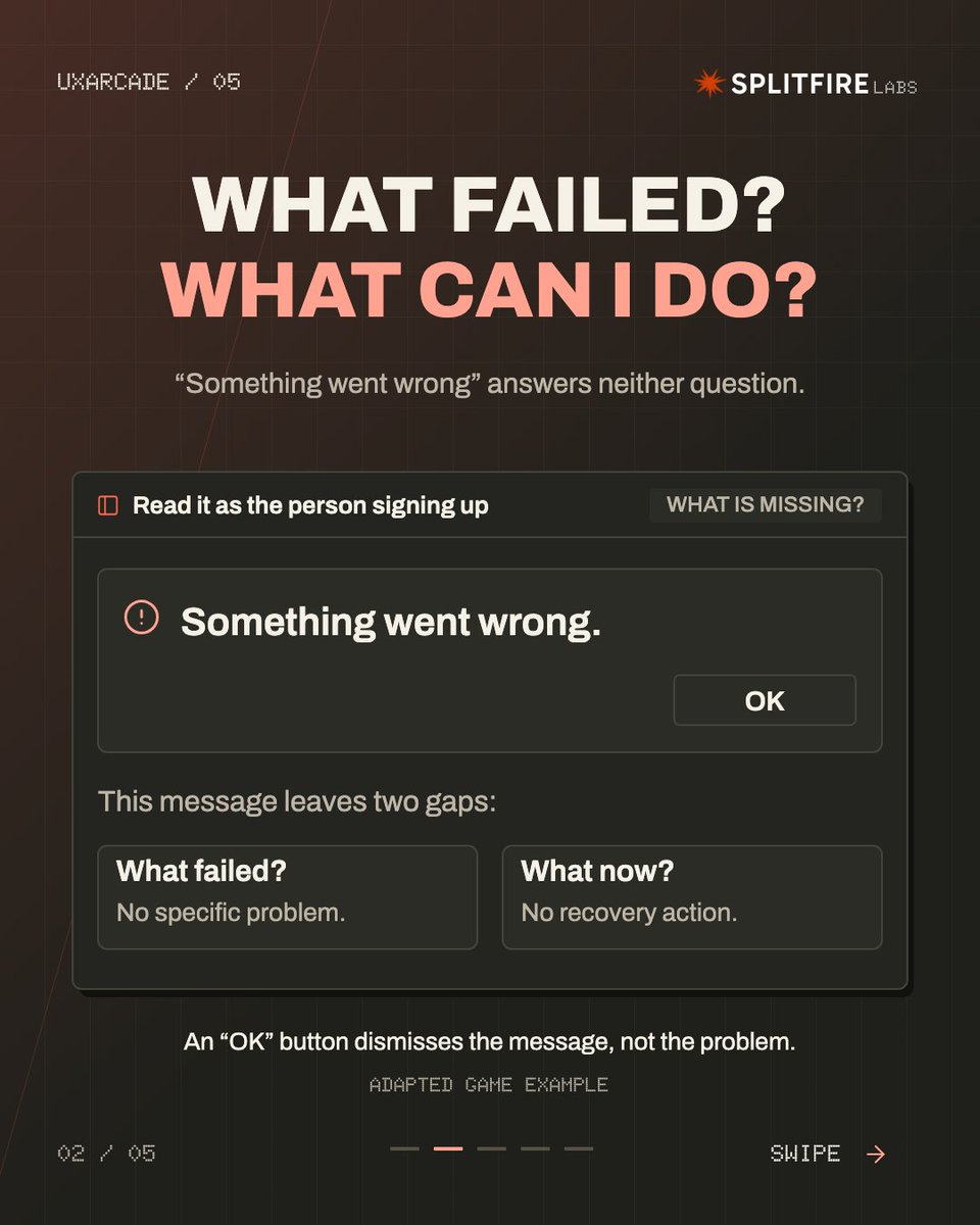
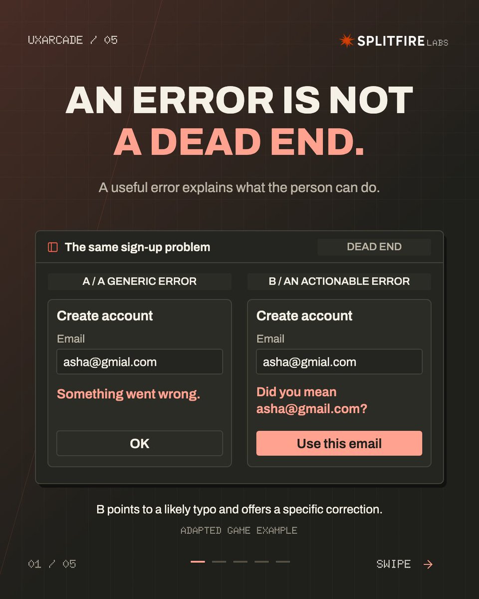
An error message shouldn’t be a wall.
“Something went wrong” tells the user almost nothing.
Better errors:
name the problem
preserve the work
offer a next step
keep the user in control
That’s Error Recovery.
Play Dead End:
https://t.co/3kfuh5NhCa
#UXDesign#UXArcade
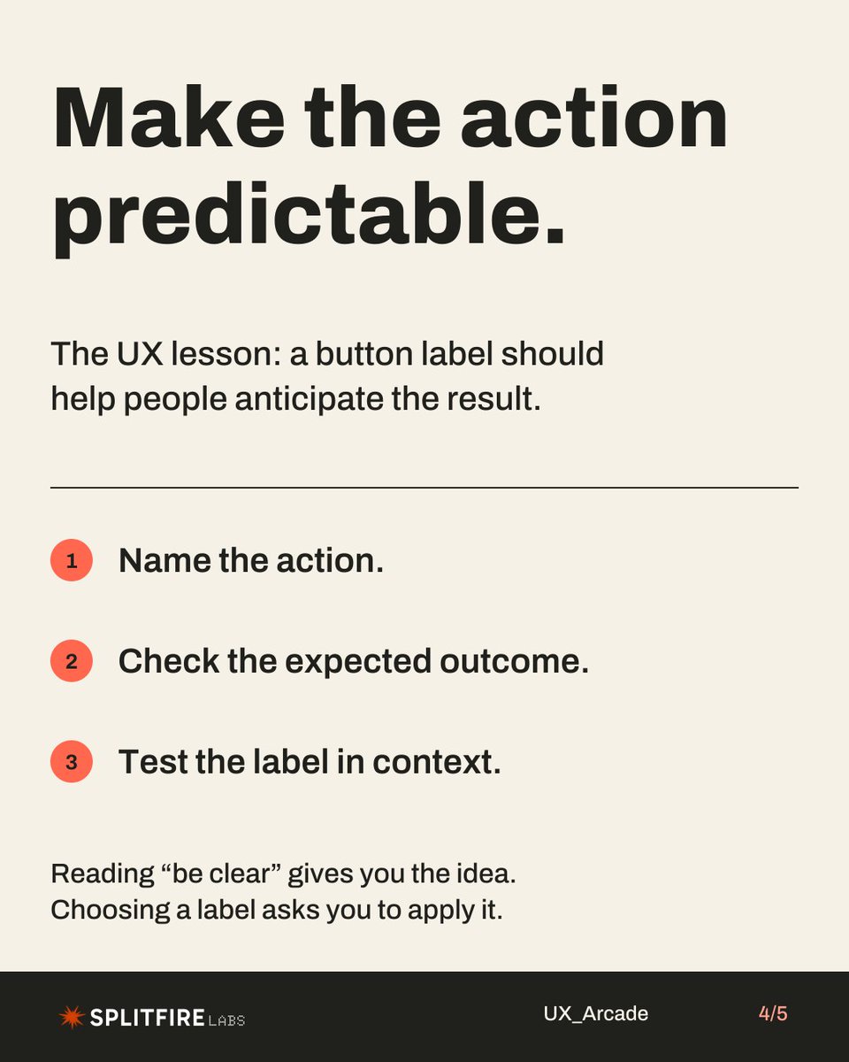
Good UX starts before the click.
If a button says “Done,” what happens next?
Save draft?
Close editor?
Publish page?
A label should help people predict the outcome.
Better promise: “Publish page”
Clearer action. Less guesswork.
Try a UX challenge:
https://t.co/3kfuh5NhCa