Most AI founders think their product is losing users because the model isn’t good enough.
It isn’t.
The model works. The interface doesn’t.
Users sign up, land on a dashboard with 14 metrics competing for attention, can’t figure out what matters, and close the tab. Not because they don’t see the value, because the design never showed it to them.
This is the real churn problem in AI SaaS right now. Not model accuracy. Not missing features. A product that makes users work too hard to get to their first win.
The fix isn’t rebuilding the AI. It’s redesigning the three screens that matter most: the empty state, the dashboard, and the first insight. Get those right and Day 1 retention changes overnight.
AI is the feature. Design is the product.
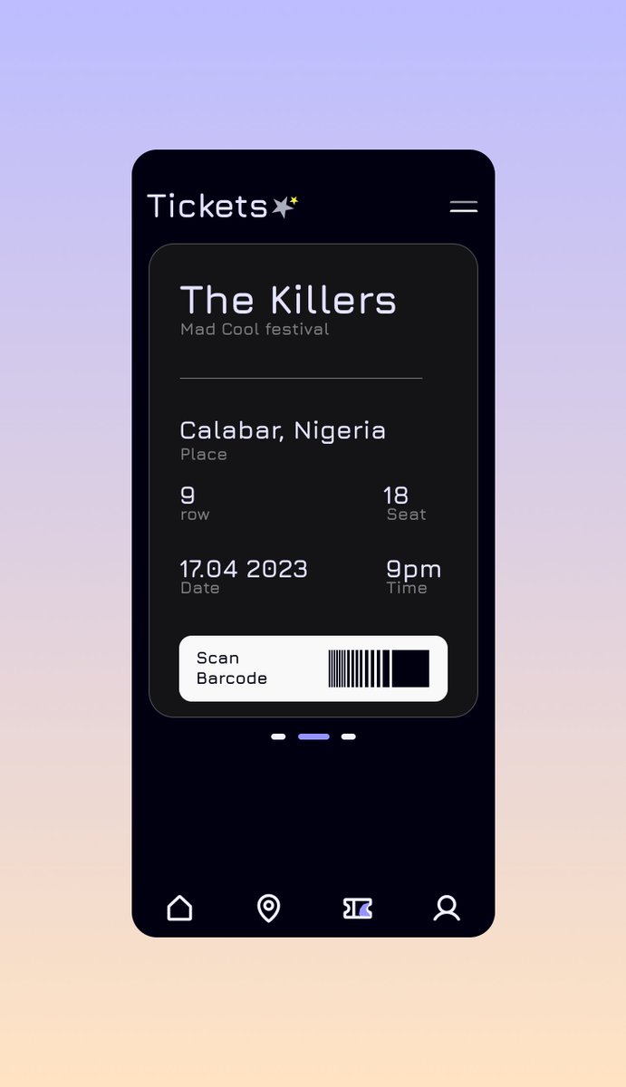
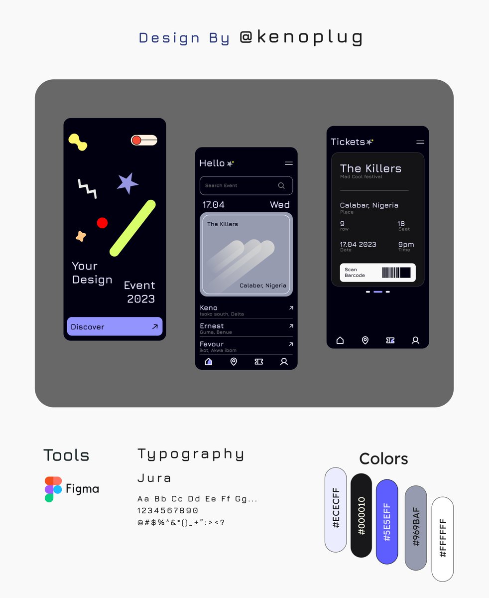
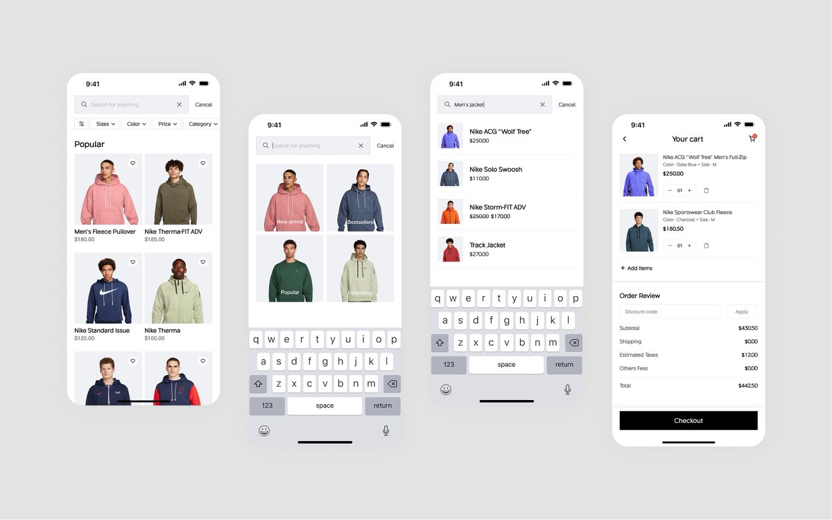
These websites offer structured lessons, real world examples, design fundamentals, and practical exercises to help you grow from beginner to confident designer.
We need UX patterns for AI behaviour, not just UI components.
UX design isn’t just about what users see anymore. It’s about what AI does next.
What happens when your product starts thinking for itself?
You’ve got beautiful buttons. Clean layouts. Pixel-perfect typography. But now there’s an AI inside the product… and it keeps improvising. Sometimes it nails the experience. Other times? It confidently recommends sushi restaurants in the middle of the Sahara.