What makes a football kit truly memorable — the design, or the story behind it?
For me, designing concept kits has always been more than visuals. It’s about creating a story that connects a club with its community — something fans can wear and feel proud of.
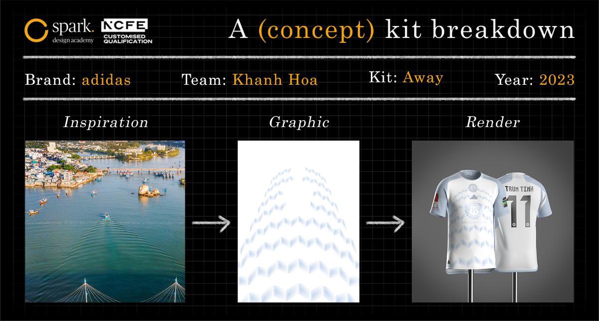
In my latest article, I break down my adidas x Khanh Hoa FC Away Kit concept, step by step — from receiving the (imaginary) brief, to crafting the story, then rendering the final 3D visuals.https://t.co/1J66VD07Ad
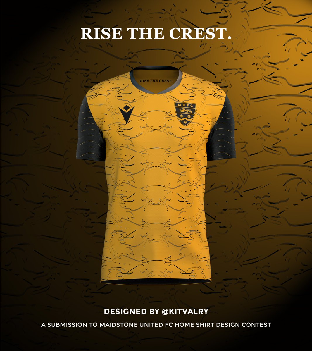
The theme, “Rise the Crest,” metaphorically reflects how the players elevate the badge through their performance on the pitch. They “rise the crest” by bringing pride and prestige to the emblem they wear—adding value, respect, and legacy to the club’s identity. (5/5)
#FlashbackFriday Back in early November last year, I came across a design contest launched by non-league side @maidstoneunited - shared by @Vietnam_Stones. The club invited fans to submit kit designs for the 2025/26 and 2026/27 seasons. (1/5)
Both designs are inspired by elements of the club crest—the golden lion (England), the wavy fesse (Medway River), and the three vintage leather balls (originally red roundels in the old crest, taken from the arms of Archbishop Courtenay, who built All Saints Church). (4/5)
👀🖌️ Brand Logo's (Hidden Meanings)
Yesterday's post about the Lotto logo was met with huge interest. This has encouraged this thread. I will start off with yesterday's...
1. 🇮🇹 @lottosport
An overlapping tennis court & football pitch with a hole punched through the centre.
⬛️| @ForwardMSNFC Pre-Season 2025
The Fouis Muitton Kit
A bit of fun from FM, taking design inspiration from classic luxury brand monograms with a blackout look and fee. Very nice.