AI is quietly changing what “good UI” means.
LLMs are turning topographical UIs, interfaces where users explore maps, folders, menus, and dashboards, into timeline UIs, where information appears as a flow you simply move through. This shift is subtle, but it is fundamental.
For decades, UI design focused on helping users decide. Where to click, what to open, how to navigate complex structures. That is why so many tools are built around trees, panels, and spatial organization. But decision making is cognitive work, and most people do not want to do that work all the time.
Some of the most successful consumer apps understood this early. TikTok and Tinder do not ask users what they want to do next. They decide for them. Tinder shows one profile at a time. You swipe left or right. No browsing, no comparison, no planning. Just a single action, repeated. This is not just simple UI. It is a structural choice.
I call this a timeline UI. Content arrives in a single sequence, and the user moves forward step by step. There is no question of where should I go. You simply respond to what is in front of you. The result is lower cognitive load and a calmer experience, often so smooth that it becomes addictive.
Now compare that to tools like Google Drive, Notion, or Figma. These are powerful, but they show everything at once. Folders, pages, canvases, layers. You decide where to focus. I call this a topographical UI, like navigating a map or terrain. It is flexible and expressive, but mentally expensive.
For a long time, topographical UIs were unavoidable. Computers stored information spatially, so humans had to navigate that space. If you wanted something, you had to know where it lived.
LLMs change this. AI can understand structure and decide order on behalf of the user. Instead of asking where the document is, you can ask what you should look at right now. The answer comes back as a linear flow, a timeline.
Chat interfaces are the most obvious example, but not the only one. AI summaries, recommendations, task extraction, and prioritization all flatten complex structures into sequential experiences. They turn maps into paths.
This does not mean topographical UIs are bad or obsolete. They are still essential for creation, exploration, and deep work. But they are no longer required for consumption and everyday decision making. AI shifts when, and for whom, each UI model is used.
The real change is not AI UI or chat UI. It is that thinking about navigation is disappearing.
Good UI in the AI era will not look futuristic. It will feel obvious, predictable, almost boring.
The best interface may not feel intelligent at all. It will simply show you the next right thing and get out of the way.
UI design is not dying.
Navigation is.
Most of today’s UI was not designed for an AI-first world.
Take to-do lists.
A real AI to-do app wouldn’t ask you to type tasks. It would find tasks for you from your chats, emails, calendar, notes, screenshots — basically, from how you already live and work.
Your job wouldn’t be to “add and organize tasks.”
Your job would be to approve or reject what the AI found.
AI would also break big tasks into steps, schedule them based on your actual time and energy, and mark them complete when the real work is done — not when you remember to check a box.
The UI shifts from managing lists to simply telling the AI your intentions:
“Light tasks today,” “Focus on fundraising this week,” etc.
The AI does the planning.
If an app still makes the user organize, break down, and prioritize tasks manually, then it’s not really AI-native. It’s just a smarter version of the old tools.
2025: the year SwiftUI died.
Hard to refute with the instability and the lack of public SwiftUI code for AI to learn from. Hopefully AI pushes Apple to develop the framework faster and open things up.
Yes, I used a to-do app as an example, but I’m actually building a workout tracker.
And in an AI-native world, it won’t stay “a place to log exercises.” It becomes your personal fitness operating system — an AI that plans your training, adjusts it as your life changes, and explains every step of your fitness journey.
Took a break from features to refresh onboarding: added screenshots so users know they’ve got the right app, plus social proof for trust. What do you think?
Old -> New
I solved this by making the extensions static functions that accept only Sendable values and objects, while keeping all non-Sendable objects on the MainActor.
You could set the module's default actor to MainActor, but I think that is a bad practice because it forces client code to access the entire module from the MainActor. What do you think?
Have you tried Swift 6.2 with default MainActor isolation?
My project built with almost no changes on Swift 6.2, but turning on default MainActor required significant refactoring, and I’m wondering if that is considered best practice.
Most of the changes were required because I had split my utility extensions into a separate module. The issue is that self in the main app lives on the MainActor, while the extensions in the other module are non-isolated, which triggers actor-isolation errors.
For example, I defined a helper export function as an extension on AVAssetExportSession. Since AVAssetExportSession is not Sendable, it raises a compile error.
In the end, I landed on:
Name: Poslog: Form & Workout Tracker
Subtitle: Safe weight lifting planner
And, it's live now! I'm hoping this helps attract more organic searches in countries where I'm not based. I'll share an update on how the rankings change in a few weeks. Right now, my app only shows up for the name “Poslog” and the company “Poslog, Inc.” haha.
https://t.co/USLkU2KqYV
ASO series 4/N
Last time I decided to include “workout tracker” in my app name. This time, I focused on finding other keywords to use in the subtitle and metadata.
For this, I used AppTweak's keyword combinations tool, but you can do the same with any tool by counting how often each word appears across search queries.
ASO series 3/N
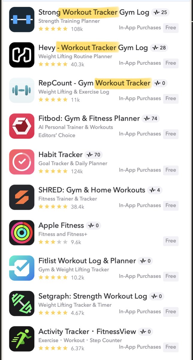
Last time, I identified "workout tracker" as a strong keyword in my niche, so I examined it more closely. Unfortunately, there's no real opportunity here; everyone in this niche is already targeting it.
So, I decided to use “workout tracker” in the app name, and “weightlifting” in the subtitle. I still had space in both, so I added differentiator keywords.
Since my app's unique feature is form analysis, I included “form” in the app name. And because this enables safe training, I added “safe” in the subtitle. I filled the remaining space with other frequent keywords.
@hthieblot@fdotinc I’m building a workout tracker app with built-in form analysis for safer, more effective training. Reached 131 paying users from 10,000 downloads. https://t.co/Tk1JL8RM6n
@issavaaage I believe that’s an excellent method for collecting feedback. While not everyone will respond, some will if you politely request their time and attention.
Recently, I received a message from a product I had canceled and provided feedback.
I still have space in the app name, subtitle, and metadata. The next step is to identify the core keywords that frequently appear in combination within long-tail searches.
ASO series 3/N
Last time, I identified "workout tracker" as a strong keyword in my niche, so I examined it more closely. Unfortunately, there's no real opportunity here; everyone in this niche is already targeting it.
ASO series 2/N
After identifying my weakness, i.e. the tap-through rate (TTR), I decided to improve the app name and subtitle. I suspect the icon has a big influence on TTR as well, but since creating and optimizing it takes more time, I left it for now.
Because only the top three apps are explicitly targeting this keyword. Since the app name carries the most weight in ASO, including the keyword there gives you a higher chance of outranking apps that are otherwise stronger.
This image comes from a Reddit post I've been following. It may be a bit outdated, especially after the recent major algorithm update, but I think many of the core principles still apply.
https://t.co/DJuoMbEuvd
For my niche, the keyword "workout tracker" stands out as the best fit among the popular options. It has a volume score of 48, and most of my competitors already rank highly for it.
ASO series 2/N
After identifying my weakness, i.e. the tap-through rate (TTR), I decided to improve the app name and subtitle. I suspect the icon has a big influence on TTR as well, but since creating and optimizing it takes more time, I left it for now.
Do you approach ASO tactically? I started recently, but I realized I'd been doing it all wrong after coming across a Reddit post that explained the process really well.
I'll share what I learned and put into practice in this series of posts. First, here are the analytics from the past three months.
This shows why it's critical to choose keywords that combine popularity with both relevance and intent. Otherwise, your TTR will drop and the app store algorithm won't consider your app a strong recommendation.