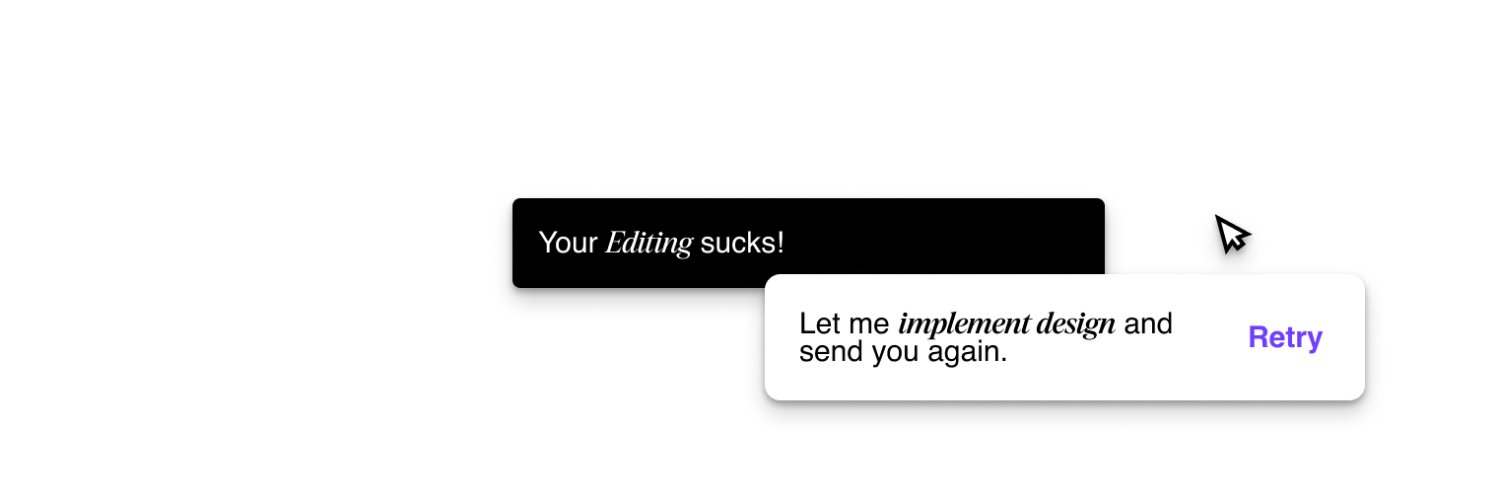
When you're recreating a design reference, the goal shouldn't be to simply copy what you see.
You need to understand why each element exists.
Full Video Link: https://t.co/aCH1nQE4eu
Most video editors make the same mistake with typography: they animate every single word.
But typography isn't supposed to be everywhere.
Full Video Link: https://t.co/aCH1nQE4eu
If you’re using Adobe After Effects just for basic keyframes, you’re wasting time.
I tested 4 built-in text animation presets inside After Effects — and one of them is honestly INSANE for fast, professional results.
Here’s what I tried:
If you’re a video editor who wants faster workflow without compromising quality, start exploring the presets panel more deeply.
Sometimes the most underrated tools are already inside the software.
What’s one underrated feature in After Effects you swear by? 👇
• Fade Up and Flip – Clean entrance with a slight dynamic twist
• Fade Up Characters – Animates letter by letter (great for dramatic emphasis)
• Fade Up Lines – Perfect for structured storytelling
• Fade Up Words – My personal favorite (super clean, modern, and highly usable)
The best part?
They’re drag-and-drop presets. No complex graphs. No overthinking.
As editors, we often ignore simple tools because they feel “basic.”
But simple + intentional = professional.