Just finished judging Website Of The Month @cssdesignawards https://t.co/ahI2XYhQYA #cssdaWOTM#webdesign#webdev My top:
Oryzo AI by @lusionltd 👏
Champion For Good Club by Double Play
Detroit Paris by Thomas Carré
Congrats to all! 🏆
Presenting the nominees of the Website of the Month for January!
https://t.co/lhyBqGc9rM
View the best WOTD winning sites of January and stay tuned for the decision of the Judging Panel.
#webdesign#webdev#webawards#cssdaWOTM#CSSDesignAwards
A button from my tiny library.
Made in @webflow with custom CSS.
I'm using here no position absolute.
You can see on hover that two backgrounds moving in and fill the button.
Those backgrounds using at the parent display: grid and with grid-area 1 / 1 we can grid pile it. It's like position absolute, only that we are not losing our responsive settings and more.
When you look closely there is a stagger on those backgrounds, this works pretty easy in CSS when we give those items a CSS Variable with --index: 0 and --index: 1.
Then we can use this variable in the delay to creating a stagger effect:
transition-delay: calc(var(--index) * .042s);
On the text which moves in I'm using these three propertys:
translate: 0 2em 0;
rotate: 1 1 .5 -30deg;
transform-origin: top right;
With separating translate and rotate we can use different transitions on it. With transform we could only use one.
--elastic-ease-out: linear(
0,
0.5737 7.6%,
0.8382 11.87%,
0.9463 14.19%,
1.0292 16.54%,
1.0886 18.97%,
1.1258 21.53%,
1.137 22.97%,
1.1424 24.48%,
1.1423 26.1%,
1.1366 27.86%,
1.1165 31.01%,
1.0507 38.62%,
1.0219 42.57%,
0.9995 46.99%,
0.9872 51.63%,
0.9842 58.77%,
1.0011 81.26%,
1
);
--smooth-ease: cubic-bezier(.32, .72, 0, 1);
transition: translate .75s var(--elastic-ease-out), rotate .5s var(--smooth-ease);
This makes the rotating feel smooth, while the moving in has a little bounce at the end.
Only the timing needs to be right with the backgrounds moving in. For this the animation tab inside the DEV Tools helps a lot.
Check it out live with many other buttons! Link in the comments.
Just finished judging Website Of The Month @cssdesignawards https://t.co/sCnZsxoA4P #cssdaWOTM#webdesign#webdev My top
The First The Last by The First The Last Agency
Seriti by Refresh Studio
Composites archi by Sparkk
Congrats to all! Amazing works! 🤯🏆
@ErmisAwards@amarchitects_@TheHowdyFamily The Botrini's Restaurant website also made its mark, securing a fantastic bronze award in the Branding & Design/Digital Design category, thanks to the talented team at G Design Studio.
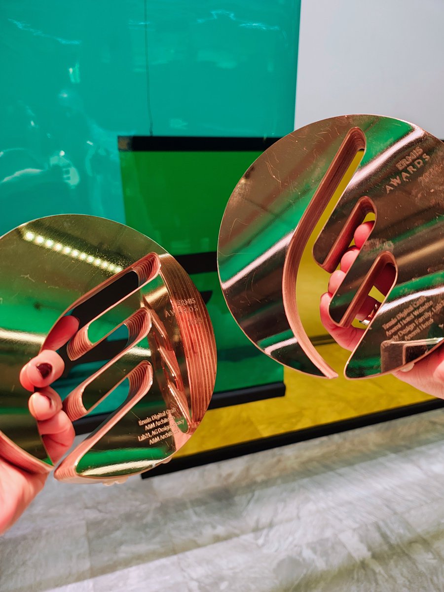
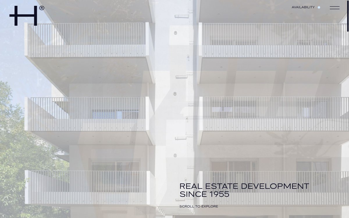
Yay! 3 of our projects got awarded at the @ErmisAwards 2024! The @amarchitects_ website snatched a gold award [design: AG Design Agency]. The Anemi Hotel website earned a bronze award [design: @TheHowdyFamily] and the Botrini's website got a bronze [design: Gdesign studio]


![lab21gr's tweet photo. Yay! 3 of our projects got awarded at the @ErmisAwards 2024! The @amarchitects_ website snatched a gold award [design: AG Design Agency]. The Anemi Hotel website earned a bronze award [design: @TheHowdyFamily] and the Botrini's website got a bronze [design: Gdesign studio] https://t.co/rGnCSr6Zbn](https://pbs.twimg.com/media/GkI5vy_WUAEjfme.jpg)
![lab21gr's tweet photo. Yay! 3 of our projects got awarded at the @ErmisAwards 2024! The @amarchitects_ website snatched a gold award [design: AG Design Agency]. The Anemi Hotel website earned a bronze award [design: @TheHowdyFamily] and the Botrini's website got a bronze [design: Gdesign studio] https://t.co/rGnCSr6Zbn](https://pbs.twimg.com/media/GkI5vy-XAAA9p4b.jpg)








![lab21gr's tweet photo. Yay! 3 of our projects got awarded at the @ErmisAwards 2024! The @amarchitects_ website snatched a gold award [design: AG Design Agency]. The Anemi Hotel website earned a bronze award [design: @TheHowdyFamily] and the Botrini's website got a bronze [design: Gdesign studio] https://t.co/rGnCSr6Zbn](https://pbs.twimg.com/media/GkI50DbXUAAOAPD.jpg)