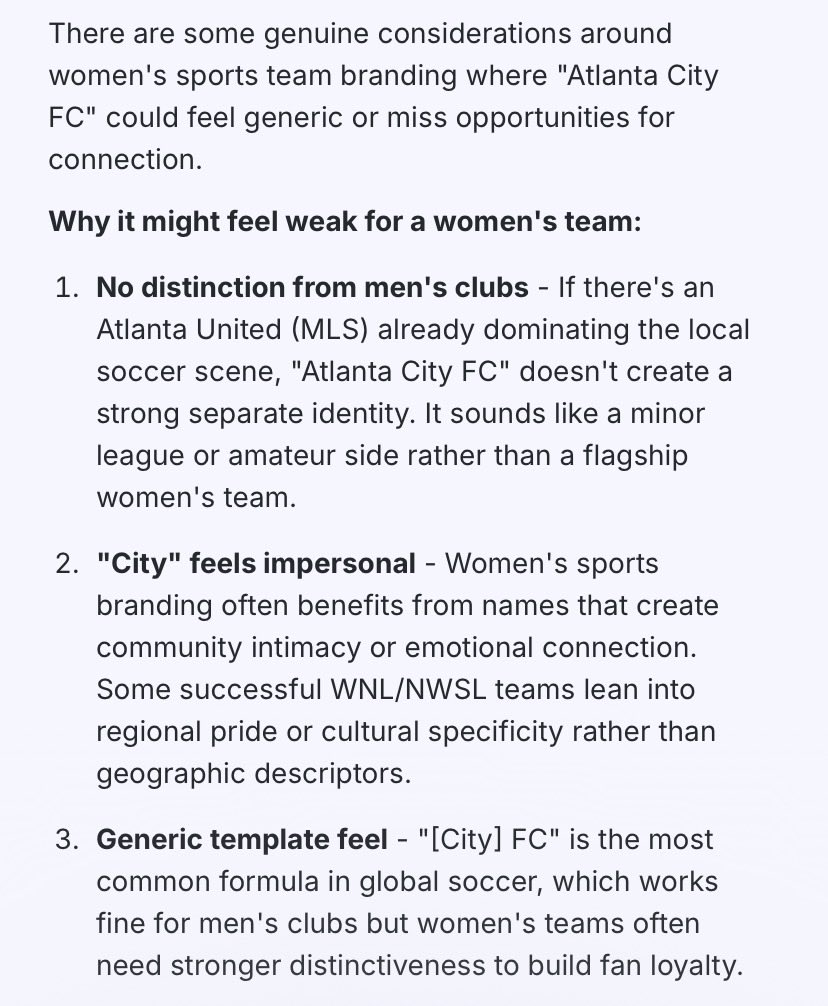
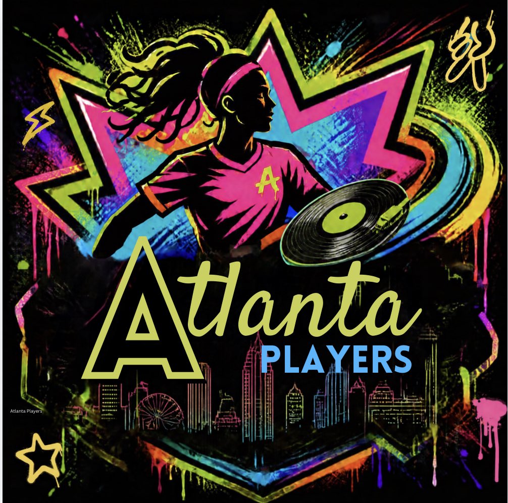
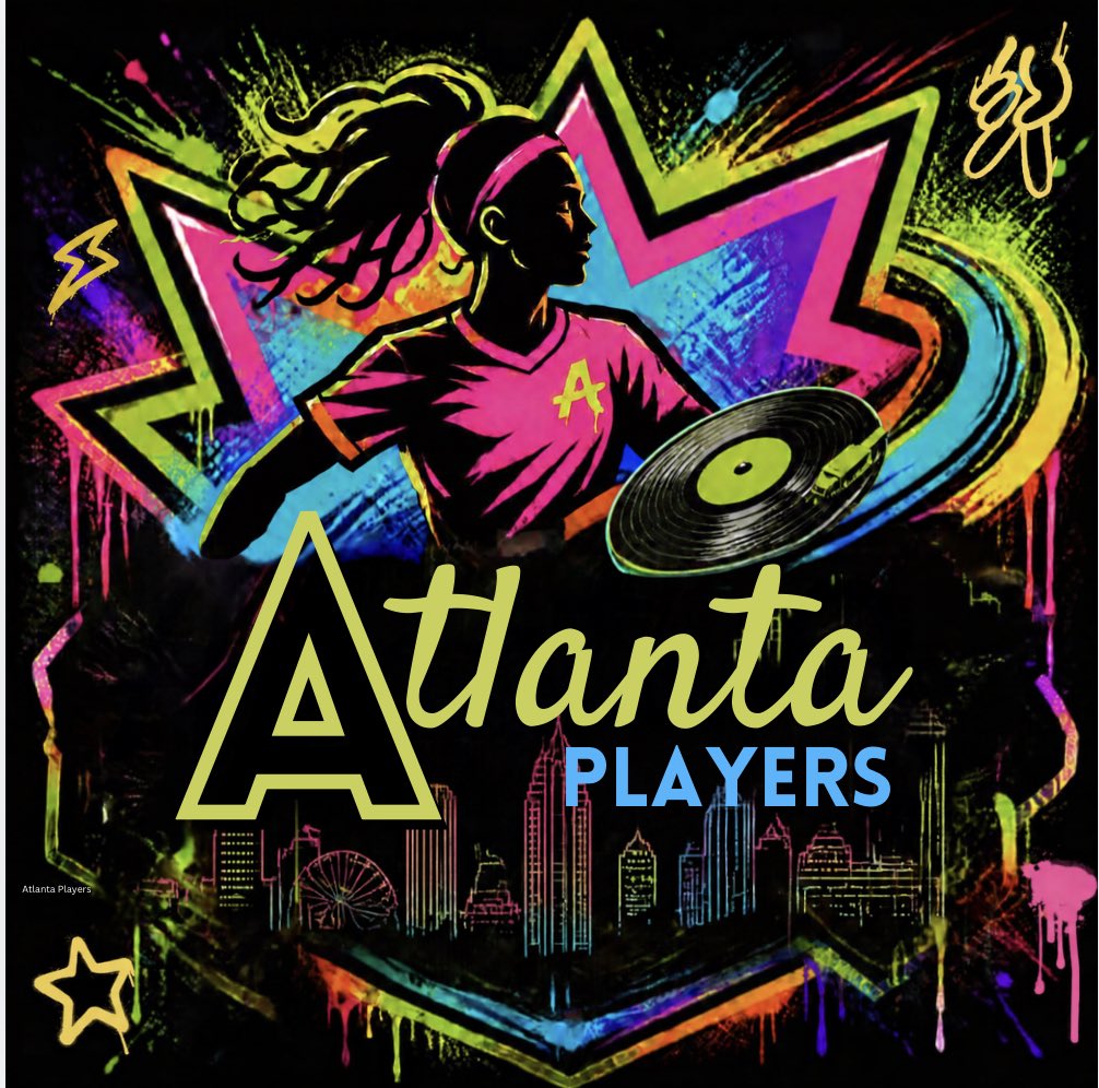
@sophsmaple62@SBJ It is a terrible logo and name. It’s almost like it was lazily put into AI to come up with a logo and name, & then never refined. It looks like a basketball or hockey team name. It could have been more fun or creative. Something like Atlanta Players - cuz girls is players too 🎶
@JeffKassouf Really disappointed. They could have had so much more fun and gotten so much more creative - my thought was Atlanta Players 🎶Cuz girls is players too 🎶 and 🎶 Welcome to Atlanta where the players play 🎶 something like this but much more refined touching on street art & hiphop
@JeffKassouf Boring and disappointing. It looks like they used ai to create it and didn’t refine it at all. It reminds me of a basketball or hockey logo.
@NWSLAtlanta2028 Really disappointed. This could have been much more fun and much more creative. City? This logo honestly looks like a basketball or hockey team. I’m a lifelong soccer player and ATLUTD fan since 2017. This could be so much better
@WGolazo@jocoolwu@NWSLAtlanta2028@NWSL As we have all seen on Ted Lasso, we need creative inspiration that matches the true vibes of the city, and something fun, to get people to come out to games. Look at how many have come to ATLUTD lately. We’re not getting fans out with something this corporate and boring.
@WGolazo@jocoolwu@NWSLAtlanta2028@NWSL Boring! Super disappointed. What about something like this but way more refined? 🎶Welcome to Atlanta where the players play🎶 cuz girls is players too 🎶