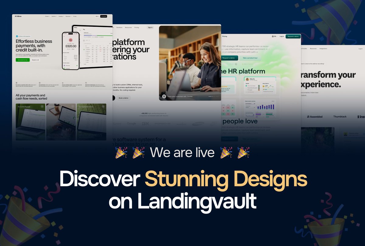
We’re live! 🎉🎉
Introducing Landing Vault – the ultimate hub for premium design inspiration.
Get ideas for your next big project with our handpicked collection of websites and landing pages.
Explore now: https://t.co/7yEIgDcfd7
#DesignInspiration#LandingVault#UIUX
I really don’t have VC funding
I don’t have any money , but I have knowledge and the knowledge is enough for me to get my app to where you want to get it to
Don’t let anybody lie to you that you can get to $10k in 30 days if you have not put in the work , especially if you are self funded
You see people like @alexcooldev making $10k in one month , only if you know the insane amount of work done in the background
It’s really a hard game
1. You have to scroll in niches
2. You have to make sure your account is warmed up in a particular hashtag
3. You have to create content from scratch
If only you know the amount of work that this things mean
Design tip for creating buttons
Almost all designers get this wrong. If you want to avoid issues with your developer, this is the correct way to build a button.
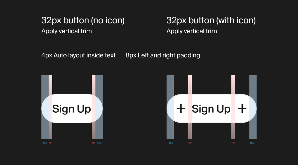
To ensure your buttons are perfectly consistent within your design system, you have to account for both versions: those with icons and those without. The goal is to make sure that when an icon is removed, the button still feels cohesive.
Here is my professional workflow:
1. For a Button Without an Icon:
--- Text Setup: Create your text layer with a 12px font size and 16px line height.
--- The Inner Layer: Apply Vertical Trim and add the text to an Auto Layout frame. Set the left and right padding to 4px.
--- The Outer Layer: Wrap that frame in another Auto Layout and add 8px of left and right padding.
2. For a Button With an Icon:
--- Integration: Simply drop your icon into the outer Auto Layout frame. It will sit perfectly next to your inner text frame.
--- Spacing Secret: Do not add "space between" in the Auto Layout settings.
The 4px inner padding of the text frame already accounts for the gap.
--- Visual Balance: Most icons already have 2–4px of internal white space. When combined with your 8px outer padding, the entire button remains perfectly balanced.
Check out the example below! This is how you build buttons like a pro.
Happy Friday, everyone!
Here's what we worked on this week with clients
It's been an incredible push across the board, a lot of moving pieces, but we love it.
First: Hero illustration for a timer app we're launching.
The client acquired the app and needed help leveling up their visuals. Our job was to create an illustration for the hero section that doesn't just look great , it converts. Every visual decision had to align with the scope of work while actually moving users to take action.
Second: Onboarding flow for an HR app.
The goal here was simple: make it feel simple. We'll go deeper on this next week, but the core focus was balancing Design Experience with Data Collection Experience, so the onboarding feels clean and intuitive rather than heavy and overwhelming. Also, shoutout to the grid system we used.
We worked with two types: a full 12-column grid and a sub 8-column grid. This one runs on the 8-grid.
Third: App Store screenshots for the timer app.
Beyond the UI work, the client also needed help with their App Store presence. Here, we focused on ASO conversion, and how to use screenshots and keywords to capture the right users. This is where a strong understanding of SEO really matters. You need to know the user search intent to get this right. More on this next week.
Fourth: Credit-based pricing system for Applygigs.
This one is a studio product of ours. We're transitioning from a pay-as-you-go plan to a credit-based pricing model, currently in development and shipping this week. The design work focused on how users move between the free tier and paid options, and how to make that journey feel natural. There are some interesting states for the pricing display cards, too. We'll share those soon.
Quick tip for designers:
Add social proof to your pricing pages. For ours, we leaned into the number of job seekers already on the platform and the app's star rating. These visual cues do a lot of the decision-making heavy lifting for users.
If you're looking for a small studio that truly understands Design, SEO, and Development or you're a founder just getting started and need a team that gets it
We'd love to chat. More to come next week. Happy Friday! 🎉
Remove Em dashes from Ai text
Hey guys, over the weekend, we built a simple sub tool to remove Em dashes from your Ai text
I have faced this problem several,
I even saw a founder send an email to thousands of
users with AI text
So i created a sub tool called Emdashes
Try it out
https://t.co/cNxcUaG9eu
#buildinpublic
AI will not take my job. Here's why
I see so much buzz going on the tech scene and lots of really cool graphic renders being generated by GPT 4.4 image models. The images are insanely good, really good, from image renders to graphic design and to mockups. AI is really changing the game.
But does it mean it takes away the creative game? No. I have said several times that AI will become enablers of technology and not replace them. The fact that AI can generate images and product shoots doesn't mean i won't get clients in that line. I feel it just brings a new wave of creative graphic designers out there.
I know some clients will be like, fuck it, i could spend $20/mo on chatgpt pro and still get the value you are giving me.
Trust me, not all clients will have to go and start prompting and prompting when they have other business dealings they need to work on. They will not do it. Why do you think there is a demand out there and people still keep on hiring graphic designers?
As creative, i think it's time to really be a generalist. Always keep on learning and learning and trying out new things.
E.g.: You are a graphic designer, learn motion design, learn how to make renders, learn how to use chatgpt to prompt better, learn video editing. The world keeps on advancing, you too need to advance yourself also,
Ask yourself: Am i upskilled enough
Ask yourself: How can i improve myself and get better 1% every day
Ask yourself: How can i deliver more value to clients
Ask Yourself: Am i willing to learn to get better
These are the core questions i really wish creative need to ask themselves and not be bothered about the fact that Ai is taking their jobs
Ai is not taking your jobs; it's just enabling you to work better and faster
#buildinpublic
Sales deck template
i worked on a sales deck template
last year for brands.
Sold quite a few licences
If you are looking for a sales deck for your brand
Feel free to check out Calde Inc. in the comments
Avvailable in figma, canva and Slides
Check comments for download links
#buildinpublic
Working on a health and wellness brand
Other treatments section
I really love the cards that we used on this
Releasing. Temop soon
We have 35+ of these different sections that will be implemented in Webflow and framer
#buildinpublic