Exploring the magic of @figma annotations and measurements.
It's incredible how we can tidy up our canvas and enhance collaboration with implementation notes! ✨
Color palette generator powered by AI
ColorMagic is an online tool that generates color palettes from text prompts. 🖋️ by @TomohiroNozaki
https://t.co/3y5VvbOAUS
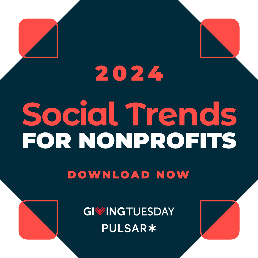
Social media can feel like a chaotic pursuit, especially for nonprofits 😵💫
Our 2024 Social Trends Report, created in collaboration with @GivingTuesday and @Pulsar, is here to help you focus your time and resources.
Download the full report -> https://t.co/GNH3EWWRsu
@nicks_twt It depends on size, function, context, and your aesthetic goals, but I lean more towards filled bc I find them more visible at smaller sizes.
Law of prägnanz may come into play as outlined icons can contain more details making them more visually complex. https://t.co/HkAPmdnJ0f
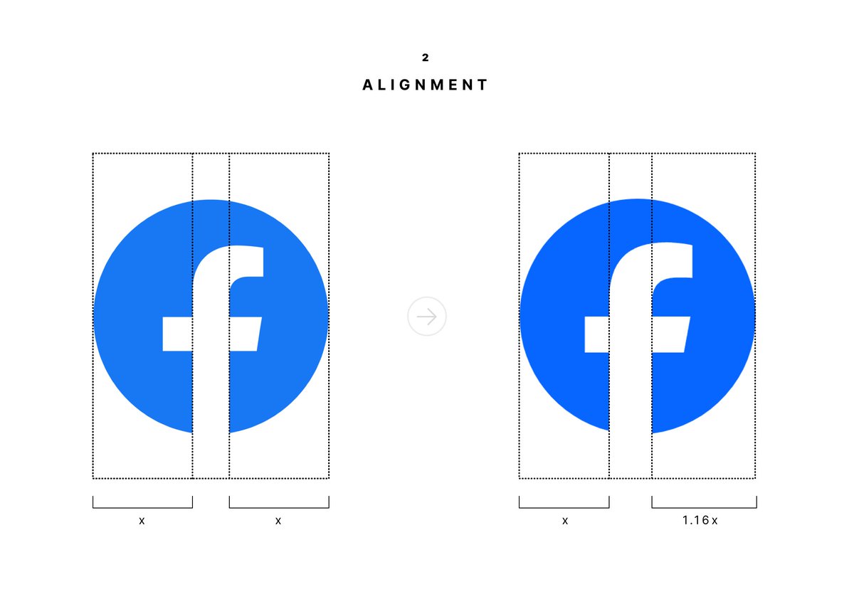
2. The alignment of the F within the circle changed in a way that considers the weight of the entire letter rather than the main vertical line. This makes the logo feel more balanced since the F now looks more in the middle.
Design impacts the way we perceive and value products.
In terms of technical specs, these are two almost identical cars.
But one of them feels more premium than the other.
Hi Designers 👋, Checkout this credit card U.I size guide cheatsheet for beginners, it's exceptional, explore it if you can, it might be useful to you on your new project............#Designgod#uidesign#uiuxdesign#UIUXDesigner#uiuxdesigners
Super happy to announce that I have officially joined the most awesome @Adobe team as an Evangelist for next gen creative pros!
Basically, I get to create more, teach more, and hang out with you all more.
You’ll be seeing a lot more of me… I hope that’s ok 😝
For my graphic designers,
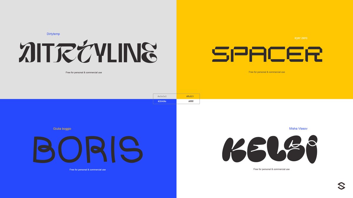
Wanted to share some of my recent font pickups of unique display fonts for those special projects.
All free for commercial use.
https://t.co/O5evABd0qU
The design system series on my YouTube channel is some of my favourite content I've ever made.
Why? Because I WISH I could see similar videos from others in the industry!
It's not theoretical, I'm sharing the REAL process of creating a marketing design system at ConvertKit.
One of two new climbing centre websites I'm working on at the moment. Initial designs have just gone off to the client.
UI inspired by the clients existing logo. Nice retro feel about this project!
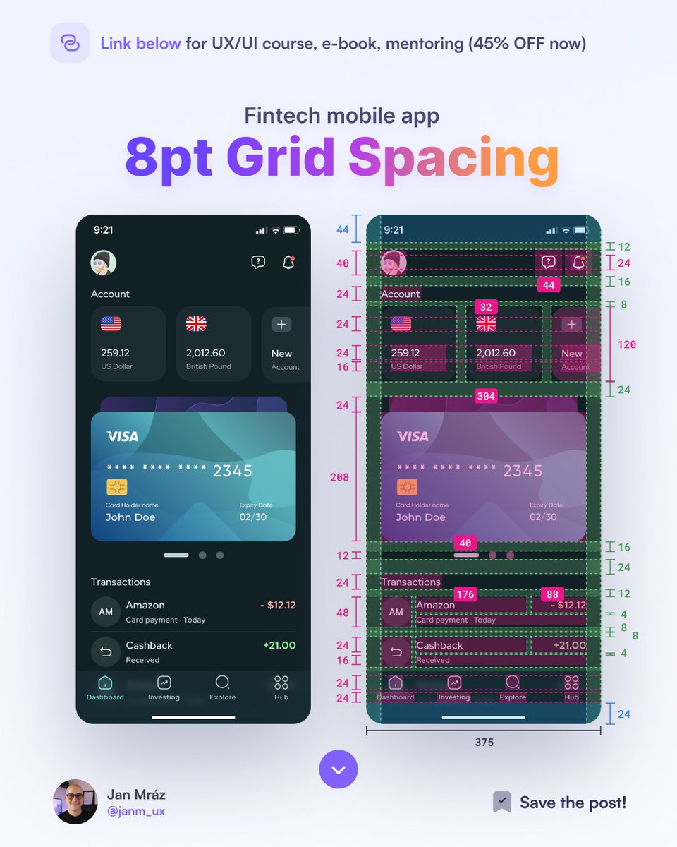
Setting proper spacing values is an essential UI design skill to create smooth and clean interfaces with enough white space. Learn more about the 8pt grid system! 🚀