At Lazoh Design, we believe every brand has its own story, personality, and unique needs. ✨
Because great design it’s about finding the right way to make every brand stand out and speak for itself. 🤯
Clients:
▫️Pepitos Grill
▫️Jaya
▫️La Marasela
▫️D'Leña
▫️Sihiy
If your website relies on vague claims, hidden information, inconsistent profiles, or unsupported expertise, your brand becomes harder to retrieve and cite.
Learn more at link https://t.co/zxLtU0pVzi
#AISearch#BrandDiscoverability#GEO#ContentStrategy#Lazoh
Instagram’s identity has evolved far beyond just its icon. 📸✨
From the original detailed camera and its groovy, retro-inspired cursive lettering to today’s cleaner, more modern visual language, the brand has grown with the way we experience the digital world. 💥
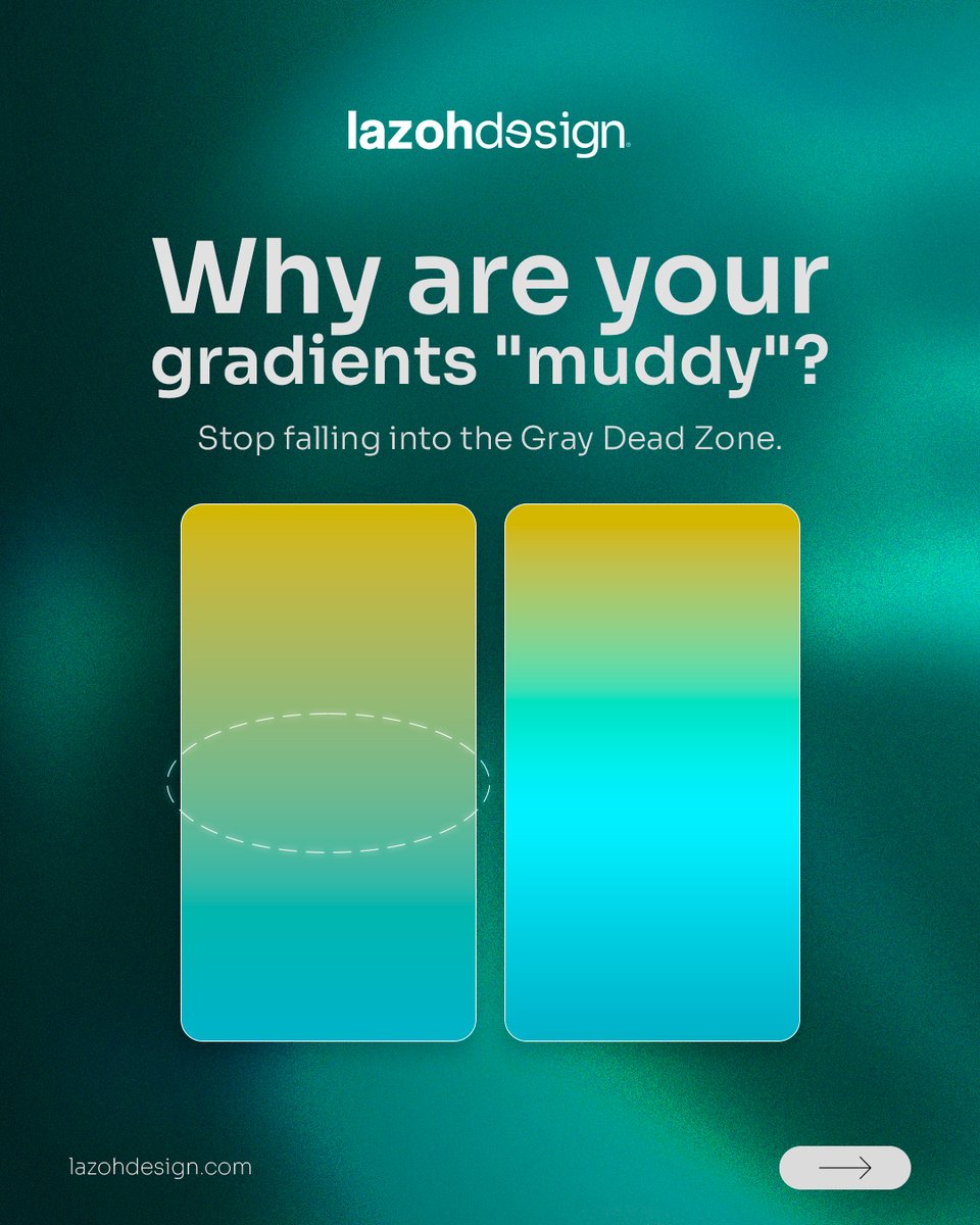
Why do some gradients feel flat or “muddy”? 🎨
The problem is often the midpoint. When opposite colors blend through gray, saturation gets lost. Adding a vibrant bridge color keeps the transition smooth, intentional, and alive. ✨
If your team repeatedly recreates layouts, debates subjective feedback, or struggles to maintain consistency across channels, the problem may not be a lack of creativity.
Read more at https://t.co/FIk2aa6KdT
#DesignSystem#BrandConsistency
We combined AI, graphic design, and photoshoot content to create different visual pieces while staying consistent with the brand’s identity, style, and personality. 🎨📸🤖
Different formats, one cohesive visual language.
Client: D-Vino - Valle Redondo
Country: Mexico 🇲🇽
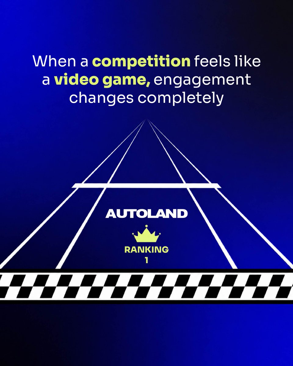
We didn’t just design a leaderboard for Autoland — we turned recognition into an experience. 🎮🏆
Inspired by retro video games, we transformed performance data into a visual world built to make competition feel more engaging, memorable and fun. ✨
✨ Mishko Effect creates eye-catching compositions.
🪟 Glass Distortion makes elements feel dynamic and interactive.
💨 Motion Blur creates a sense of movement, speed, and energy, guiding the viewer's eye and making static designs feel alive.
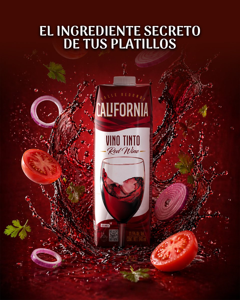
🍇 For California, we designed a transit station advertisement that captures attention through bold visuals, clean composition, and a message that reinforces the brand's identity.
Creating experiences that move with people. 🍷
Client: Vino California
Country: Mexico 🇲🇽
Your text isn't too long—it might just be too crowded. ❌
📏 Increasing the spacing between letters improves readability, creates visual balance, and gives your typography a more refined, premium feel.
Small adjustment. Big difference. 💥
Because the secret is in the spacing.
Behind every great campaign is intentional design. 💥
👀 For Botran MX, we created a collection of visual assets designed to capture attention while staying true to the brand's identity.
Design that elevates every message. 💯
Client: Valle Redondo - Botran
Country: Mexico 🇲🇽
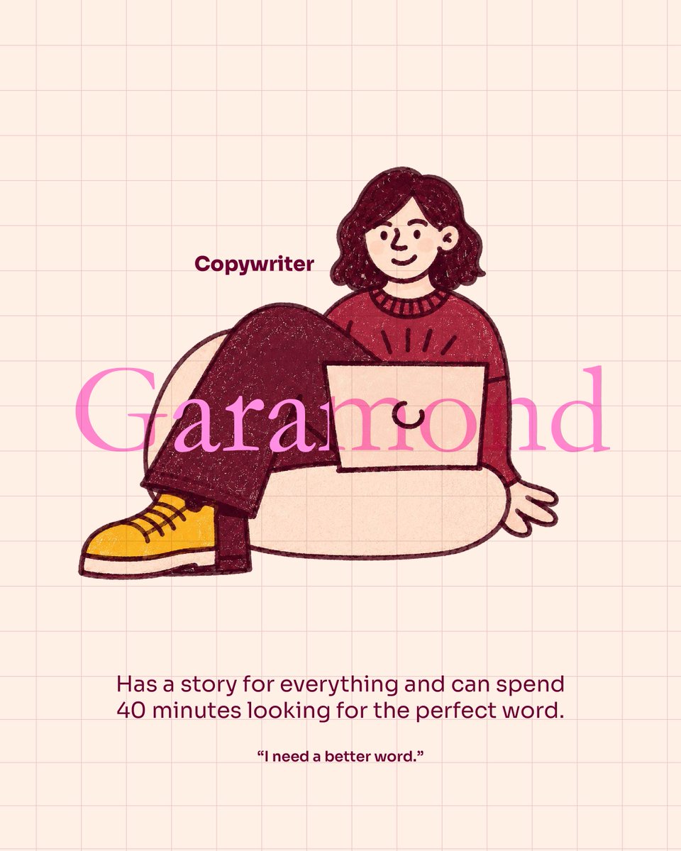
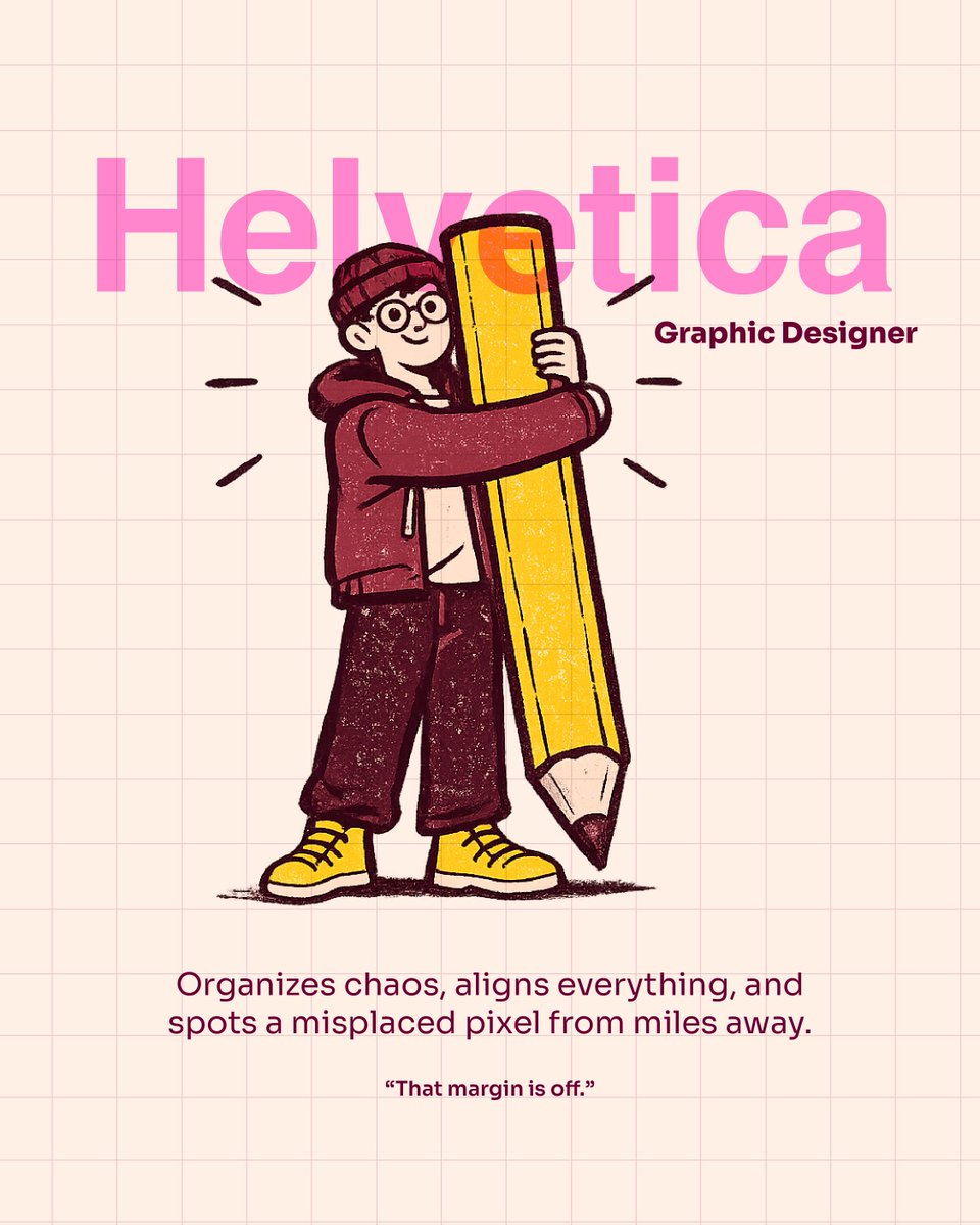
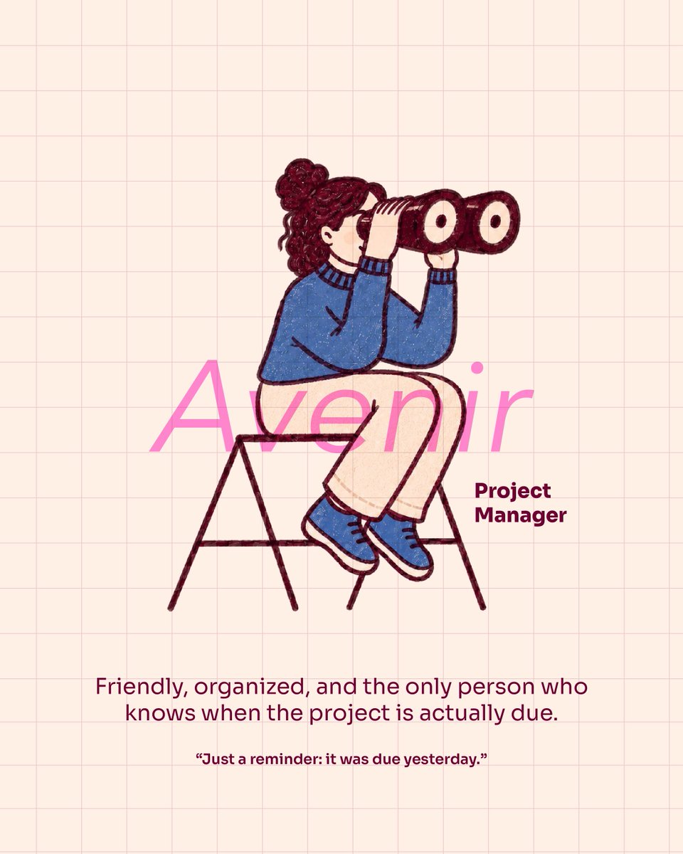
Every creative role has its own typeface energy ✍️🎨 From the dramatic Creative Director to the detail-obsessed Designer, the word-hunting Copywriter, and the always-on-time Project Manager.
Which typeface are you? 👀 Tag your company’s Comic Sans 😂
#FridayInspo ✨
Can you see sound? 🔊👀
In design, sound doesn’t always need to be heard — it can be felt visually
Movement can show rhythm.
Shape can express tone.
Timing can create energy, tension, or flow.
CR: marko_koma_ - Audio: Original from Marko Koma
From social media to printed materials, we’ve created a wide range of design pieces for Autoland—each one tailored to showcase its diverse product lines and the unique identity of renowned brands such as Mazda, Mercedes-Benz, Citroën, Kia, and more.
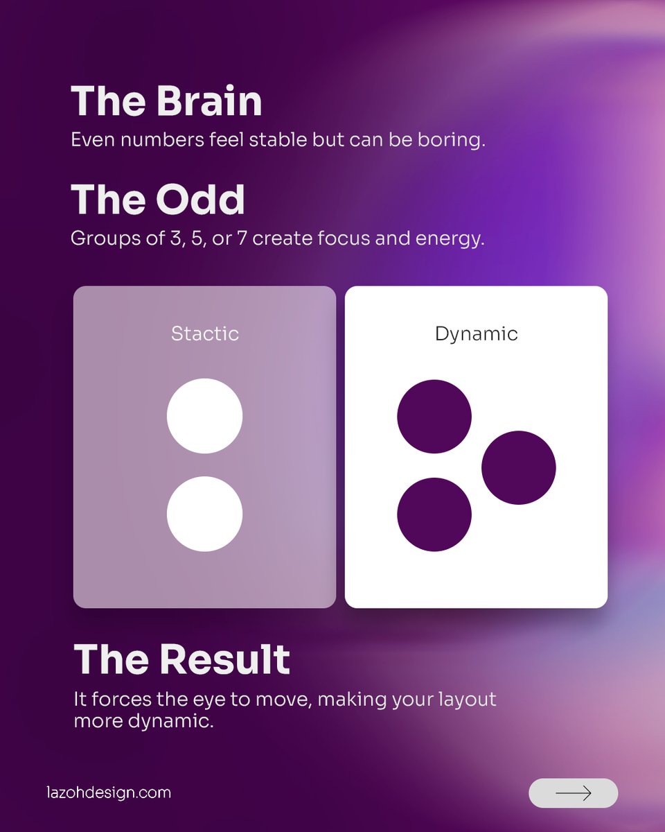
Odd numbers (3, 5, or 7) create instant focus and energy.
The Result: It breaks the symmetry, forcing the eye to move and making your layout dynamic!
Pro Tip: Next time you arrange icons, photos, or buttons, use an odd number to make your design feel alive! 🙌
📖 We ensure every single piece of content, color palette, and message fully aligns with their identity, resulting in awesome design pieces that captivate their audience. 🎨🚗
Ready to elevate your brand’s visual identity? Let’s create something amazing together!
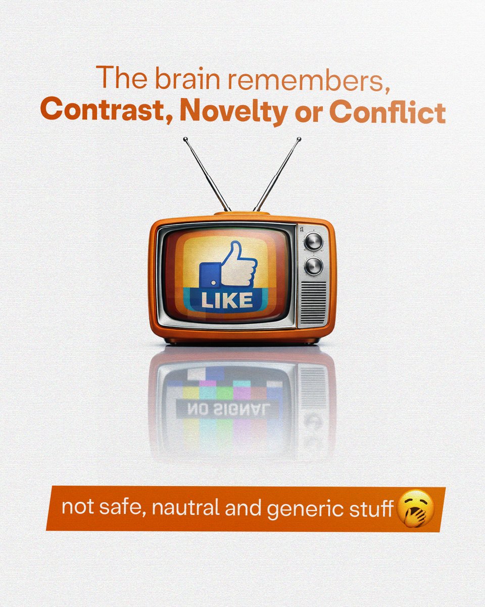
The brain remembers contrast, novelty, or conflict. 🧠
👉🏻 Not safe, neutral, generic design.
Add one intentional tension: unexpected scale, sharp asymmetry, or a strong opinion. ✅
If everyone likes it, no one remembers it. That’s your hook. 🤯
A website that looks good but doesn’t convert is not a growth asset. It’s a digital brochure.
Clarity converts. Friction kills conversions.
Read more: https://t.co/wCCf3aqpU1