In yesterday's @washingtonpost we published a portion of the known names of 18,500+ Gazan children killed in the war. We could only fit 18% of the names on these 2 pages — it would have taken 5 more pages to list them all.
If the avg. American was in Gaza, this is what it'd mean for their family and friends.
"After five months of war, seven would be dead."
Powerful framing and statistics from @alyssafowers, @lmshap, @catebrown12, Hajar Harb. https://t.co/MgFDtFibIy
one of the most fun projects i've ever worked on :-)
i built an interactive beat maker, using the extremely cool and underrated ✨Web Audio API✨, to help you *hear* the story of how reggaeton beats evolved (& make your own beats!).
https://t.co/XBotX5FNMA
@daddy_yankee@LuisFonsi@wisin Make your own reggaeton beat using our virtual drum machine — part of an audible tour through the genre’s evolution, from Jamaican dancehall to dembow: https://t.co/lQKNYykZVv
Workers @washingtonpost have been in contract negotiations with our bosses for 18 months.
But the company is refusing to pay us what we’re worth or bargain in good faith.
So on Dec. 7, we’re walking off the job for 24 hours.
got to spend a week answering a question i've long had. the answer, as you might expect, is much deeper than i imagined: https://t.co/SH8igOtDKh
(also i got to draw lots and lots of leaves!! 🍃🍂)
Some tech notes for the nerds: I built the viz here in plain old canvas/javascript (in React), with a RAF loop for animations: https://t.co/Fqf6CnlyHS
I tried *a lot* of implementations (SVG, P5, animation libs). This was by far the most performant and easiest to manage!
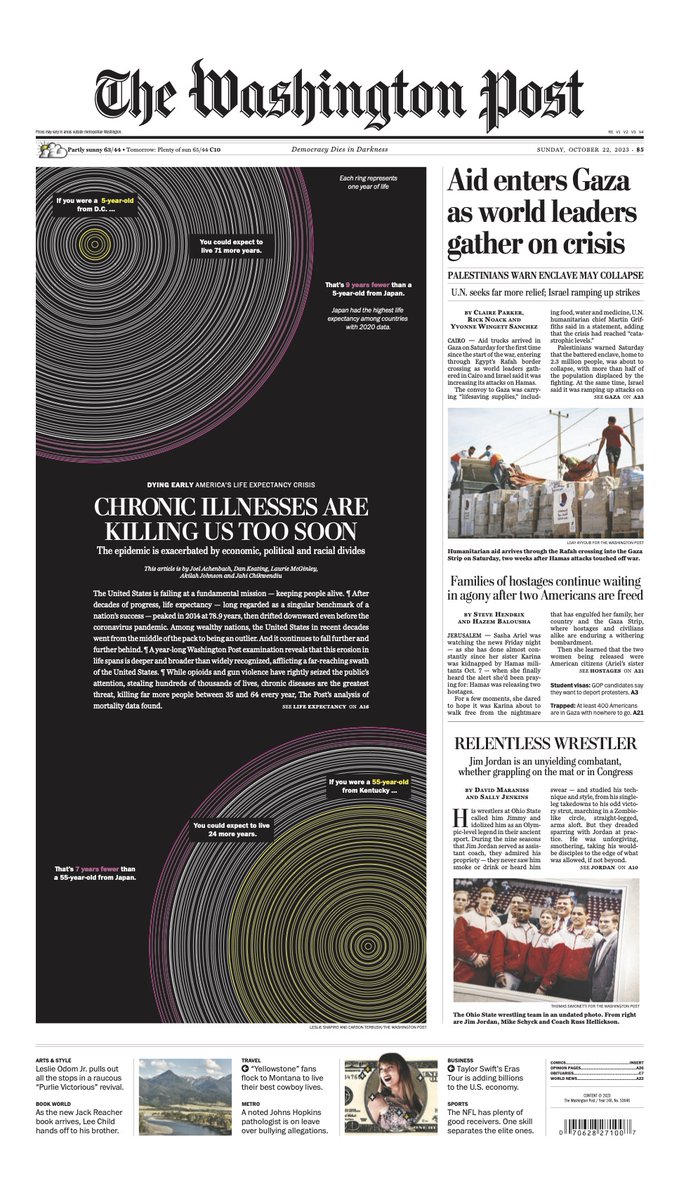
When generative art makes the A1 :)
Sunday's front page was our story on the U.S. life expectancy gap, feat. a print version of the generative rings I built for online.
You can see your own personalized version of this viz in our online story: https://t.co/Fqf6CnlyHS
When generative art makes the A1 :)
Sunday's front page was our story on the U.S. life expectancy gap, feat. a print version of the generative rings I built for online.
You can see your own personalized version of this viz in our online story: https://t.co/Fqf6CnlyHS
The World population has just reached 8 billion people.
@sadbumblebee@lmshap@RubyMellen and Hailey Haymond worked on this big visual story that includes a calculator to check how many people like you are int he planet
(I'm one in 367,900)
https://t.co/caQZAfFV6Y
“Cut Short” by @alyssafowers + @lmshap of the Washington Post reads like a story, introducing a fraction of the 1 million individuals who died of COVID. @ClaireESantoro's interview explores this powerful work and the choice to visualize #qualitative data https://t.co/wBe4JBuHux
🚗⛽️ Planning to hit the road on Memorial Day weekend? We built a gas calculator that tells you how much you’ll pay at the pump (spoiler alert: it’s a lot more than in pre-covid times!). https://t.co/sNtkTmE5nj w/ @lmshap@n_kirkpatrick @dataKateR
Every victim of covid-19 had their own joys and hopes for the future. @lmshap and I marked one million deaths from covid-19 by writing about one person who died each week of the pandemic: what they loved doing and what they wanted to do next. https://t.co/Ww9oYME7g4
New version of a story we first did back in May, looking at the covid case rate when the vaxxed population is factored in.
One big diff: In May, low-vax states were actually looking better than some high-vax states.
With the delta surge, that's over.
https://t.co/3N5d8UQsBB