📊 BTC Seasonality: History Doesn’t Lie — Is July a Crypto Black Hole?
Take a look at the chart below. It’s more than just stats — it’s the rhythm of Bitcoin traced across 16 years of market history. Every all-time high (ATH) and every 52-week high, mapped month by month. On top of that, we’ve added BTC’s average monthly price in 2025 (black line).
🔍 The takeaway? Two months rise above the rest: February and the legendary November — when Bitcoin tends to shine brightest.
But there’s a darker side to this seasonality. And here’s where things get interesting:
⚠️ July? Zero ATHs. Zero. Across 16 years. ⚠️ September? Equally grim.July saw a yearly high only twice in history. 🧮 November? The undisputed king: 49 ATHs and 67 yearly highs. Median high? 32.5. Coincidence? Not likely.
📈 Now, let’s look ahead: The current average BTC price (black line) mirrors the seasonal trendline(green) almost perfectly. Which leads to a bold seasonal forecast: 👉 Correction ending in July 👉 Bounce in August 👉 Soft pullback in September 👉 And… potential cycle top in October/November
🧠 History doesn’t always repeat — but it loves to rhyme.
An excellent comparison. We can clearly see how easy it is for a country to fall off the path of sustained development — but the real question is what it takes to get back on that path. Poland’s remarkable success story is explained in detail in the following book: Europe’s Growth Champion: „Insights from the Economic Rise of Poland.”
Spadek zainteresowania crypto:
Na wykresie przedstawiono popularność frazy „crypto” w Google Trends w ciągu ostatnich pięciu lat, zestawioną z ceną ETH. Warto zauważyć, że większość spadków kończyła się w momentach, gdy poziom zainteresowania obniżał się poniżej wartości 25. Obecnie wskaźnik ten wynosi 23, patrz wykres poniżej:
W zasadzie nie widzę negacji w sensie dosłownym, ale są 2 scenariusze. 1 zrobimy to szybko, im szybciej, tym większa szansa na ATH na początku 2026. Jeżeli zrobimy to wolno, to odbijemy niżej, bo obie średnie schodzą w dół. W tym drugim wypadku 200D SMA może być tylko korektą wzrostową w dalszych spadkach.
@100trillionUSD BTC history shows, that death cross (50DSMA<200DSMA), that has recently triggered has been a buy signal, at least in the short term. Having that said, 101K+month close is very likely.
📉 S&P 500 Chart: A Reversal Ahead?
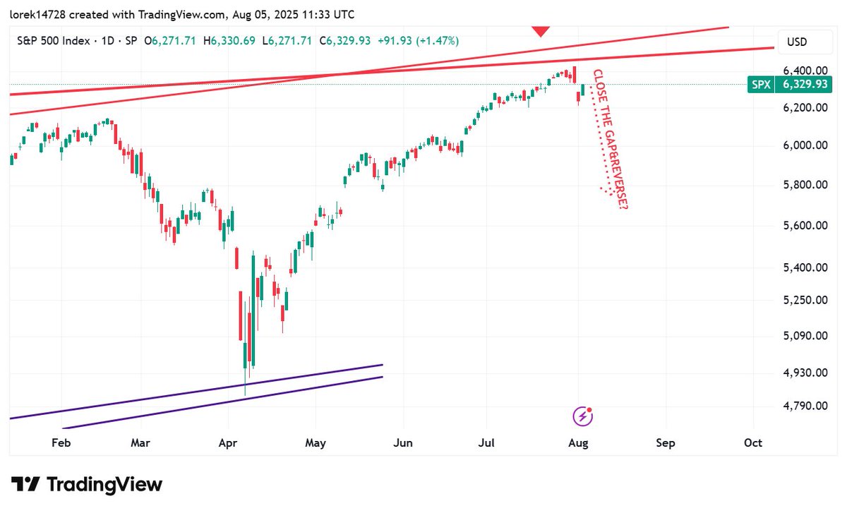
The weekly chart has just served up a classic alarm bell for the bulls — a powerful bearish engulfing candle. The red body of the candle completely devours the previous green one, signaling that the close was sharply lower than the open and confirming a surge in selling pressure.
🔍 Interestingly, this marks the fifth appearance of such a signal over the past three years. If you glance at the chart on the left, you’ll see that previous instances paved the way for notable corrections. And here’s a curious detail: most of these candles occurred in July — a perfect tie-in to my earlier post on S&P 500’s summer seasonality.
🧭 Right now, the spotlight is on the price gap visible on the daily chart (on the right). Should today’s price pivot downward from this zone, there’s strong reason to anticipate a correction on par with past declines — with a median drop of roughly 10%.
📉 Wykres S&P 500: Czas na zwrot akcji?
Na tygodniowym wykresie pojawiła sięwyraźna świeca bearish engulfing – klasyczny sygnał alarmowy dla byków. Czerwony korpus tej świecy całkowicie pochłonął wcześniejszy zielony, co oznacza, że zamknięcie wypadło zdecydowanie niżej niżotwarcie, a presja sprzedażowa rośnie.
🔍 Co ciekawe, to już piąty taki sygnał w ciągu ostatnich trzech lat! Warto spojrzeć na wykres po lewej – poprzednie świece tego typu zapowiadały poważniejsze korekty. I jeszcze smaczek: większość z nich wystąpiła w lipcu, co świetnie koresponduje z moim poprzednim wpisem o sezonowości letniej indeksu.
🧭 Teraz kluczowe jest zachowanie ceny wobec luki cenowej, widocznej na wykresie dziennym po prawej. Jeżeli dziś nastąpi zwrot i cena ruszy w dół – mamy pełne prawo oczekiwać kontynuacji korekty o skali poprzednich spadków, średnio 10%.
📊 Monthly Charts – July Signals from DXY and Copper
The end of July is a fitting moment to look at the monthly charts of selected assets. Among the broader market, two instruments stand out: the US Dollar Index (DXY) and copper.
DXY has formed a strong bullish engulfing monthly candle, which may indicate the beginning of a rally for the US currency. Significantly, this reversal occurred precisely at the ascending trendline, reinforcing the technical strength of the signal.
In contrast, copper presents the opposite scenario—a bearish engulfing candle preceded by a false breakout to the upside. This points to deteriorating sentiment and increased selling pressure on the commodity, often regarded as a barometer of economic health—aptly nicknamed “Dr. Copper.”
The comparison between the two charts paints a concerning picture:
📉 Risk assets—such as stocks and cryptocurrencies—may come under pressure
⚠️ Economic prospects also appear weaker, particularly if copper’s decline continues
📊 Wykresy miesięczne – lipcowe sygnały z DXY i miedzi
Zakończenie lipca to dobry moment, by spojrzeć na miesięczne wykresy wybranych aktywów. Na tle rynku szczególnie wyróżniają się dwa instrumenty: indeks dolara DXY oraz miedź.
Na DXY pojawiła się silna, bycza świeca miesięcznatypu bullish engulfing, co może zapowiadać początek wzrostów amerykańskiej waluty. Co istotne, zwrot nastąpił idealnie na linii wzrostowego trendu, co dodatkowo wzmacnia techniczny wydźwięk sygnału.
W przypadku miedzi obserwujemy sytuację odwrotną – świecę typu bearish engulfing, poprzedzoną fałszywym wybiciem górą. To wskazuje na pogorszenie nastrojów i presję podażową na surowiec często postrzegany jako barometr kondycji gospodarki – nie bez powodu nazywany Dr. Copper.
Porównanie obu wykresów daje niepokojący obraz:
📉 Ryzykowne aktywa – takie jak akcje i kryptowaluty – mogą znaleźć się pod presją
⚠️ Perspektywy gospodarcze również wyglądają słabiej, szczególnie jeśli spadki miedzi się utrzymają
🔄 BTC in Focus — Is the Trend Nearing Its Breaking Point?
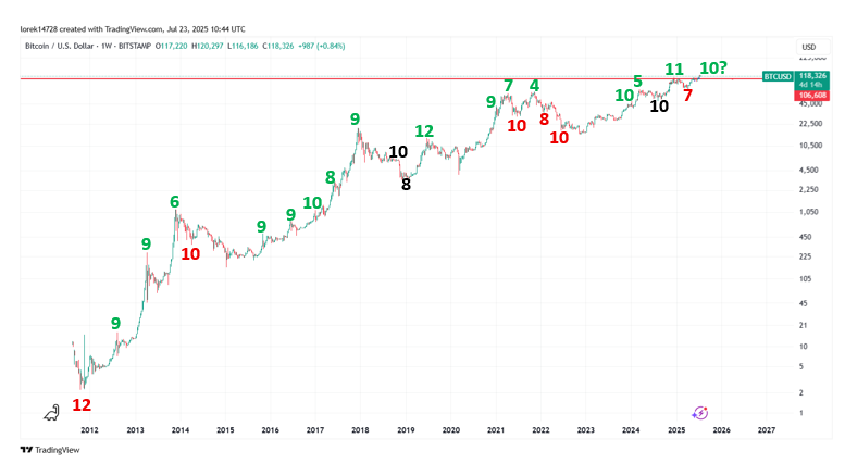
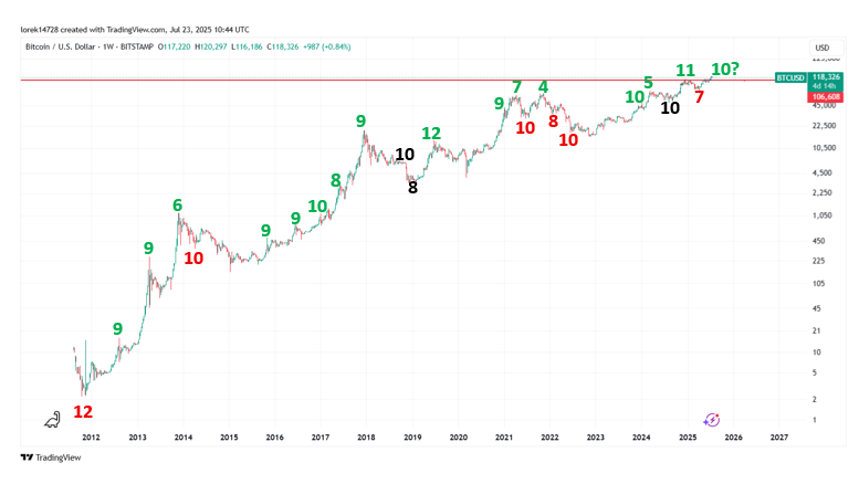
Look at the chart below: it highlights the duration of medium-term BTC trends since 2011. The takeaway? History plays hardball. Whether it’s surging rallies, painful selloffs, or sideways consolidations, no trend has lasted longer than 120 days. And that 120-day mark? It’s practically a unicorn in the crypto world — most trends have wrapped up after just 90–100 days.
🧭 On the chart, I’ve marked the key trend sequences — measured in 10-day periods. The current rally? It’s already broken past the 100-day threshold. That puts us in a fascinating position: is a trend shift on the horizon? Or are we at least due for a short-term cool-off?
🚨 Time to stay sharp. Markets love to flip the script just when confidence hits peak levels and everyone starts thinking, “This time it’s different.”
🔄 BTC pod lupą — czy trend właśnie zbliża się do granicy wytrzymałości?
Spójrz na poniższy wykres: pokazuje długości średnioterminowych trendów na BTC od 2011 roku. Co ciekawe, historia nie zna litości — niezależnie, czy mamy do czynienia ze wzrostami, spadkami czy mozolną konsolidacją, żaden trend nie zdołał przetrwać więcej niż 120 dni. I choć te 120 dni to niemal unicorn w świecie kryptowalut, większość trendów kończyła się po zaledwie 90–100 dniach.
🧭 Na wykresie oznaczyłem kluczowe sekwencje trendowe — liczone w dziesięciodniowych okresach. Obecny rajd? Już przekroczył magiczną barierę 100 dni. To stawia nas w niezwykle ciekawej pozycji: czy zbliżamy się do zmiany kierunku? A może chociaż do krótkoterminowego schłodzenia rynku?
🚨 Warto mieć rękę na pulsie. Rynek uwielbia zaskakiwać właśnie wtedy, gdy większość zaczyna wierzyć, że „tym razem będzie inaczej”.
💳 Credit Conditions in the U.S. – Banks Just Sent the Market a Warning
We all know banks make money by lending. If they can lend, they do. But sometimes, they flip the switch to maximum caution and tighten credit, that’s exactly what’s happening now. 🔍
Banks typically restrict credit for two key reasons:
The Fed is hiking rates sharply, making safe government bonds more attractive than lending.
Rates are falling or flat, yet banks still slam the brakes—because they’re worried about their clients’ ability to repay.
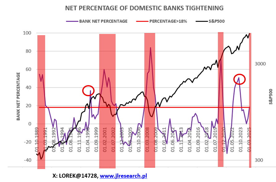
👉 It’s this second scenario we care about. Why? Because historically, it’s been a reliable recession signal. Look at the chart: There have been four past episodes where banks significantly tightened credit not due to rate hikes, but because of perceived risk—and each time, the S&P 500 fell into a bear market.
🧮 The key threshold? +18%meaning the percentage of banks tightening credit exceeds those easing it by at least 18%. This is quarterly data, so not precise for timing, but they’ve always lined up close to market peaks:
Q2 2000 – right before the dot-com bubble burst
Q4 2007 – just ahead of the global financial meltdown
Q2 2025 – happening now 💥
That puts Q3 2025 squarely in the danger zone as a potential market top.
💳 Credit Conditions in the U.S. – Banks Just Sent the Market a Warning
We all know banks make money by lending. If they can lend, they do. But sometimes, they flip the switch to maximum caution and tighten credit, that’s exactly what’s happening now. 🔍
Banks typically restrict credit for two key reasons:
The Fed is hiking rates sharply, making safe government bonds more attractive than lending.
Rates are falling or flat, yet banks still slam the brakes—because they’re worried about their clients’ ability to repay.
👉 It’s this second scenario we care about. Why? Because historically, it’s been a reliable recession signal. Look at the chart: There have been four past episodes where banks significantly tightened credit not due to rate hikes, but because of perceived risk—and each time, the S&P 500 fell into a bear market.
🧮 The key threshold? +18%meaning the percentage of banks tightening credit exceeds those easing it by at least 18%. This is quarterly data, so not precise for timing, but they’ve always lined up close to market peaks:
Q2 2000 – right before the dot-com bubble burst
Q4 2007 – just ahead of the global financial meltdown
Q2 2025 – happening now 💥
That puts Q3 2025 squarely in the danger zone as a potential market top.
💳 Dostępność kredytu w USA – banki właśnie wysłały rynkom ostrzeżenie
Wiemy, że banki żyją z kredytów. Jeśli tylko mogą – pożyczają. Ale są momenty, kiedy włączają tryb „ostrożność maksymalna” i świadomie zakręcają kurek z kredytem. Taka sytuacja właśnie ma miejsce. 🔍
Banki zazwyczaj obniżają dostępność kredytu z dwóch powodów:
Fed ostro podnosi stopy, więc bardziej opłaca się kupować bezpieczne obligacje niż ryzykować z kredytobiorcami.
Stopy spadają lub są płaskie, a mimo to banki ciągną za hamulec, bo… boją się o wypłacalność swoich klientów.
👉 Nas interesuje drugi scenariusz, bo to on historycznie zwiastował recesyjne bessy. Spójrzcie na wykres: W historii rynków mieliśmy cztery przypadki, gdy banki istotnie ograniczyły akcję kredytową nie z powodu stóp, lecz strachu przed ryzykiem – i za każdym razem S&P 500 zaliczał bessę.
🧮Kluczowy poziom to +18% – czyli o tyle więcej banków zacieśnia politykę kredytową niż ją luzuje. Dane są kwartalne, więc nie dają idealnego timingu, ale… zawsze trafiały w okolice rynkowych szczytów:
Q2 2000 – tuż przed pęknięciem bańki dot-comów
Q4 2007 – tuż przed globalnym krachem finansowym
Q2 2025 – właśnie teraz 💥
To wskazuje, Q3 2025 jako okres potencjalnego szczytu na rynkach.
@Dawidholder To nie będzie raczej nic grubego, ot zwykła korekta pod byle jakim pretekstem ( klęska żywiołowa, itp). Na bessę jeszcze przyjdzie czas (z poziomu 6600?)
📈 Sentyment na rynku akcji w USA: uwaga na euforię!
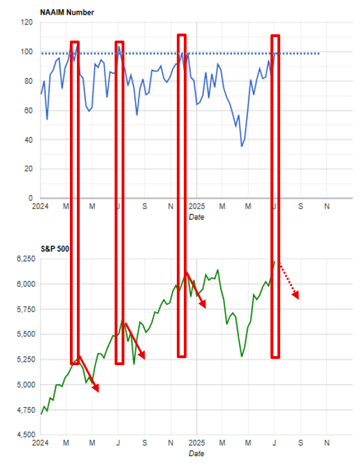
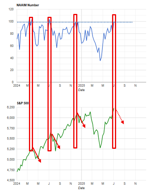
Indeks NAAIM Exposure (obrazujący pozycjonowanie funduszy) osiągnął poziomy niespotykane od początku roku – mówimy o skrajnym optymizmie inwestorów. Spójrzcie na wykres 👇
W ciągu ostatnich 18 miesięcy, gdy NAAIM przekraczał wartość 99 (niebieska linia przerywana), S&P 500 niemal za każdym razem wchodził w korektę na poziomie 5–10%. Dolny wykres i czerwone strzałki mówią same za siebie 📉
➡️ Moim zdaniem historia może się powtórzyć – nie sądzę jednak, żeby to już był czas na głębsze niż 10% spadki. Raczej klasyczna korekta zdrowego rozsądku po fali euforii.
🧠 Wniosek? Uważne zarządzanie ryzykiem i trzymanie emocji na wodzy mogą być teraz kluczowe
📈 US Stock Market Sentiment: Warning Signs of Euphoria!
The NAAIM Exposure Index (reflecting fund managers' positioning) has hit levels not seen since early this year—we’re looking at extreme investor optimism. Just look at the chart 👇
Over the past 18 months, every time NAAIM exceeded 99 (the dotted blue line), the S&P 500 slipped into a 5–10% correction. The lower chart—with those red arrows—tells the story 📉
➡️ I believe history could repeat itself. However, I don’t think this is the moment for a drop deeper than 10%. It looks more like a classic, rational pullback following a wave of market euphoria.
🧠 Takeaway: Smart risk management and keeping emotions in check might be essential right now.
📈 US Stock Market Sentiment: Warning Signs of Euphoria!
The NAAIM Exposure Index (reflecting fund managers' positioning) has hit levels not seen since early this year—we’re looking at extreme investor optimism. Just look at the chart 👇
Over the past 18 months, every time NAAIM exceeded 99 (the dotted blue line), the S&P 500 slipped into a 5–10% correction. The lower chart—with those red arrows—tells the story 📉
➡️ I believe history could repeat itself. However, I don’t think this is the moment for a drop deeper than 10%. It looks more like a classic, rational pullback following a wave of market euphoria.
🧠 Takeaway: Smart risk management and keeping emotions in check might be essential right now.
📊 BTC Seasonality: History Doesn’t Lie — Is July a Crypto Black Hole?
Take a look at the chart below. It’s more than just stats — it’s the rhythm of Bitcoin traced across 16 years of market history. Every all-time high (ATH) and every 52-week high, mapped month by month. On top of that, we’ve added BTC’s average monthly price in 2025 (black line).
🔍 The takeaway? Two months rise above the rest: February and the legendary November — when Bitcoin tends to shine brightest.
But there’s a darker side to this seasonality. And here’s where things get interesting:
⚠️ July? Zero ATHs. Zero. Across 16 years. ⚠️ September? Equally grim.July saw a yearly high only twice in history. 🧮 November? The undisputed king: 49 ATHs and 67 yearly highs. Median high? 32.5. Coincidence? Not likely.
📈 Now, let’s look ahead: The current average BTC price (black line) mirrors the seasonal trendline(green) almost perfectly. Which leads to a bold seasonal forecast: 👉 Correction ending in July 👉 Bounce in August 👉 Soft pullback in September 👉 And… potential cycle top in October/November
🧠 History doesn’t always repeat — but it loves to rhyme.