If your ads are bringing traffic but not conversions, try a Listicle page.
It bridges the gap between curiosity and purchase.
It educates and guides visitors to a confident "yes".
Want to explore how this could work for your brand? Send a DM.
🎟Win a FREE ticket to ShopX 2026
⚡Join the waitlist now: https://t.co/7PNQcKuEpF
The doors aren't open yet, but the waitlist is. And the earliest sign-ups get a real shot at attending the most anticipated AI eCommerce summit in APAC for free.
Here's the deal: ShopX 2026 provides 250 seats. The waitlist is how you skip the line.
Join early and you get:
✅An opportunity for a FREE ticket, only for our earliest sign-ups
✅Priority access the moment applications open, ahead of the public
✅First look at speakers, tracks, and the full agenda
⏳Waitlist registration closes on July 6. Don't wait until the last minute - secure your spot now for the best chance to get a FREE ticket.
The room is small. The demand is not. Every day you wait, someone takes your spot.
Don't watch this one from the sidelines. Join the waitlist now.
----------------
👉Explore GemPages the leading page builder for Shopify: https://t.co/TfRRlLs7OD
#ShopX2026 #Ecommerce #Shopify #AI #APAC
How To Sell A Sleep Product Without Talking About Sleep
Most sleep brands sell melatonin.
The best sleep brands sell what people actually want:
Waking up refreshed.
Notice the headline:
Not “fall asleep faster.”
Not “contains melatonin.”
Instead:
“Wake up like you actually slept.”
That’s powerful positioning.
Because customers don’t buy sleep products.
They buy better mornings.
The smartest CRO move on this PDP?
It removes the 3 biggest objections before they appear:
✅ No morning grogginess
✅ No pills to swallow
✅ No complicated routine
Then it reinforces the same promise with:
• Low-dose melatonin
• 8-hour release
• Stick on before bed
• Gradual release all night
• 391 reviews
• 30-day guarantee
What’s even better?
The bundle structure is engineered for AOV:
• Buy 1 = £20
• Buy 2 Get 1 Free = £40
• Buy 3 Get 2 Free = £60
• Buy 5 Get 5 Free = £100
The customer isn’t deciding whether to buy.
They’re deciding how much value they want.
Research suggests transdermal melatonin patches may help support sleep maintenance through gradual overnight release, which aligns perfectly with the page’s “sleep through the night” positioning.
Then they add urgency:
⚠️ Only 14% available
📉 Limited-time spring deal
🎁 Free sleep reset guide
🚚 Free shipping on larger bundles
That’s how you stack motivation without looking pushy.
💡 CRO Pro Tip:
Stop selling your mechanism.
Start selling the outcome your mechanism creates.
Nobody wants melatonin.
Nobody wants a patch.
Nobody wants ingredients.
They want to wake up energized, clear-headed, and ready for the day.
The closer your PDP gets to that desired outcome, the higher your conversion rate becomes.
People don’t buy better sleep.
They buy better tomorrows. 🚀📈
A product page can look good and still not sell.
This buy box was designed to make buying feel easier:
• Reviews visible early
• Scannable benefits
• Cleaner bundle structure
• Subscription framed better
• Strong CTA focus
Conversion is mostly about reducing hesitation.
People don't always abandon carts because of price.
They abandon because of risk.
- What if it doesn't work?
- What if the quality isn't good?
- What if shipping takes too long?
- What if I need a refund?
Good product pages don't just sell benefits.
They reduce fear.
People rarely leave because they dislike your product.
They leave because they haven't reached enough certainty to buy.
Good product pages answer questions.
Great product pages remove doubt.
That's where conversion happens.
Your Shopify stores don't need more apps.
They need more clarity.
I've seen stores with 20+ apps installed while the real problems were:
• Weak messaging
• Poor mobile UX
• Missing trust signals
Tools help.
Fundamentals convert.
AI can build a Shopify store faster than ever.
But it still can't tell you why people aren't buying.
Tools create pages.
Understanding customers creates conversions.
The brands that win will combine both.
AI can build a Shopify store faster than ever.
But it still can't tell you why people aren't buying.
Tools create pages.
Understanding customers creates conversions.
The brands that win will combine both.
Designed this buy box concept for a supplement landing page with one goal:
Make buying feel simple.
Clean hierarchy, clearer bundle selection, visible savings, and trust elements placed where they actually matter.
𝗦𝘂𝗺𝗺𝗲𝗿 𝟮𝟬𝟮𝟲 𝗖𝗼𝗹𝗼𝗿 𝗧𝗿𝗲𝗻𝗱𝘀 𝗔𝗿𝗲 𝗛𝗲𝗿𝗲. 𝗜𝘀 𝗬𝗼𝘂𝗿 𝗦𝘁𝗼𝗿𝗲 𝗦𝘁𝗶𝗹𝗹 𝗦𝘁𝘂𝗰𝗸 𝗶𝗻 𝗟𝗮𝘀𝘁 𝗦𝗲𝗮𝘀𝗼𝗻? ☀️
Every season brings new visual trends and summer is all about fresh, vibrant, scroll-stopping colors.
But many Shopify stores? Still using the same palettes all year round.
The Summer 2026 Palette Power-List:
🍊 Bright citrus tones (orange, lemon yellow)
🌤️ Soft pastels with a sun-faded feel
⚡ Bold contrast combos that pop on mobile
Updating your store’s color palette isn’t just about design, it’s about staying relevant in a fast-moving market.
👉 Which palettes are trending right now?
👉 How are brands combining colors this summer?
Check the graphic below for the latest summer palettes 👇
--------------------------
👉 Refresh your store design with GemPages: https://t.co/TfRRlLs7OD
👉 Start your Shopify store today: https://t.co/HU3Ebv3V1y
#GemPages #Shopify #EcommerceDesign #SummerDesign
Behind the scenes of building a responsive Listicle page in Instant.
Desktop, tablet, and mobile all optimized individually.
Small layout decisions make a huge difference in how a page feels and performs.
This redesign wasn’t about making the page look “better.”
It was about making the buying decision easier.
AIM:
• Better hierarchy
• Earlier trust
• Faster product understanding
• Stronger CTA visibility
• Cleaner mobile scanning
Good product page reduce hesitation.
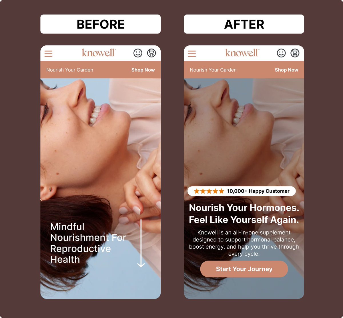
The “before” version looked clean.
But no direction.
So the redesign focused on:
• Stronger messaging
• Earlier trust signals
• Better CTA visibility
• Clearer hierarchy
• Faster understanding on mobile
Good design attracts attention.
Structured design drives action.
A product page can look good and still not convert.
Designed this buy box to make buying feel easier:
• Reviews visible early
• Scannable benefits
• Cleaner bundle structure
• Subscription framed better
• Strong CTA focus
Conversion is mostly about reducing hesitation.
Designed this buy box with one goal:
Reduce hesitation and make buying easier.
Focused on:
• Early trust (reviews first)
• Scannable benefits
• Clear bundle value
• Subscription framed as savings
• One strong CTA
Good design attracts.
Structured design converts.