Big new work alert … for lovely Little’s!
We’ve loved working with the team to create the packaging for Little’s new iced coffee concentrate range, designed to bring instant hit, grab-and-go energy to a fast-growing cold coffee category.
Get yours now at Sainsbury’s.
On-pack competitions can do far more than offer a prize. Our work with Clipper has turned everyday packs into campaign touchpoints, driving engagement, supporting retailers, capturing data and creating richer brand experiences beyond the brew. Turning purchase into connection.
Finding new customers is not just about being seen. It is about being understood quickly.
For Fieldfare, that meant defining a messaging toolkit for POS and digital advertising.
Need to simplify what your brand says and give your audience a clearer reason to act? Let's talk.
A new chapter for Quebec House
Mad River created a style guide and interpretation panels that honour Quebec House’s Georgian character, while remaining flexible enough to support future exhibitions within the Coach House.
The exhibition is now open throughout 2026. Go visit!
25 YEARS OF MAD RIVER!
25 years of ideas, graft, late nights, bright sparks, bold clients, brave briefs and brilliant people. We’ve learned a heck of a lot along the way. We’re proud of where we’ve been. We’re excited by what comes next.
A window display shouldn’t be an isolated moment. For Good Phats, we designed the display as the start of a wider brand experience. Connecting the window to in-store activations and product trial moments. When customers can experience the product, curiosity becomes loyalty.
Shaping the world of Perelló has been a dream for us here at Mad River. Building on its unmistakable character we created a brand and packaging identity that doesn’t just sit on shelf, it shows up in culture.
Want to build that kind of brand? Let’s talk.
Here’s something we’ve been working on with the brilliant team at Little’s Coffee. The perfect gifting set built for the season consisting of flavour-packed Little’s Coffee paired with reusable iced coffee cups, all brought together with packaging designed by us at Mad River.
Introducing the Barista Studio for Argos! A fully immersive space designed to show just how good coffee at home can get. Working alongside Hope & Glory PR, we sourced the venue, designed the space, and transformed it within 24 hours into a fully branded, sensory-led experience.
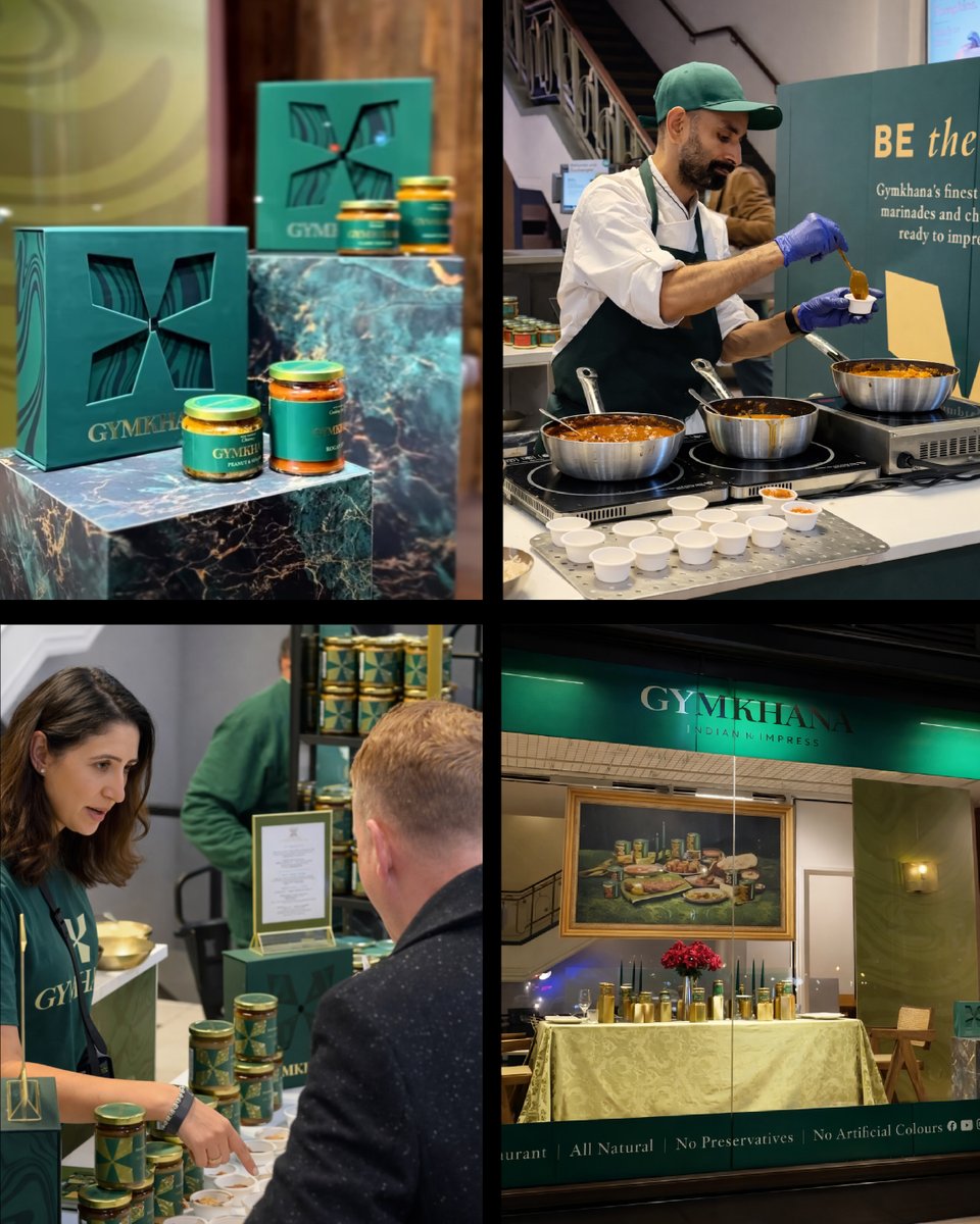
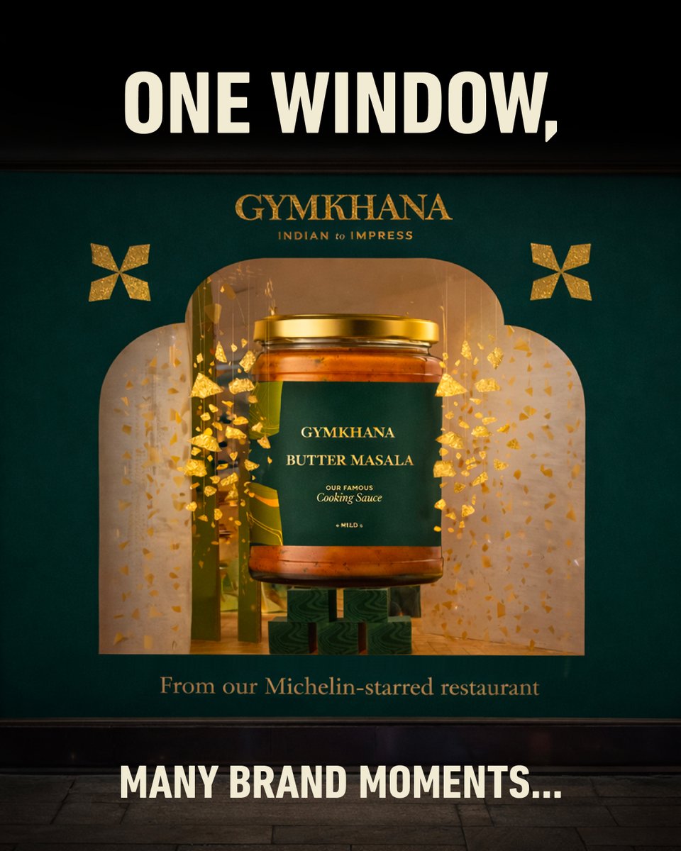
A great window display should do more than stop people in their tracks. For our project with Gymkhana, we designed every element with longevity in mind. Click the link in our bio to read our insider guide to creating window displays that build brand love.
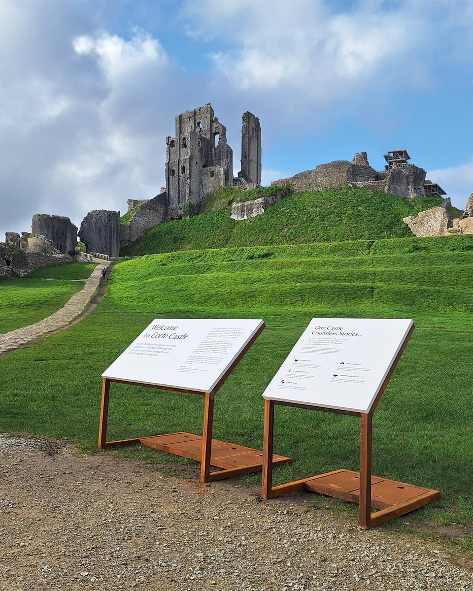
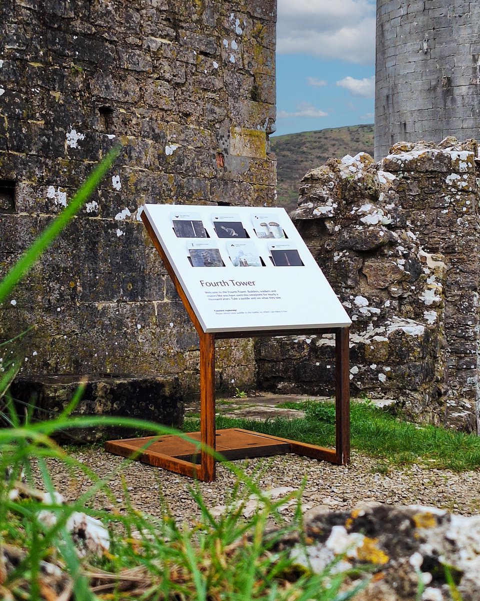
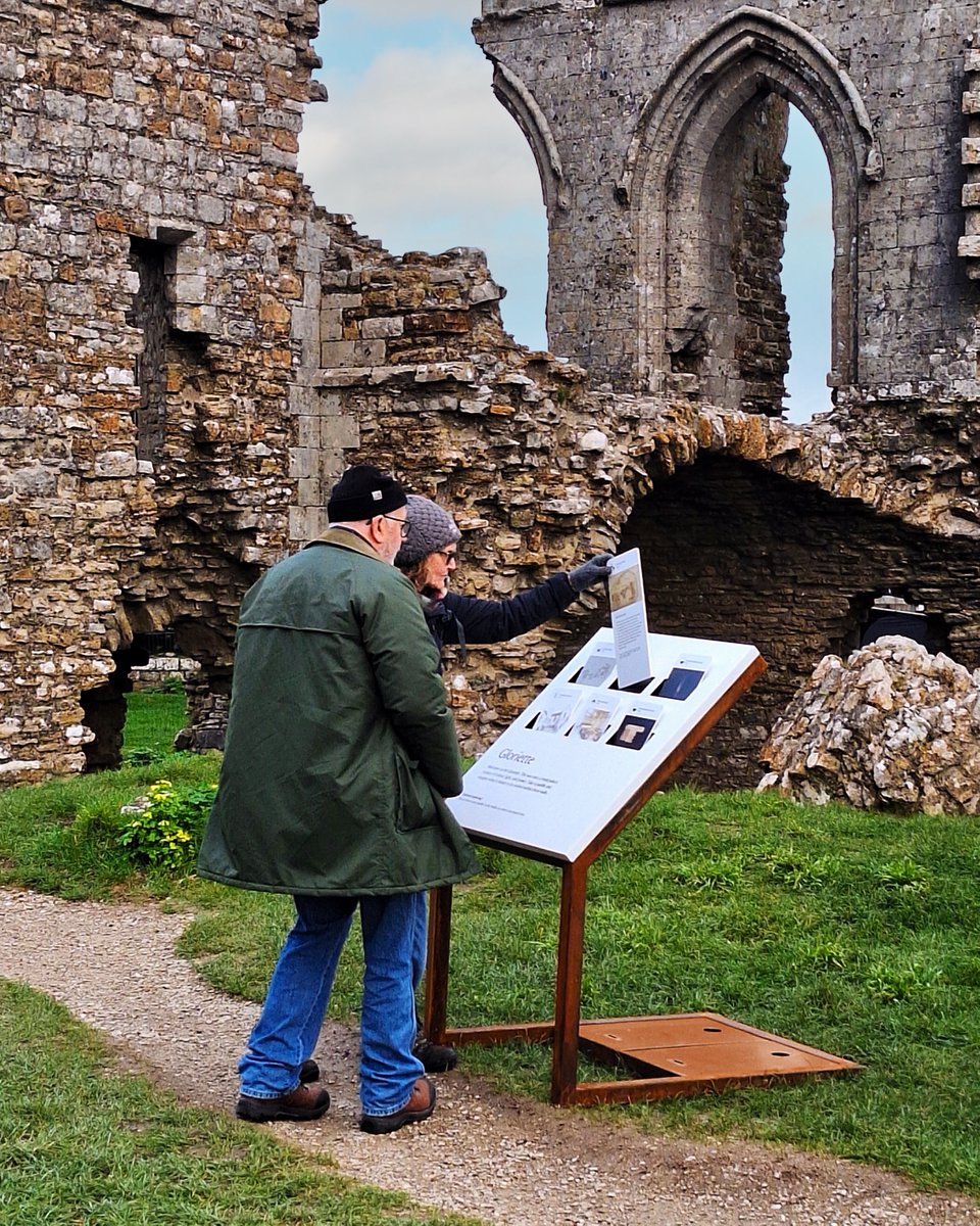
Corfe Castle. A ruin shaped by centuries of power, conflict and everyday life. In partnership with the National Trust, we created an outdoor interpretation pilot that invites visitors to pause, look closer and connect with Corfe Castle's layered history.
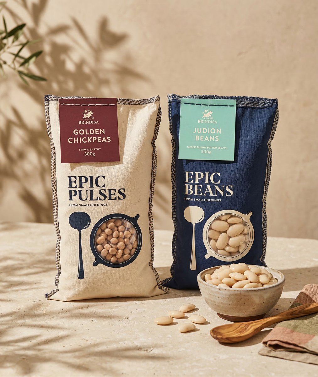
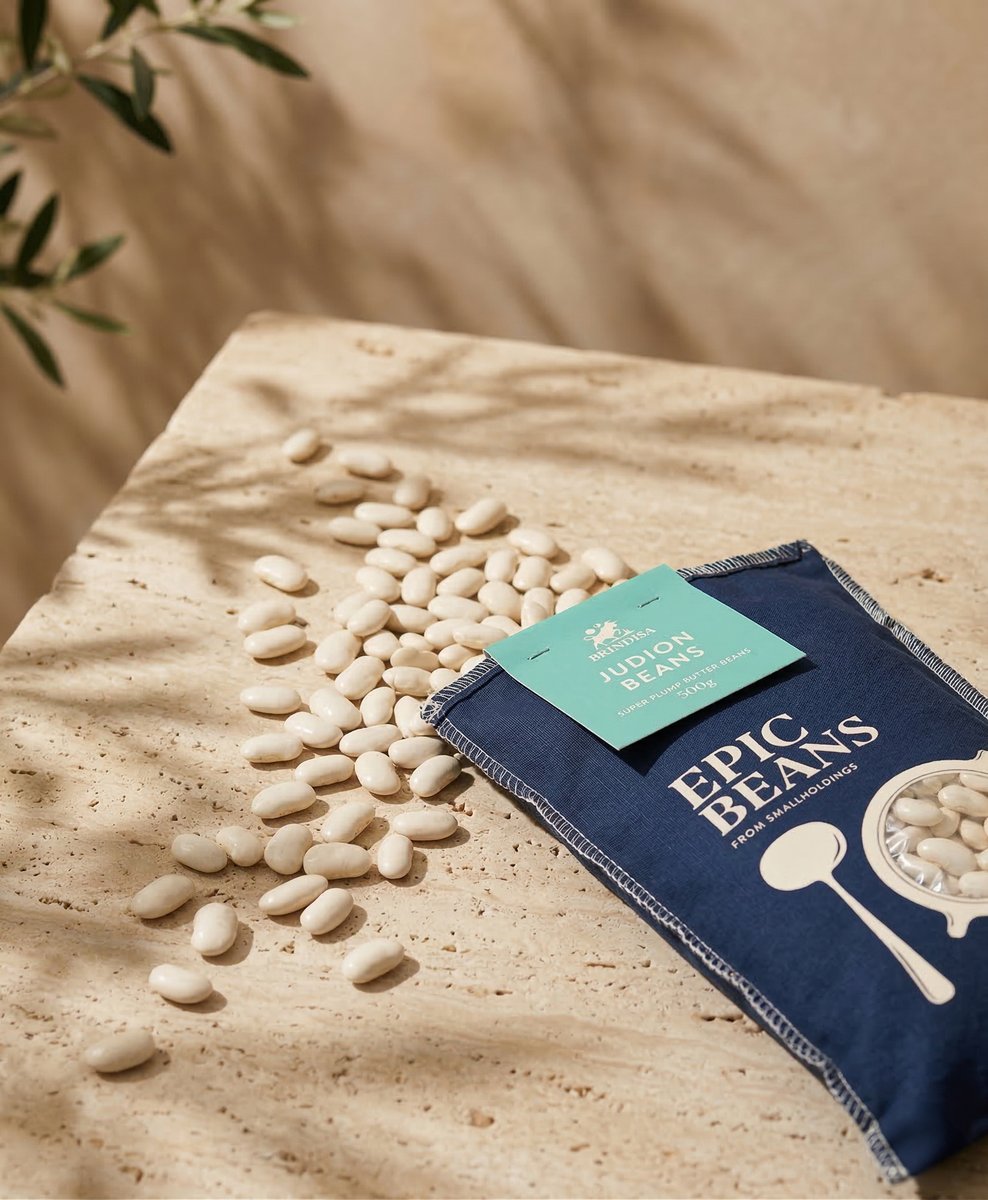
Brindisa’s Epic Beans deserve packaging with as much depth and character as what’s inside. So for this project, we created a range that feels rooted in Spanish culture whilst giving it the shelf presence to stand proudly in a modern retail space.
We’re proud to share that Mad River is now working with survivalist, expedition leader, presenter and resilience expert, Megan Hine, to develop her brand comms and strategic narrative. We’re super excited to be partnering with Megan.
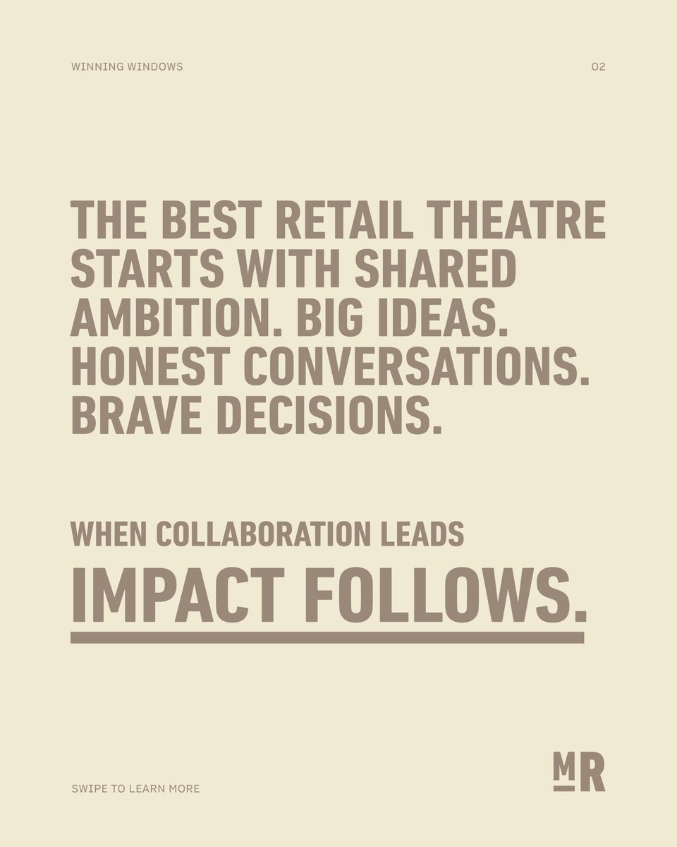
The most powerful retail theatre does more than showcase a product. It stops people mid-stride, it starts conversations. When brands and creatives share ambition, the results speak loudly. Click the link in our bio to read our guide to creating displays that build brand love.
We love creating work that actually feels like the people behind it and the new Launch PR website is exactly that.
PR sites can often feel interchangeable. This one doesn’t because it’s rooted in Launch’s voice, culture and ambition.
Go take a look … https://t.co/DqSs8HqANJ
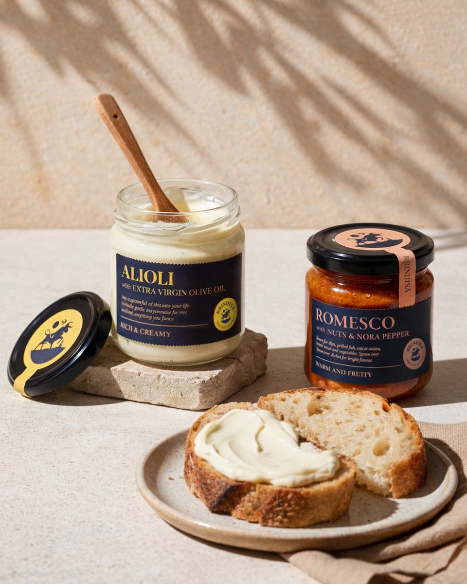
Following on from last week’s Tarta de Santiago post, we’re excited to share more of our packaging work with Brindisa, this time for their Romesco and Alioli products. It’s always a pleasure to bring such characterful products to life and there is even more goodness coming soon.
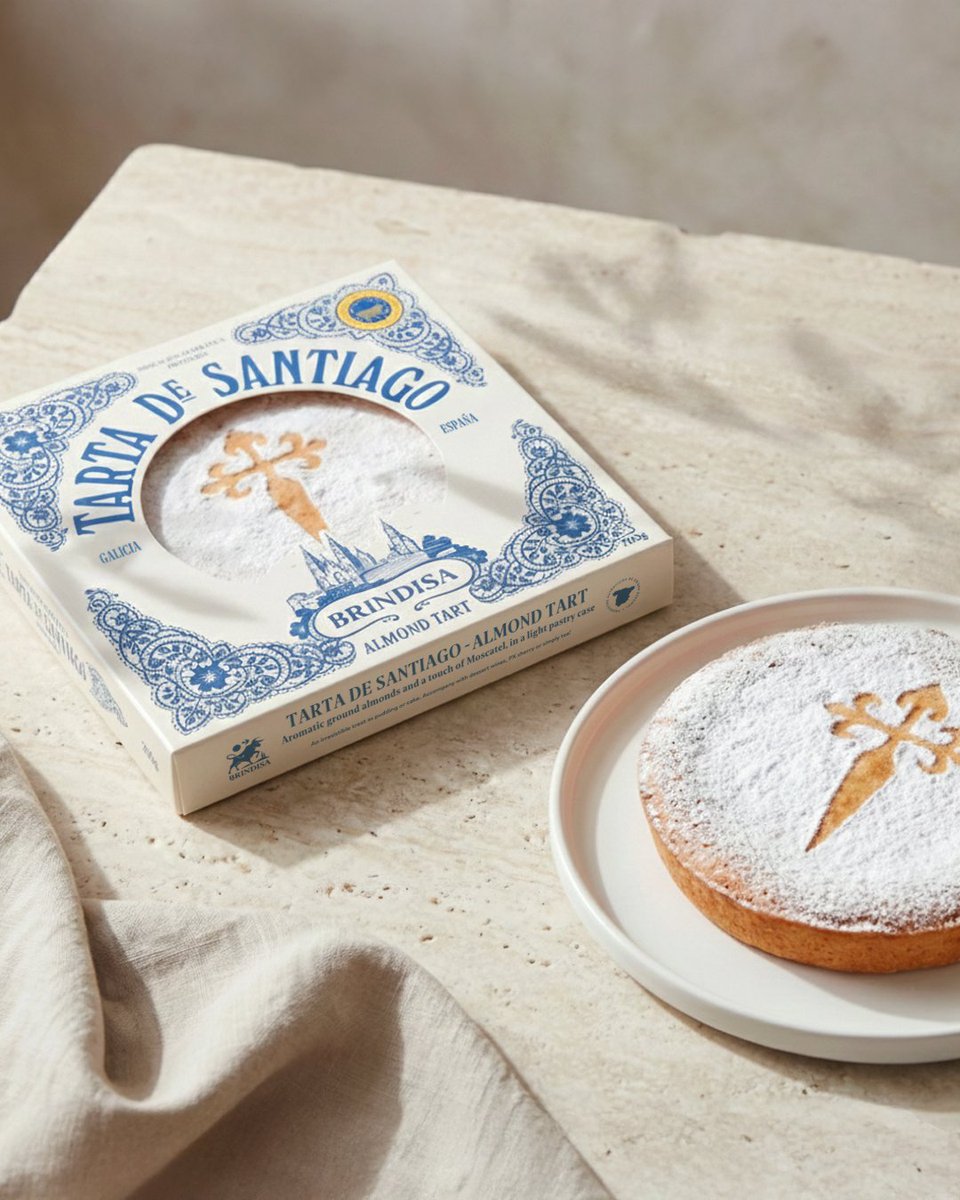
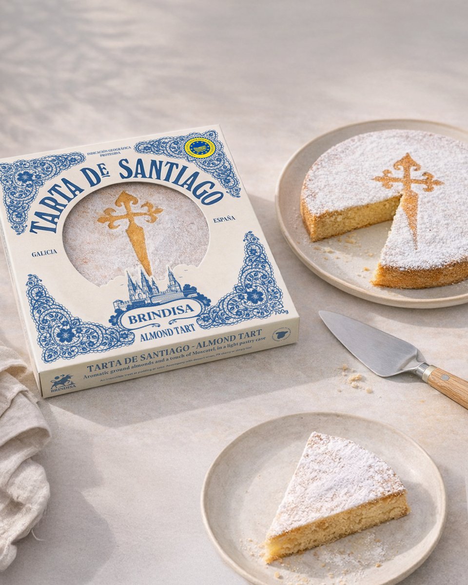
Have you tried Brindisa’s Tarta de Santiago? We highly recommend you do, particularly now that its packaging has been dusted with Mad River magic. This cake has centuries of history, marked by the cross of St. James so the design needed to feel authentic and quietly confident.
A window display only works if it works in the real world.
Reflections, sight lines, eye height and space all matter and when they’re handled right, your brand gets the spotlight. Click the link in our bio to read our guide.
From cult tins to a full pantry takeover
We’ve been super proud to evolve the iconic Perelló brand beyond olives, most recently rolling it out seamlessly across the new beans and pulses ranges, staying true to its iconic heritage whilst bringing some new fresh energy.
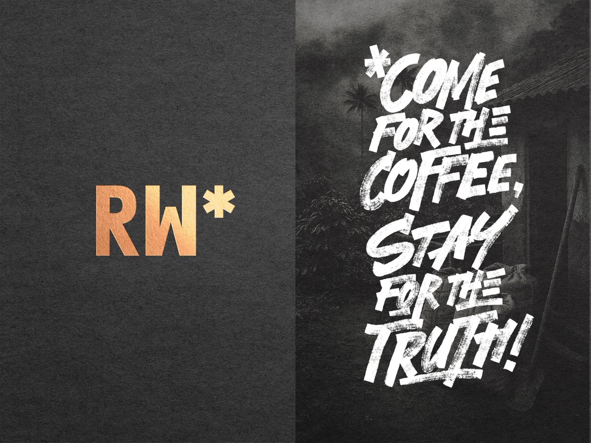
For Roastworks, we turned the asterisk into a signal of trust. We created a brand communication toolkit that uses the * to highlight real truths about the coffee trade. Pairing honest statements with real imagery to uncover what’s usually hidden in the small print.