Hello! I am Maico, a data analyst and an aspiring analytics engineer. 👩💻📊
Follow along as I dive deep into data analytics, share my progress, projects, and key insights from readings. Let's learn and grow together!
Excited to start this journey! 🌟 #DataAnalytics#TechTwitter
On a separate note, I'm happy to have passed practices and assessments on @DataCamp, ensuring I still have my SQL fundamentals in place 🫶 Thank you #DataEngineeringPilipinas and #DataCamp for the opportunity to upskill and grow!
A Trick for Power BI Report Design:
>>> Placement <<<
When the audience looks at a report, an automatic and unconscious process occurs when they grasp the report.
Therefore, you should use the basic report design principle of placement to support this process and help communicate meaning from data effectively.
Good placement of report objects contributes to an ordered report design.
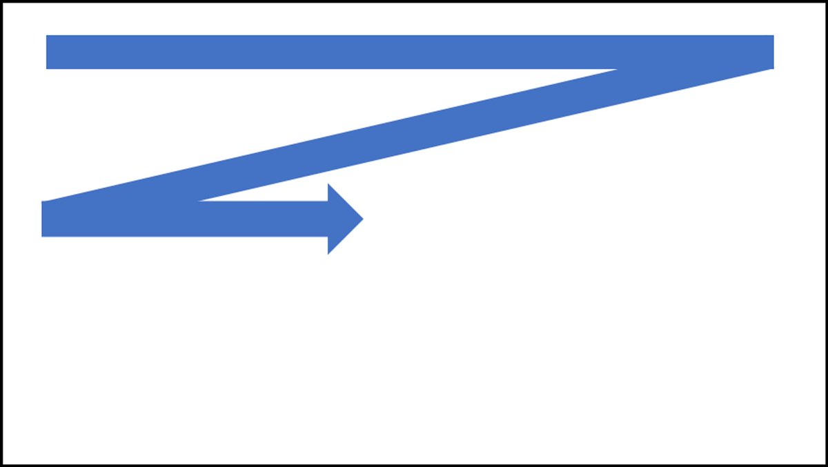
Generally, you should place the most important information in the upper-left corner of the page and arrange the report elements from left to right and top to bottom.
Making your report look good is about more than just putting things in the middle or placing them randomly.
You can make it more interesting by using a trick called the "Rule Of Thirds."
Here's how it works:
Imagine your page divided into nine equal boxes (like a tic-tac-toe board)
Put the important parts of your report along these lines or where they cross
This way of arranging things often looks better than just putting everything in the center
This method makes your report more eye-catching and organized.
Have you used this trick before in your Reports?
How can Canadian trucking OEMs adapt to the Net Zero?
Using data from ACT Research & a metal manufacturer, we analyze challenges and opportunities for OEMs transitioning to zero-emission trucks Check out our findings @ https://t.co/gj9zHSjCaO
#DataAnalytics#Sustainability