ALMI came to us for a redesign. A boutique real estate investment firm that had outgrown their first website.
We redesigned the whole thing top to bottom. The experience. The storytelling. A new visual language to finally match the unique high-level service they provide.
When the client is this special, things go interesting places.
Here's where it landed.
Been working on this one behind the scenes, and I’m so happy it’s finally live.
A new website for And Then, with a fuller identity, and many tiny details we probably spent too much time obsessing over (please tell me someone noticed the radial page navigation in the corner).
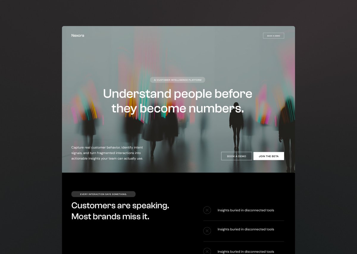
Here's a quick test most founders never think to do:
Go to your website right now. Pretend you've never seen it before. Give yourself five seconds.
What did you feel?
Not what did you read. Not what information did you find. What did you feel?
This is exaclty what your potential customers are doing.
Five seconds, gut feeling, stay or leave.
Now, if that gut feeling wasn't great, the question becomes: where's the poop?
In my experience, it's usually one (or several) of these:
1. Homepage's first section trying to say everything at once
2. No unified design language/aesthetics
3. Design fundamentals are off: no clear hierarchy, the spacing feels cramped, the text is hard to read, wrong line-height, poor typography choice and treatment
4. Cheesy or generic stock photos (huge credibility killer!)
5. AI design cliches (you know the look… it's everywhere right now and it already feels dated)
6. A template that still looks like a template (don’t get me wrong, templates are great, but if you haven't adjusted the details and layout to make it yours, it shows)
7. Your website could belong to anyone, nothing in the design tells a visitor what kind of business they just landed on
Do it. Do the exercise, it’ll tell you more than you think.
How did your website do?
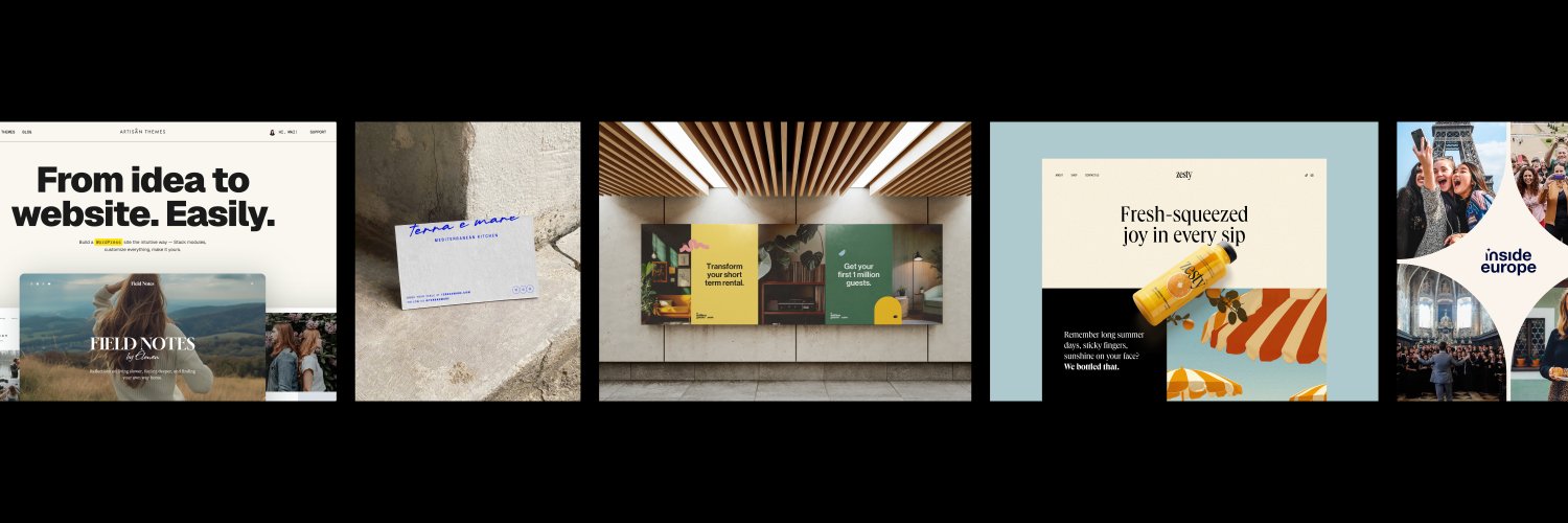
A few unused initial concepts we created for a digital startup (name and copy changed). Which one would you have picked?
P.S. We did these in a one-day sprint 🚀. The client needed a quick turnaround to pitch investors.
There are clients. There are good clients. There are great clients. And then there's a whole different category: the ones who become part of the family.
That's Inside Europe for us.
We found each other more than a decade ago. They were in a different place back then. So were we.
They came for our themes, but stayed for the whole thing.
Everything we've built together goes far beyond a single piece of design, but I think this before and after captures the spirit of it.
For the designers reading this: I wish you an Inside Europe of your own. They're one of the great pleasures of this work.
And if you're a boutique business that still cares about the details, about what you give, and your online presence doesn't reflect that yet, I'd love to bring that same care to your brand. Let's talk.
Something I genuinely didn't expect to become such a big part of our work at Studio By Artisan:
Stepping into businesses that already have a brand. Already have a website. Already have things going on.
When we started out, I assumed every project would be the romantic blank canvas. Fresh start. New brand. Very cinematic.
In reality, most founders who come to us have a brand they've been using for years. A website that was good enough when they launched but slowly became the thing they avoid sharing, or even worse, apologize for.
These projects are actually harder than building from scratch. You have to figure out what's working, what's holding them back, and what made the brand feel like them in the first place so you don't accidentally erase it. You can't just burn it all down because there's real value in what already exists. It just needs to grow up.
It's become one of my favorite kinds of work.
Taking something that's 60% there and turning it into something the founder is actually proud to show people.
If you're reading this thinking "that's literally us", DM me. Let's talk.
Something I see all the time:
Founders who are incredible at what they do. Clients love them. Service is premium. And their website... looks like it belongs to a completely different, much more boring company.
The way you do things and your point of view are your whole competitive advantage. If your branding erases all of that and replaces it with something "safe," you've essentially paid someone to make you forgettable.
there are two types of visual identity designers.
ones who start with the logo and build the world around it. and ones who build the world first and let the logo emerge from it.
neither is wrong but they produce very different results.
We built our first WordPress theme knowing very little about web design.
And somehow… that mistake became Artisan Themes.
[Here’s the story of how we got to redesign our website -again- after 7 years]