I never understood users who rate an app right from onboarding. It’s basically the same as those marketplace reviews saying, “Everything’s great, the item arrived, haven’t unpacked it yet - 5 stars”
🚨 Another App Store rule change.
Apple is now rejecting apps that ask for a rating on first launch or during onboarding.
Looks like the era of collecting thousands of easy 5-star reviews before users even try the app is coming to an end.
Apple is cleaning up the App Store.
@marbennaid@offpaths@capcutapp Why use CapCut when there’s free DaVinci Resolve? And if you want AI features, you can just buy the lifetime version and that’s it! No subscriptions. It’s cheaper and better than using CapCut
@offpaths@capcutapp Why use CapCut when there’s free DaVinci Resolve? And if you want AI features, you can just buy the lifetime version and that’s it! No subscriptions. It’s cheaper and better than using CapCut
Now you can use Codex from your phone !
But there’s one important catch: your computer needs to be turned on, since it works kind of like remote access.
Have you tried it yet?
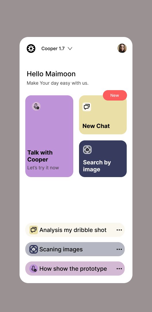
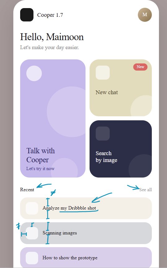
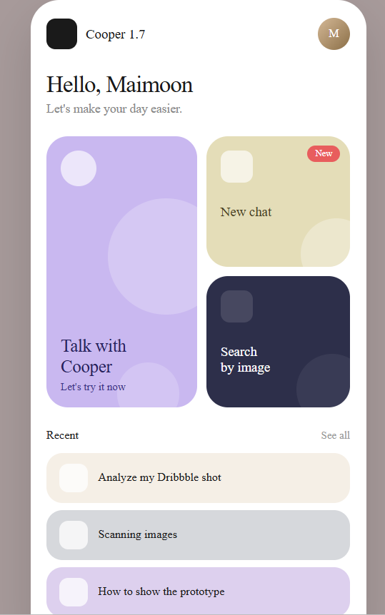
Design mistakes breakdown:
Your design has a better font size, but there’s an issue with spacing. The padding is inconsistent, so the balance isn’t preserved. In some places, the text is too close to the edge with almost no padding.
The extra outline on the lower blocks isn’t needed, and overall the icons don’t need an additional stroke because it creates too much visual noise. You could simply use higher-contrast icons.
In the second case, where the design was made by Claude, the fonts are too small in some places and hard to read. The spacing issue is still there as well, and the icons seem to have disappeared.
Sorry, both have a few issues 😄
Your design has a better font size, but there’s an issue with spacing. The padding is inconsistent, so the balance isn’t preserved. In some places, the text is too close to the edge with almost no padding.
The extra outline on the lower blocks isn’t needed, and overall the icons don’t need an additional stroke because it creates too much visual noise. You could simply use higher-contrast icons.
In the second case, where the design was made by Claude, the fonts are too small in some places and hard to read. The spacing issue is still there as well, and the icons seem to have disappeared.
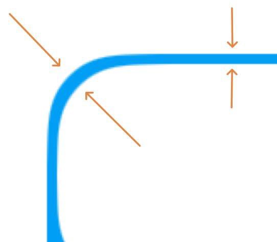
Design tip #1
One common UI mistake is using the wrong outer radius.
If a card has an inner radius and padding, the outer radius should not be the same as the inner one.
The correct formula is:
outer radius = inner radius + padding
This makes the shape look visually and physically correct.