We are now booking new clients for Q2! 🎊 If your team is looking to launch a new product from the ground up or make impactful upgrades on an existing product, let's chat 💬
To check out our work, head to https://t.co/ZvHXgutoxB 🖥🍵
@tushar_jain@cobie@cobie hey! Our team has been working on Web3 products since 2017 🍵 some of our latest work is here: https://t.co/FTzvhJAlvH — would love to chat if there is a project you’re wanting support on!🚀
Wumbo is a Chrome Extension that sits on top of Twitter and allows users to mint social tokens for influencers/creators they follow as a way to “back” them.
One of the features we designed for the Wumbo team is NFT Tagging.
In this post, we explore how we designed the experience to
🖥 Leverage existing patterns
🎨 Evoke a specific reaction with color
✅ Make use of timely confirmations
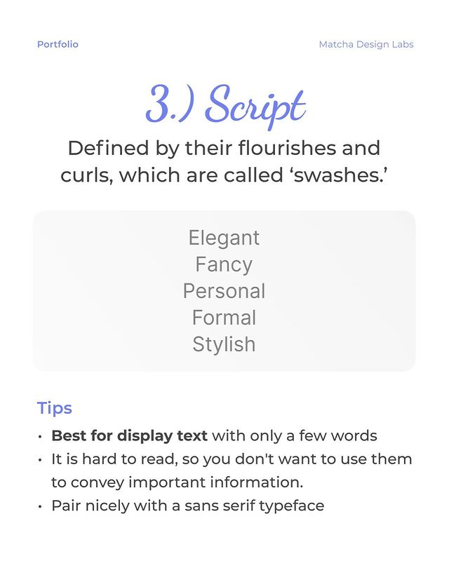
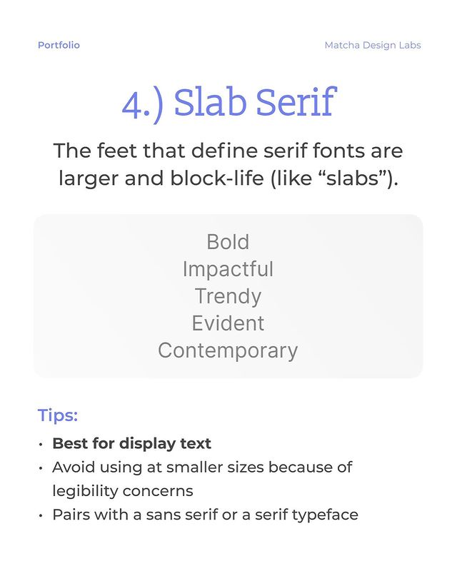
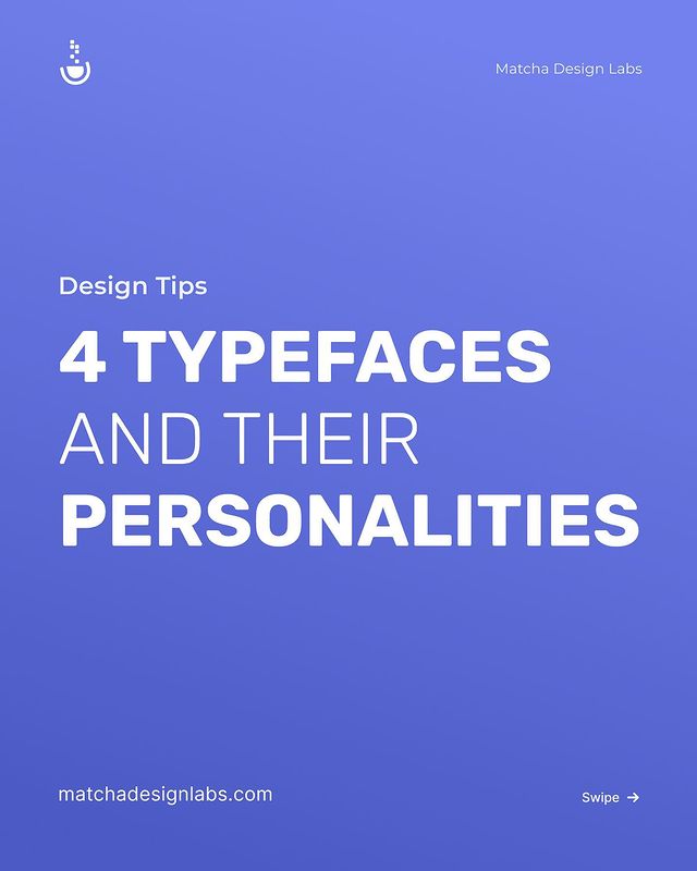
Typeface choice can have an incredible impact on how we feel about a brand or product.
So type families must match your website’s tone and voice for customers' interactions with both be positive.
In this post we explore 4 typefaces, their personalities, and how to use them.
How to use this post:
👉 Pick one or two from the options in this carousel.
👀 Look for typefaces with similar shapes and slants for pairings.
😈 Don’t be afraid to experiment with to get just the mood you need for each project.
It's official 🥳
We have launched a new website with a refreshed look and feel!
Let us know what you feel about the new website in the comments
Here 👇
https://t.co/2U2kqSROdO
#NFTs#NFT#Web3
Wait to go team!! Killed it! Thanks to @BryZettler, @otterlytheotter, @tanergrap, and @matchadesignlab putting in the work!
For anyone that wants to launch a DAO or SubDAO token: head to https://t.co/SkK5UYeYmw!
We don't show @avanimiriyala @AlliVerv11 and the @matchadesignlab crew enough love. ❤️
They've been the brains behind our product designs and everything else that you get to feast your eyes upon, including our cute wallet character and this new foxy one! 🦊💙
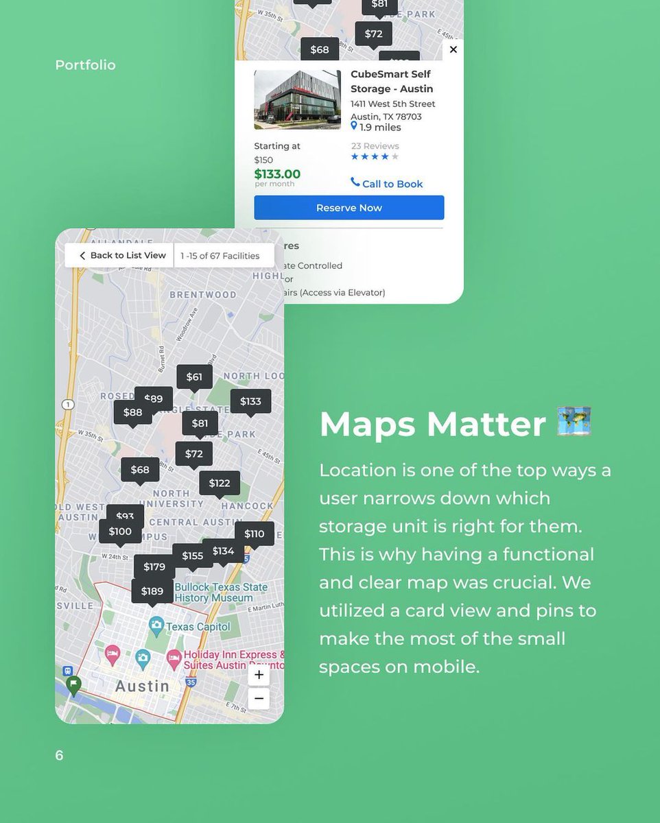
Our objective was to redesign the https://t.co/I34QFtsBHv’s search results page to achieve a streamlined experience that was easy to scan, user-friendly, but also optimized for conversions.
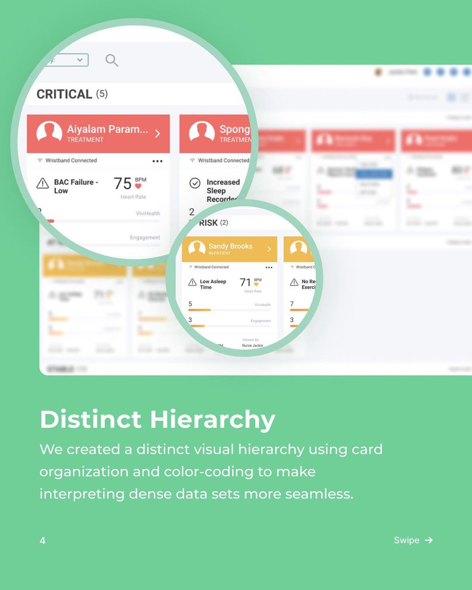
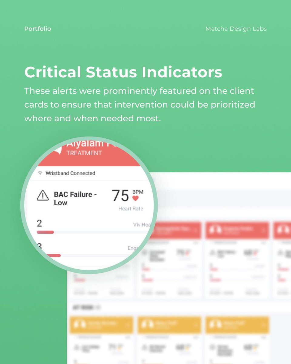
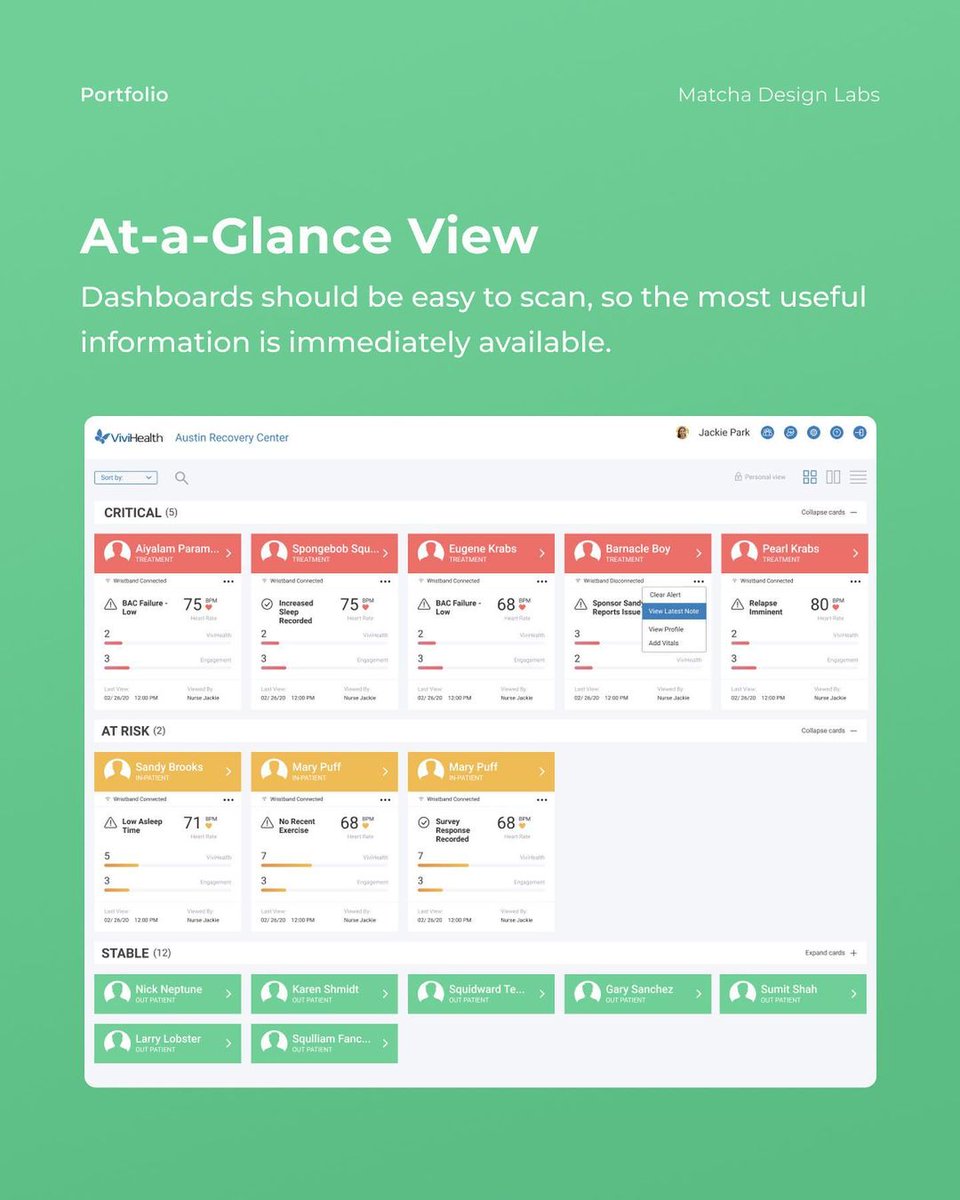
The importance of triage dashboards has reached new heights this year 👋
✍️ We designed this interface to offer Care Providers an at-a-glance view of the status of those in their care.
👀 There is a distinct visual hierarchy using card organization & color-coding to make interpreting dense data sets more seamless.
🚨 Critical status indicators are prominently featured on the client cards to ensure the intervention could be prioritized where &when needed most.
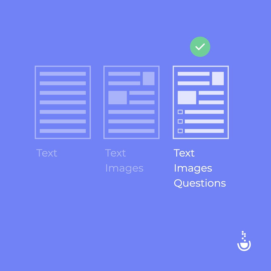
👋 Try structuring your presentations, user experiences, layouts, etc. to sparingly include visual aids and related questions to help users better retain information.
Have you applied this levels of processing theory to your designs?
Let us know in comments 🗣
If your users are able to process data in a variety of ways, they will more effectively recall that knowledge.
🤔 How can we apply this psychological concept to become better designers?
👋