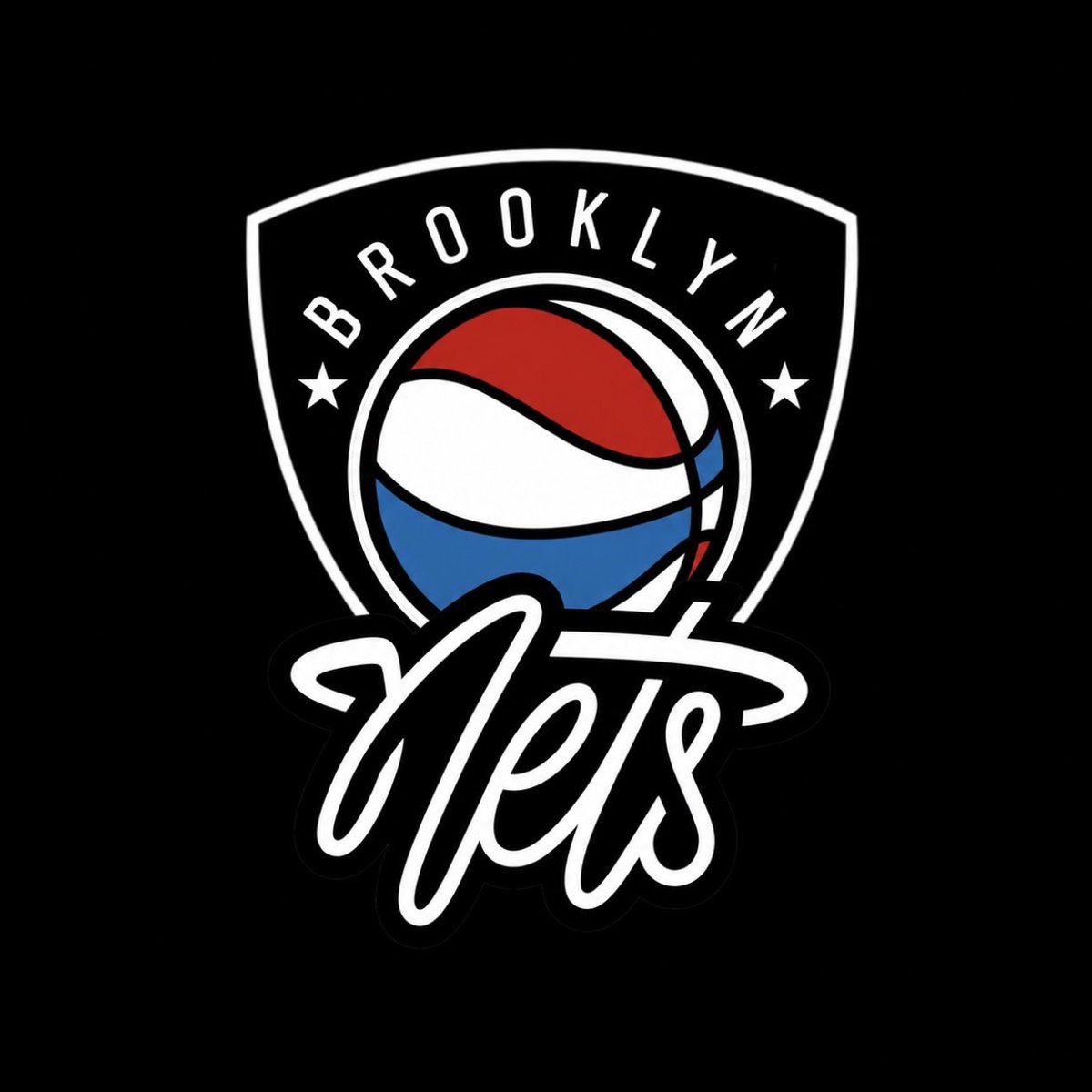
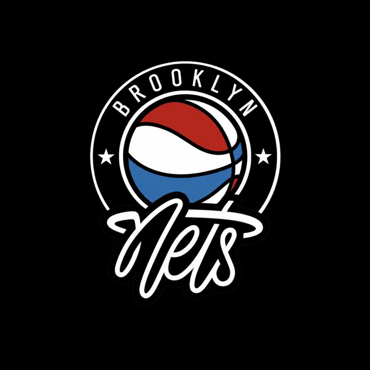
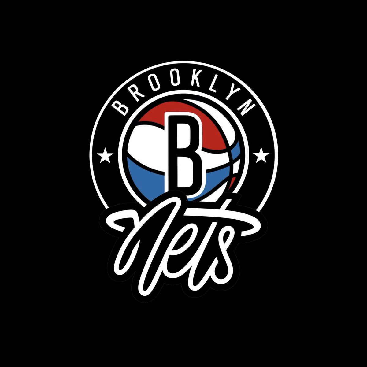
Two primary logo ideas, one with the shield and one with the circle, the two stars represent the two states that the Nets have played in (New Jersey and New York) and the nets script logo mimics the rim and net used on the old New Jersey logo
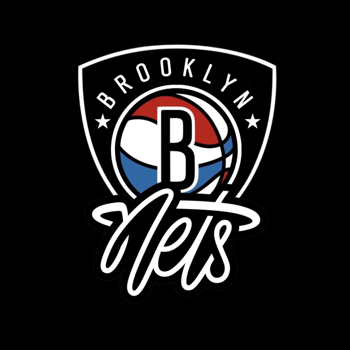
@twosteezi@TonezSports@Os91413Jon@BrooklynNets I changed the Brooklyn to the curved font used on the current circular logo and I think it looks cleaner, imo I still prefer the B on the ball but I did one without too
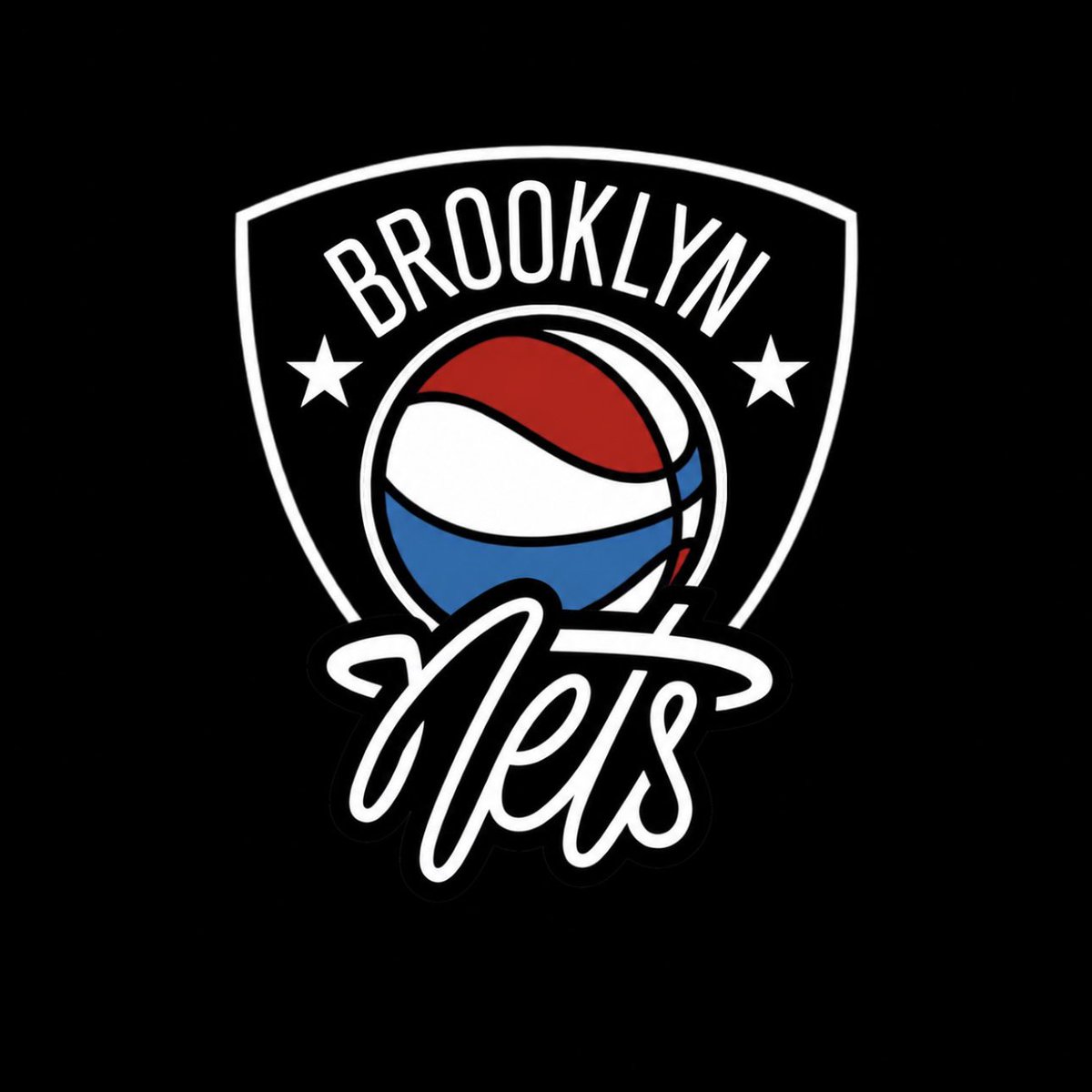
@twosteezi@TonezSports@Os91413Jon@BrooklynNets Lmk if you want me to do more, I think this is more like what you said with the shield, I tried to make it so it kinda looked like a backboard with the nets script logo and the ball going in
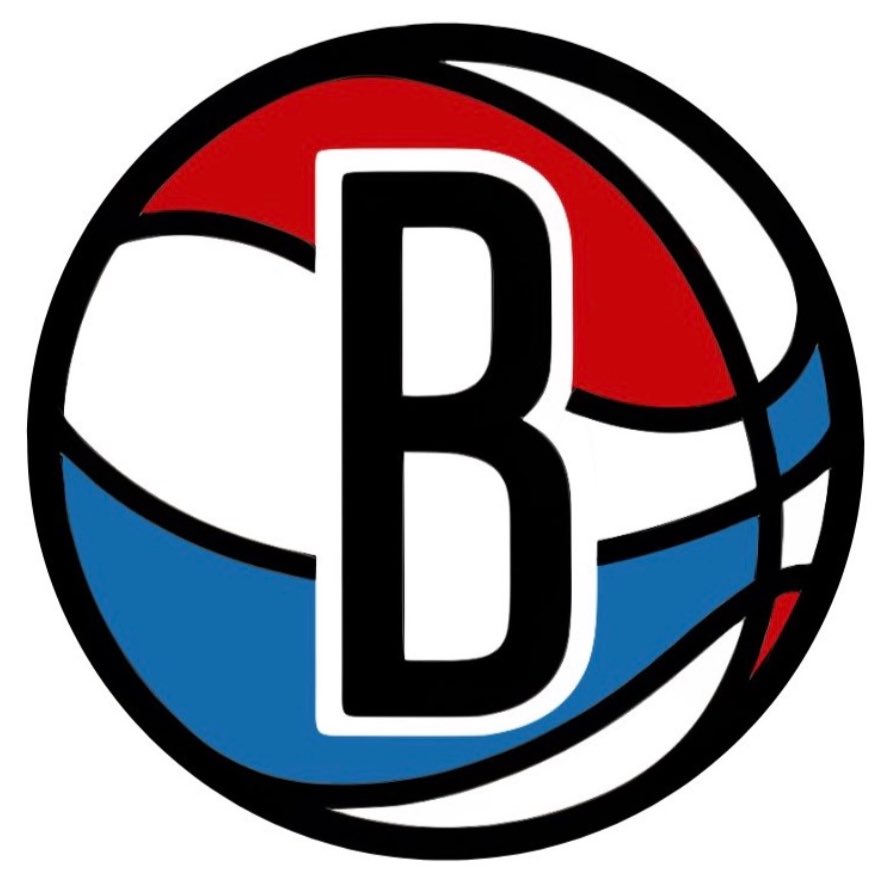
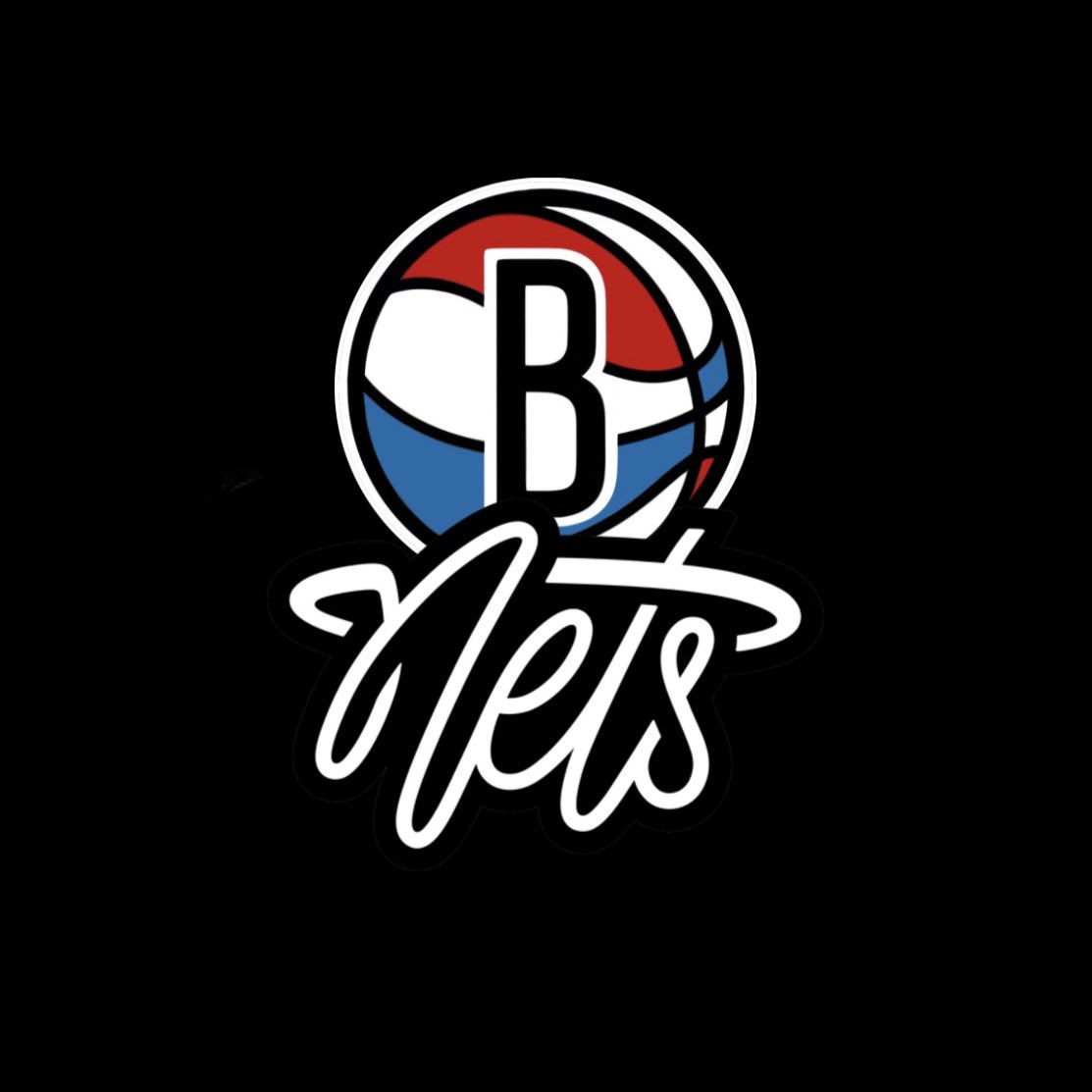
@twosteezi I’m not sure if this is exactly what you meant but I made this earlier and I removed the B from the ball, and I made another one with a smaller B
It’s about time the Brooklyn Nets did a rebrand so here is my mock up, I created a new primary logo which combines the ABA B ball with the nets script logo, as well as new home and away jerseys which are a modern take on the current classic jerseys
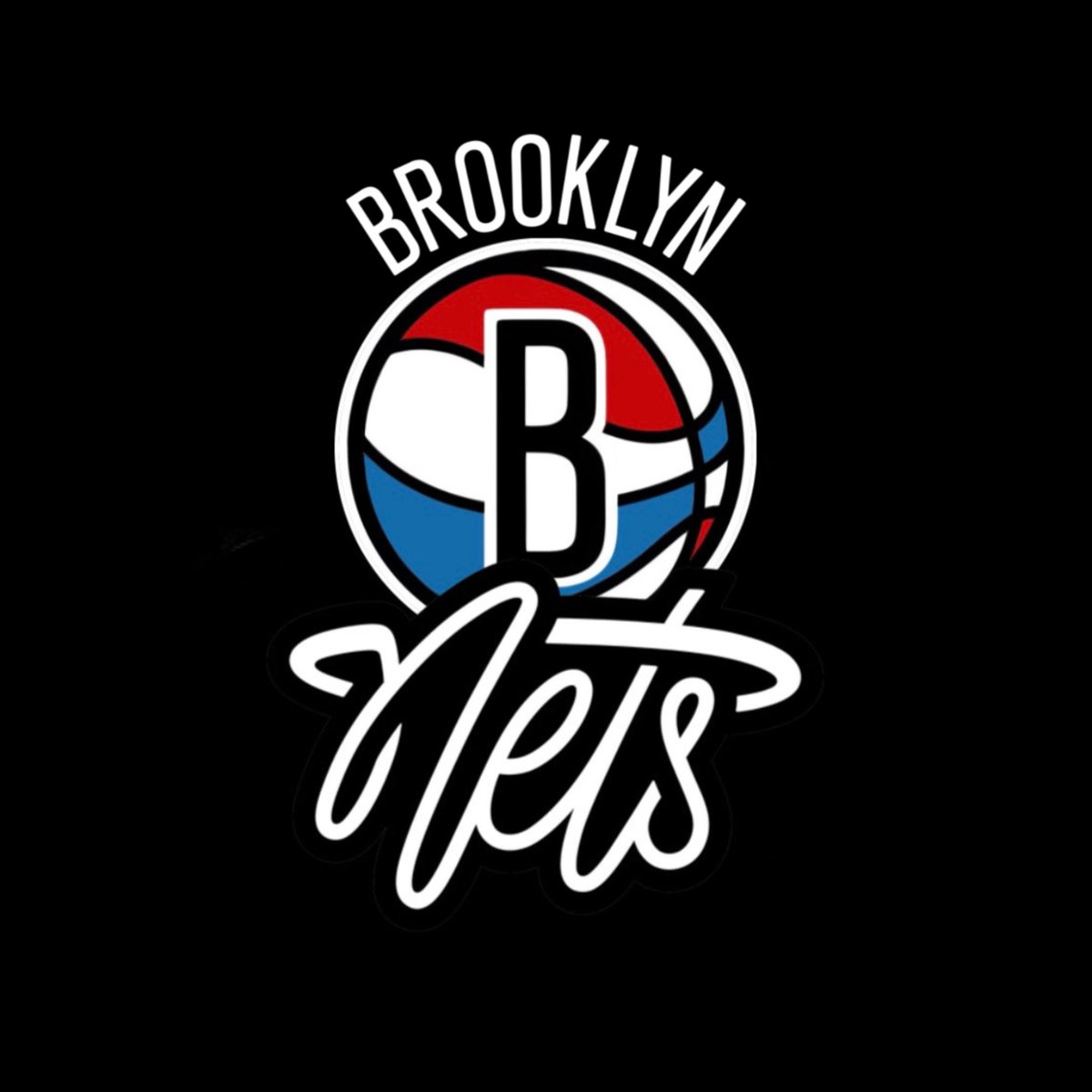
@danlatorraca@chimmyOtriumph@dbearak I think I saw that too about the name and everyone’s logo having to be in some sort of circle. I made a few designs that could be used as primary and secondary logos, I really like the idea of the B ball going into the script net logo
havent seen anyone try this yet, here is my attempt at the draft logo #NetsWorld
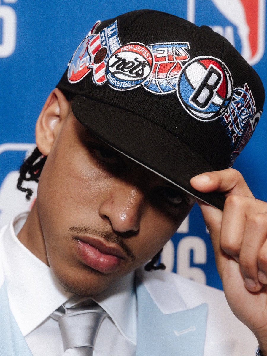
love the classic ABA vibes, would love to see this get used for the '76 title anniversary
@HoopGrids I played around with the logo too, combining the B ball with the nets script logo, I actually love how flush everything lines up with the ball going into the net