1. Limit negative space.
2. Add key product call-outs; like ‘Limited Edition’.
3. Make model & garment sizing more accessible.
4. Create product siblings to easily browse colours.
5. Add call-outs underneath the cart button to drive customer confidence.
From one studio to another. Here’s a fun little PDP optimisation for our friends at Après Studio.
The goal here (as always) was to remove friction from the customer journey - making it easier to shop.
Here’s 5 simple ways to do that…
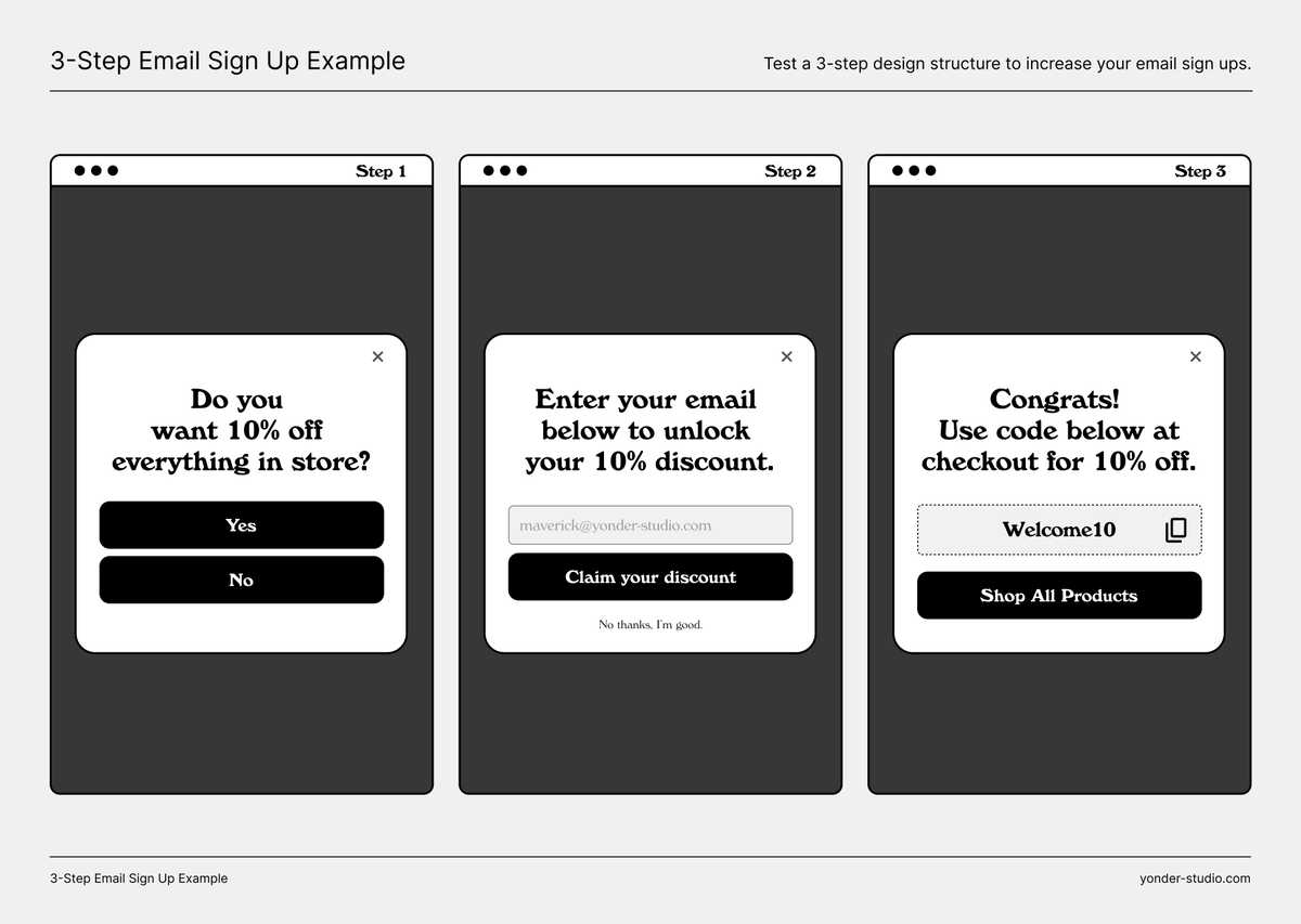
We work with a skincare brand that converts at over 5%.
However their subscription rate on email pop-ups sucked.
We made three simple changes that increased their subscribers by 170%.
Here's what we did...
If you enjoyed this tweet:
1. Follow me
@mav_blanc
for more CRO tips
2. RT the tweet below to share this thread with your audience
3. Send me a DM of your brand's URL and hero product and I'll record a free audit and share some ways for you to optimise your site for sales!
3. We showed the discount in the final stage with a link to their most popular collections page.
If they are signing up, they are very likely to be in a purchasing mindset.
Don't get in their way.