https://t.co/LWFlsfGmYH is live. over 250 of the best branding projects from around the internet.
curated manually. not daily, only when we find something actually worth your time.
if you have a project worth adding, there's a submit button.
When you present brand concepts to a client, you're not asking "which idea do you like?"
You're actually asking "how much risk are you willing to take?"
Early in my freelance career, I used to present 4, 5, sometimes 6 concepts. I told myself it showed range. That I was giving the client "options." The truth is I was insecure. I didn't trust my own judgment enough to edit down, so I outsourced the decision to the client and called it collaboration.
What actually happened every single time: the client got overwhelmed. They'd start cherry-picking "the color from concept 2, but the layout from concept 5, and can we try the font from concept 3?"
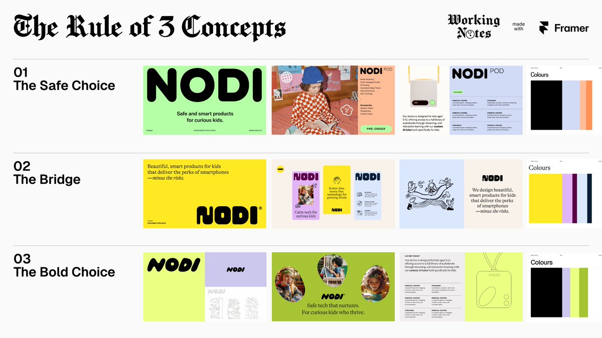
Now I always try to present three concepts. Three options create a conversation about spectrum of risk:
The Safe Choice. Close to what they briefed. It says "I heard you." This builds trust before I push anything.
The Bold Choice. The one that challenges something. An assumption, a convention, a constraint they thought was fixed. This is the reason they hired a designer.
The Bridge. Lives between the two. Has the ambition of the bold with the comfort of the safe. (honestly, this is the one that ships 70% of the time)
When I frame it this way - "how adventurous do we want to be?" — the conversation shifts completely. But here's the thing, bold concepts still die when they stay abstract. now that tools like @Framer let you design full visual identity systems and push them easily as live pages, even a brand pitch becomes something the client can feel. that's the difference between "do you like this palette?" and "do you like being inside this brand world?"
P.S. Rule I never break:
I never present an option I'd be embarrassed to build. No sacrificial lambs designed to make my favorite look better.
N27, the first one avant-grotesk font family by atipo®. Download Regular & Italic weights for free!! https://t.co/qVqkpYnfFF a través de @atipostudio
#ÚltimaHora | La tenista estadounidense Amanda Anisimova derrota a la número uno Aryna Sabalenka y se convierte en la primera finalista en Wimbledon 2025.
Foto: Reuters
🚨 ÚLTIMA HORA: Samsung acaba de poner fin a la era del iPhone.
La IA del Galaxy S25 está 5 años por delante, y Apple no va a alcanzarla.
Aquí tienes las 9 funciones alucinantes que lo demuestran: 👇
watching ep 8 of the new season of handmaid's tale.
the radiohead track for the opening montage was absolutely perfect.
love when shows get the music right, and directors/editors have such a high sense of musicality.
By using style boards, you can quickly test the design’s look and feel with the client to see if it meets their expectations. If it doesn’t, you can start over. If it does, you can use these artboards to develop the final pages
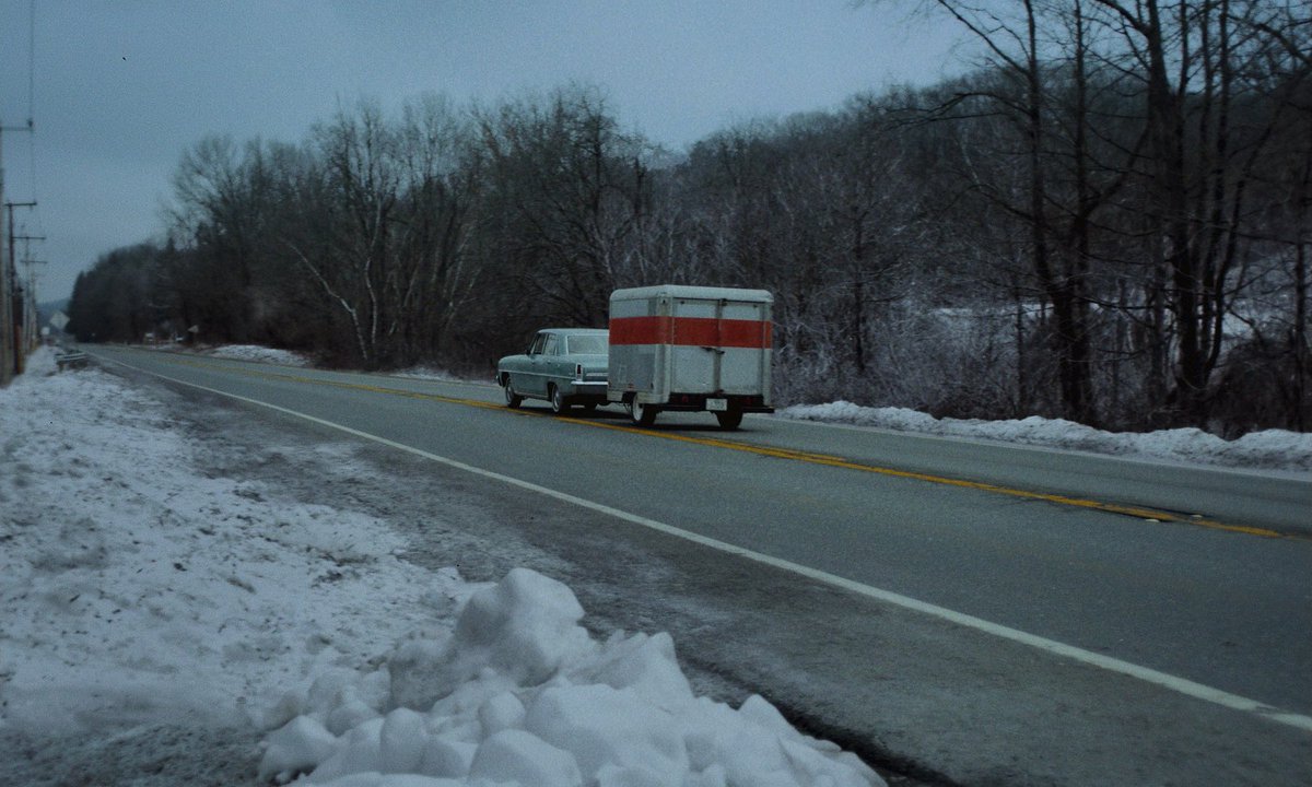
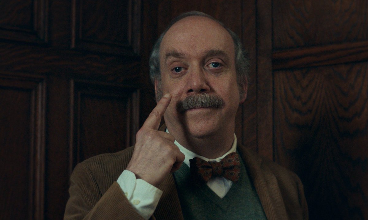
Ver los últimos 20 minutos de The Holdovers en Navidad es algo muy especial.
Espectacular, tal vez lo mejor que ha hecho Payne. Definitivamente una nueva tradición verla en estas fechas