This is a complete gem! #midcenturymoderngraphicdesign by @Theo_Inglis is a must-have for anyone with a passion for design & illustration. Unearthing sensational covers, revealing phenomenal propaganda & showcasing the best illustrated books from an exciting era @BatsfordBooks
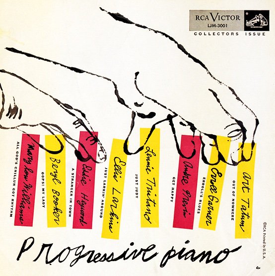
Andy Warhol’s Record Sleeves | 1. After arriving in New York from Pittsburgh in June 1949, Warhol sought freelance design work. By the early 1950s he felt confident enough to experiment, as in this witty record sleeve for the 1952 album Progressive Piano.
https://t.co/s5JLoYhj8t
Andy Warhol’s Record Sleeves | 2. This is a triumph of design economy. Using two colours of ink, Andy Warhol created a compelling cover for Thelonious Monk's 1954 album by juxtaposing his delicate handwriting with the blunt modernity of the M, O, N and K.
https://t.co/m7lDpEmwz3
FANTASTIC book: Mid-Century Modern Graphic Design by @Theo_Inglis. Such an awesome collection of beautifully designed book covers, posters, album covers and children’s books. And more. Highly recommended. (And fun side note: some from my own collection are in this book!)
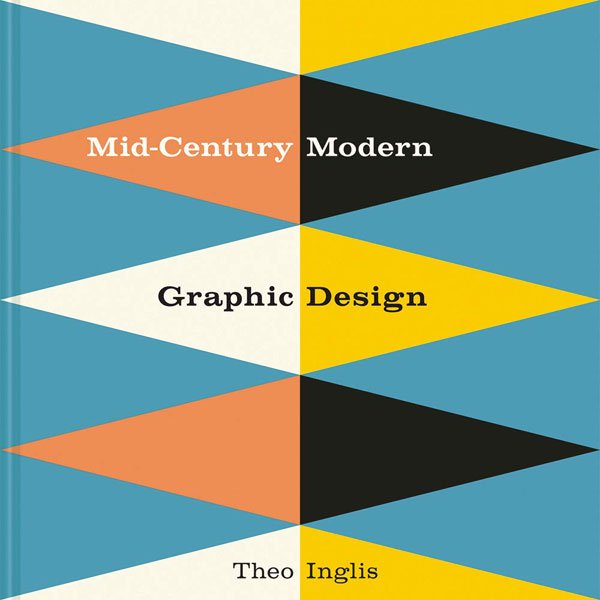
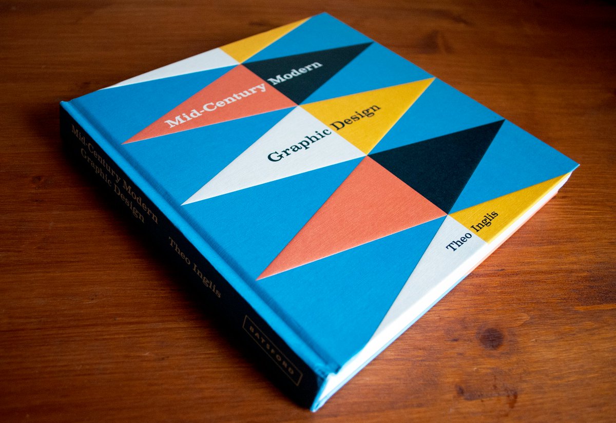
My book Mid-Century Modern Graphic Design is published today! It is 256 pages with 600+ images by over 150 designers, plus an introduction and 5 essays on each chapter theme (book jackets, record sleeves, posters, magazine covers and illustrated books) https://t.co/gmCRyz1del
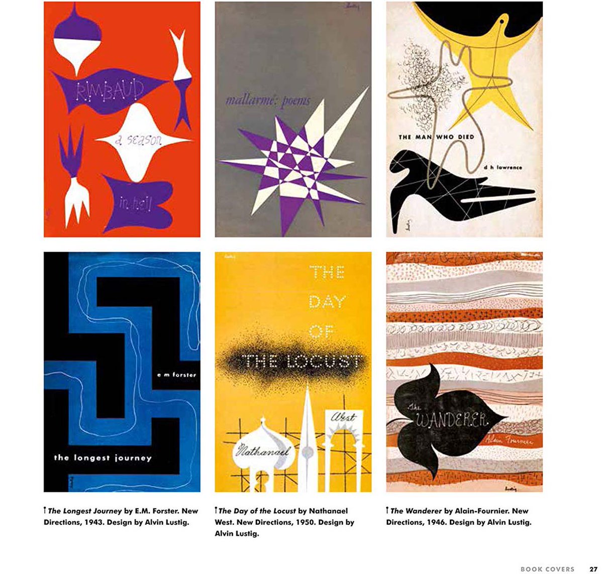
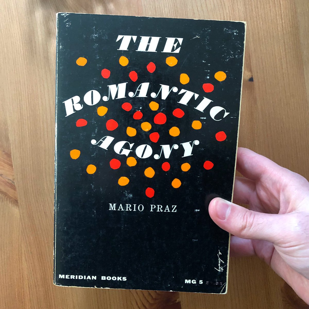
Day 1: Elaine Lustig Cohen, 1956. Following the death of her husband Alvin in 1955 Elaine took the reins with some of his former clients, including Meridian Books, who she designed many great covers for. https://t.co/Ewb1nkBFLW
My book is out in a month! In the run up keep an eye on my ‘A Book in the Hand’ Instagram where I’ll be posting mid-century book covers for the next month or so 📚👋 https://t.co/Gu1aiirneG
Last week I saw this M. Peter Piening cover online for the first time. That very same afternoon I dug one up on the thrift shop record bins. Fate!
—
I’ve spent quite a bit of time researching Piening‘s work for American Recording Society, and it seems li… https://t.co/J2M6CuzZG2
Alvin Lustig, single page ad from Interiors magazine, 1945. See more of Lustig‘s advertisements and book jackets in the Online Archive: https://t.co/a126kCJcU2.
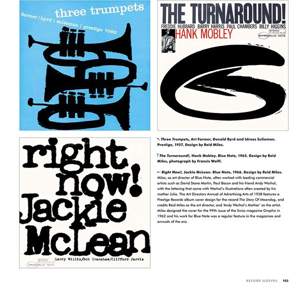
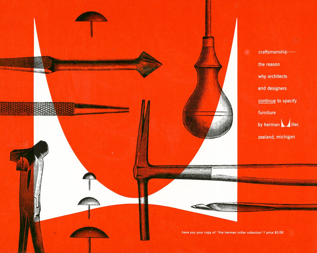
Designer Irving Harper once called his swooping red logo for Herman Miller “the century’s least expensive corporate branding.” Click through for more of Harper’s classic graphic design from the 40s and 50s. https://t.co/YH6rXZo20J
Made a little website with more info about my forthcoming book, as well as a link to pre-order it directly from me through PayPal (UK only for now sorry!) https://t.co/gmCRyz1del
This looks pretty essential. Mid-Century Modern Graphic Design by Theo Inglis is an extensive overview of the imagery and illustrations of the mid-20th century. https://t.co/D2E1T7lM7I
Upcoming book by @Theo_Inglis "Mid-Century Modern Graphic Design" is going to be a MUST-HAVE, available from @BatsfordBooks May 2019.
Pre-order and preview pages at U.S. Amazon link here: https://t.co/irYP8sphY3
Excited to say that my book 'Mid-century Modern Graphic Design', a 256-page exploration of post-war graphic design and illustration published by @BatsfordBooks, is now available to pre-order! Out on the 2nd May 2019. https://t.co/nSqosZccVV https://t.co/VcVaEHvJvZ