Designed the brand icon for Firanse, a cross-border payment app for creators, freelancers, and remote workers.
Every curve was intentionally crafted to represent movement, connection, and borderless transactions.
Simple. Distinctive. Purposeful.
Let's enjoy the best of the week.
The vision has never changed, we're consistent and on focus mode.
I'm Micheal Great. I partner with ambitious founders and brands to design world-class fintech products, complex software, and high-converting digital experiences.
Another week of being a world class fintech solution design partner.
I'm Micheal Great. I partner with ambitious founders and brands to design world-class fintech products (Web2 & Web3), complex software, and high-converting digital experiences.
I know every payment tells a bigger story than the interface users see.
In Nigeria's fintech ecosystem, many payment failures aren't caused by poor product design, they're often the result of complex infrastructure working behind the scenes. Yet, when something goes wrong, it's the product that loses the user's trust.
Read my latest article on how payment infrastructure shapes user experience and what product teams can do to design for resilience.
Read the full article here: https://t.co/Th4M4lg0Aj
haven't met me yet?
I'm Micheal Great. I partner with ambitious founders and brands to design world-class fintech products (Web2 & Web3), complex software, and high-converting digital experiences. From strategy and validation to premium execution, I transform bold ideas into products that are intuitive, scalable, and built to earn trust.
Working on Flowfund has reminded me that Product Design is really about making decisions.
One of the first decisions I made was to resist the urge to fill every screen with features.
Take the empty state, for example.
A lot of products introduce multiple actions the moment users arrive. I intentionally didn't.
Why?
Because Flowfund's value doesn't begin when users explore the app. It begins when they upload their first invoice.
Without an invoice, there's nothing to verify, nothing to finance, and no value to create.
So instead of asking users to make several decisions, the product asks them to make one.
"Upload your invoice."
As I moved deeper into the product, another question shaped almost every screen:
What is the user actually trying to accomplish when they open this app?
For an SMB, it isn't checking settings or browsing menus.
It's understanding how much working capital they can unlock and taking the next step with confidence.
That realization influenced everything, from the hierarchy to the placement of actions. Every decision was made to reduce hesitation, not to increase visual appeal.
This project has also reinforced something I believe every designer eventually learns.
Beautiful interfaces don't build successful products.
Products succeed when business goals and user goals reinforce each other.
If users can't accomplish what they came for, the business doesn't grow.
If the business can't achieve its objectives, users eventually lose too.
The challenge isn't choosing between business and users.
It's designing a system where both succeed together.
That's the standard I've been holding myself to throughout this project, and it's changed the way I think about product design.
Not as the craft of creating beautiful screens.
But as the discipline of designing better decisions.
You haven't met me?
I'm Micheal Great. I partner with ambitious founders and brands to design world-class fintech products (Web2 & Web3), complex software, and high-converting digital experiences. From strategy and validation to premium execution, I transform bold ideas into products that are intuitive, scalable, and built to earn trust.
Beautiful morning...
I'm Micheal Great. I partner with ambitious founders and brands to design world-class fintech products (Web2 & Web3), complex software, and high-converting digital experiences. From strategy and validation to premium execution, I transform bold ideas into products that are intuitive, scalable, and built to earn trust.
Good morning fellas...
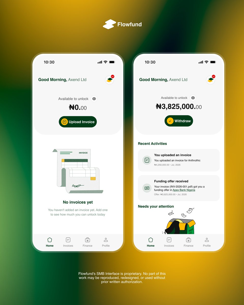
Flowfund SMB Dashboard
The thinking behind these two dashboard states is to reflect the user's journey.
The first screen, showing ₦0.00, represents a newly onboarded user who has just created a Flowfund account and hasn't uploaded any invoices yet.
The second screen represents the state after the user uploads a verified invoice. Flowfund performs a series of background verification checks on the invoice, and once it passes validation, the platform unlocks a funding amount based on the invoice's verified value. The user can then withdraw the approved funds directly to their local bank account.
A simple flow: upload a verified invoice, get it validated, unlock working capital, and keep the business moving. Everyone wins. 😁
I'm Micheal Great, I partner with founders and brands who refuse to settle for mediocrity, designing fintech products (Web2 and Web3), complex software, and Landing pages that convert. From idea to premium execution, I help ideas come alive and products stand out through clarity, quality, and rigor.
It's another to stay productive.
Work in progress for Flowfund, working on this project has broaden the way I see and perceive fintech products.
What I've learnt and learning.
1. Context matters
2. Business goals in mind as you design.
3. Design solutions that comply with regulations else... hmmm
4. Not every screen in a product has to be beautiful. Based on my experience, some features will naturally look a bit ugly, no matter what you do 🙂. That's completely normal, just make sure they solve the problem they're meant to solve.
I'm Micheal Great, I'm Micheal Great, I partner with founders and brands who refuse to settle for mediocrity, designing fintech products (Web2 and Web3), complex software, and Landing pages that convert. From idea to premium execution, I help ideas come alive and products stand out through clarity, quality, and rigor.