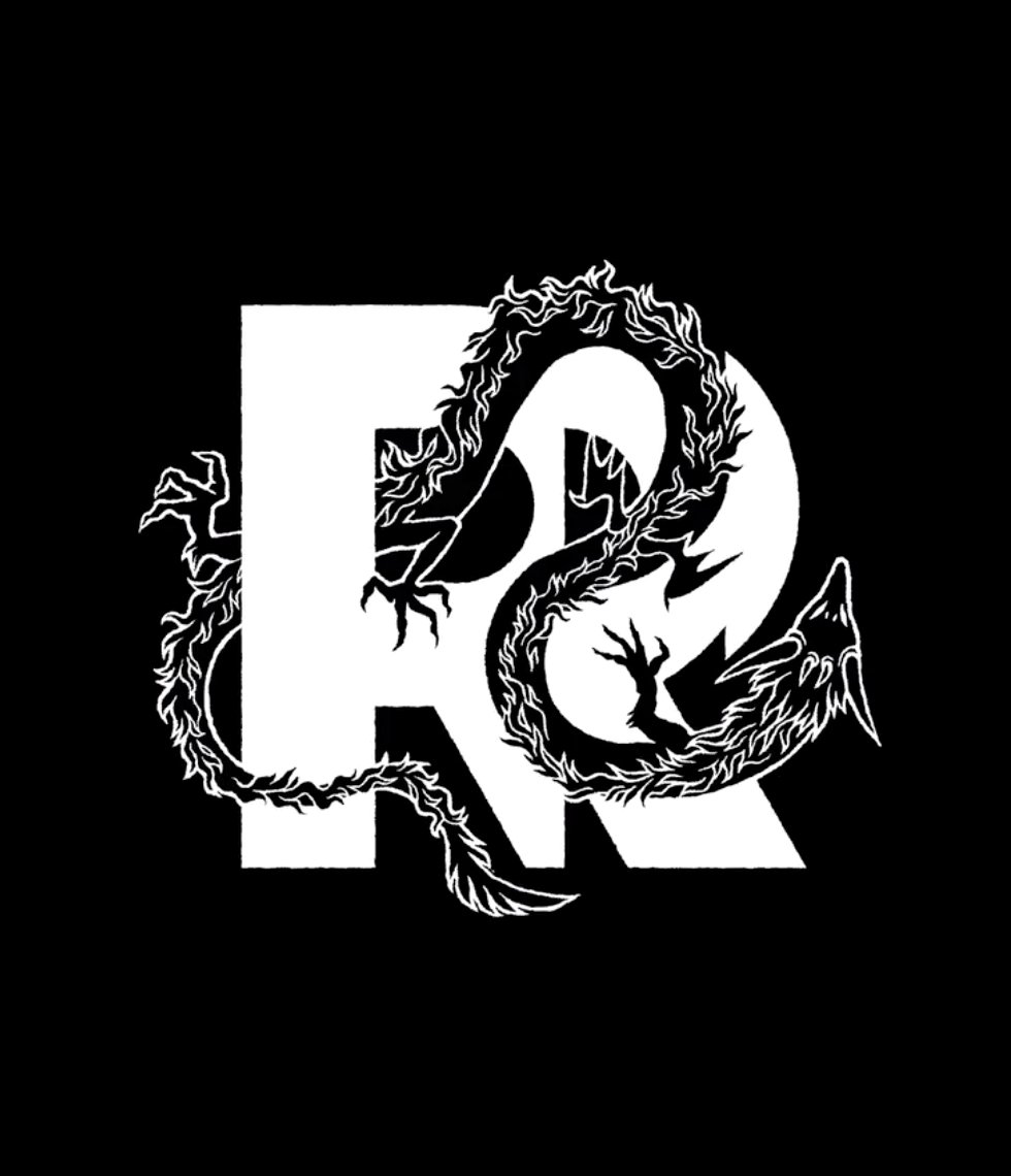
@sportslogosnet No dice. Take-Two are just being bullies. But it DOES give Remedy the chance to permanently switch to one of their rad alternate versions of the logo...
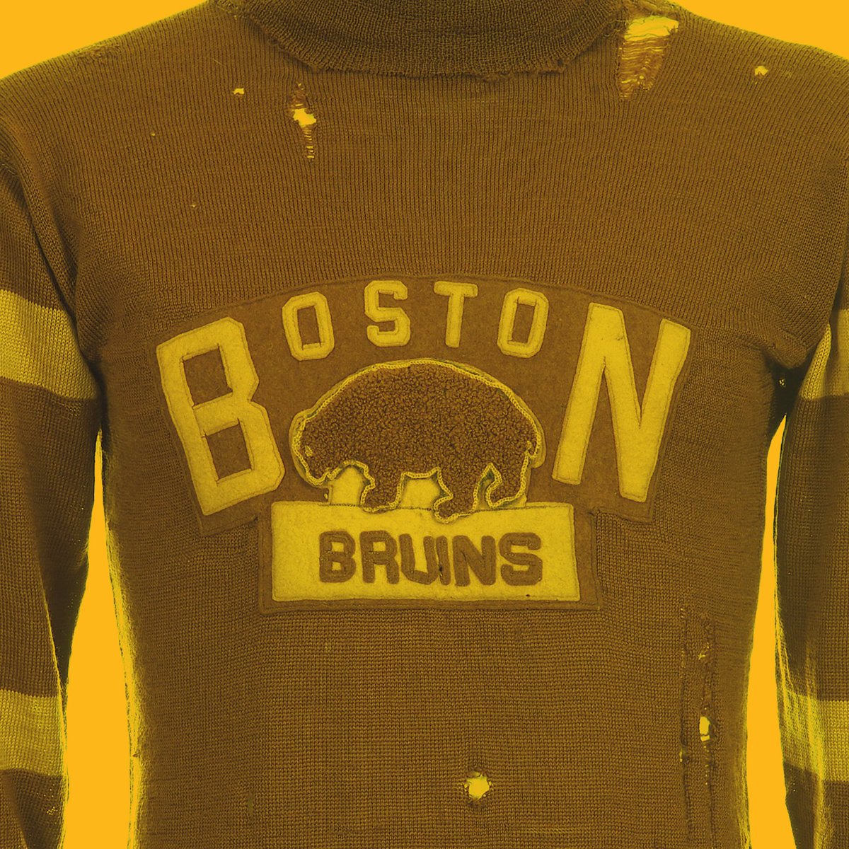
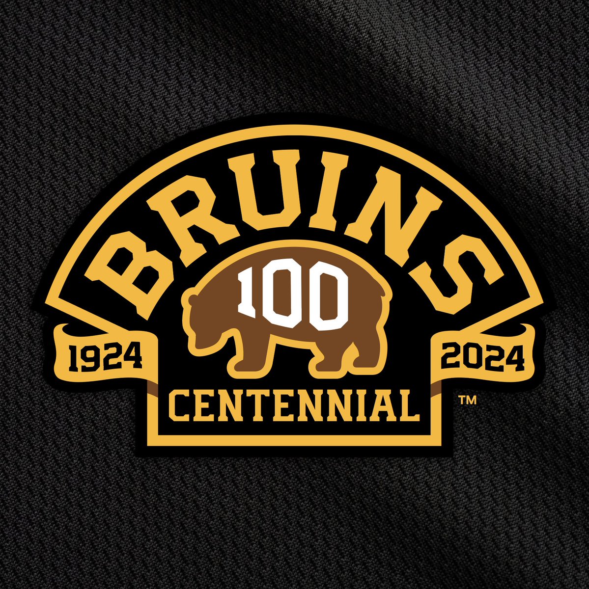
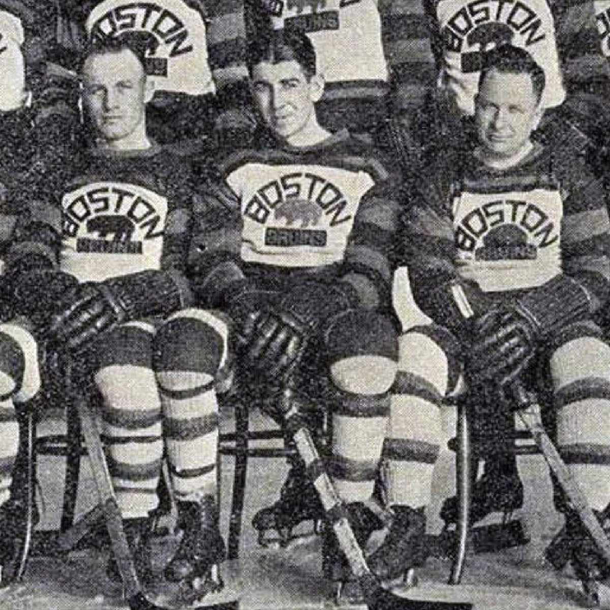
We had the honor of collaborating with @ajmazz11@markmajewski and the @NHLBruins in bringing the Bruins Centennial to life. We're looking forward to an incredible 100th season!
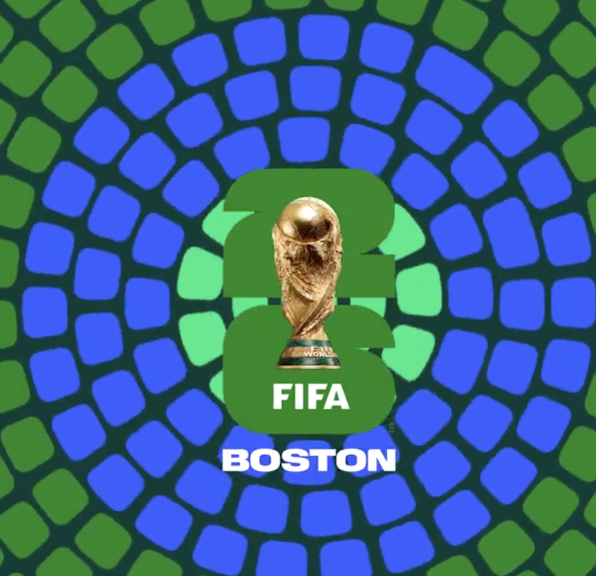
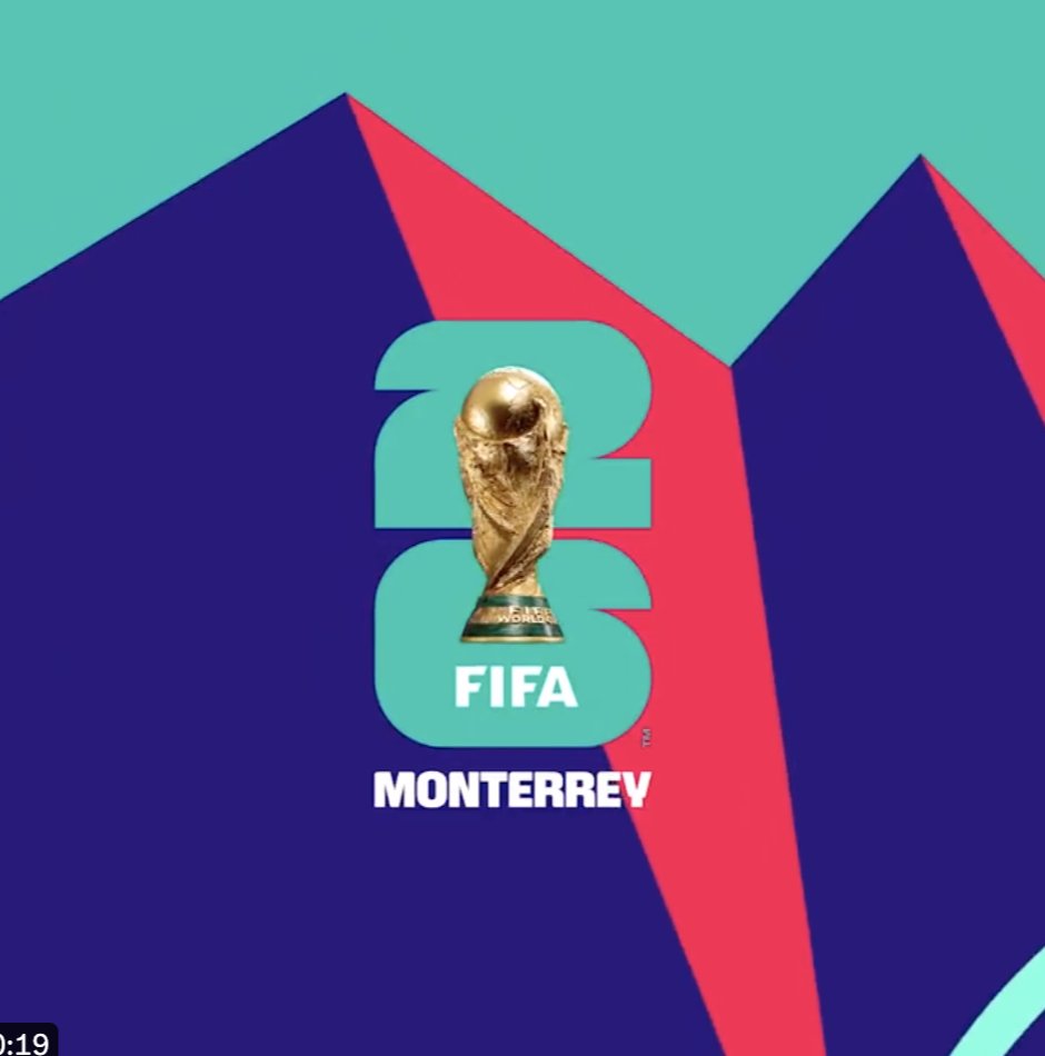
@GameplanChicago Is it just the photo of the Cup popped into the logo that you think is unsuccessful and wouldn't translate well? I agree it may have worked better as a more graphic icon or illustration, but embroiderers can work wonders with photo-realistic illustrations these days.
This is a logo that would say something awkward at the company holiday party and then think about it for the next 34 years. All identities should strive to do this.