The question you asked was exactly what I asked myself when I first entered the University of Ilorin campus as a 100-level student. I looked at the road stretching from the school gate to the academic area, twisting and turning, and I wondered: "Why stress us?
Why didn't they just pave a straight line that would link us directly to the Faculty of Education?" Several people gave me funny responses. In fact, some even said it was for aesthetics, others said it was to prevent overspeeding.
It wasn't until I got to 300-level and was introduced to Engineering Survey that I got the answer. It's a technique called Gradient Management.
If you build a road straight up a steep hill like that, the slope becomes too sharp. A car engine has limits. If the road is too steep, vehicles will struggle to climb, and heavy trucks will roll back. Coming down is even more dangerous because gravity will pull you down so fast that your brakes might fail.
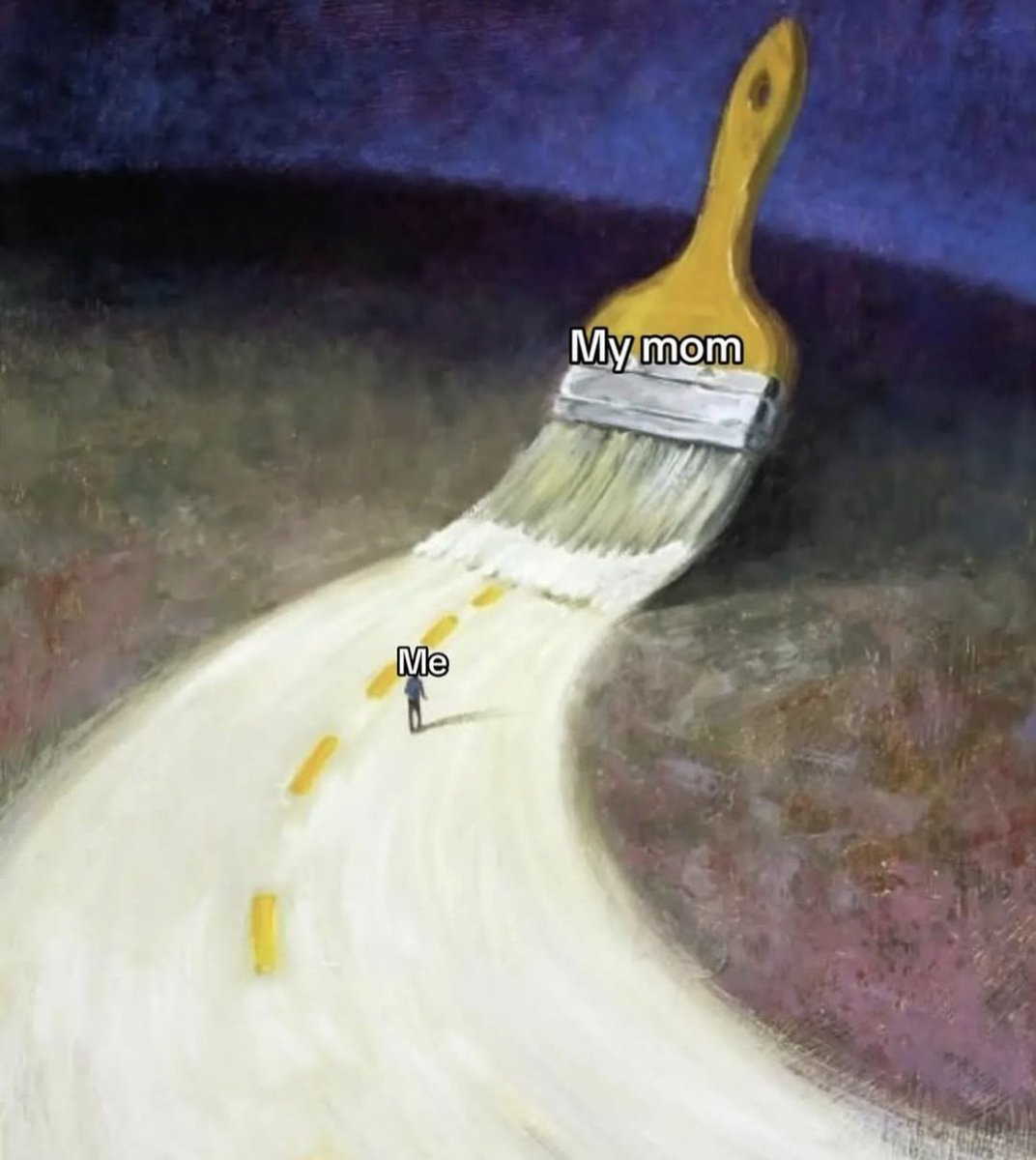
To fix this, we intentionally make the road longer and windy to reduce the steepness. Think of it this way: It is easier to walk up a gentle ramp that wraps around a building than to climb a straight ladder. Winding the road spreads the height over a longer distance, making the climb gradual and safe for engines.
Also, a straight line through a mountain means you have to blast through solid rock or fill up deep valleys, which costs billions. And as you know, following the natural contours of the land is not only safer; it is way cheaper.
So in short, we are just using Geometry to defeat Gravity. You get?
This new week, may God surprise you with the sweetest answers to your silent prayers and bring peace to every corner of your heart. Trust the unseen work.
#Tarius5daysChallenge
Submitting for DAY 5 of the challenge and we’re finishing strong with IronRoot Cattle Co! 🐂💨
From genetic traceability to commercial scale, we’re redefining the modern ranching standard. Proud to have participated in the challenge. 🏗️🌾
Congratulations, you made it to the last day of our 5 days challenge! 🥂 Be proud of yourself, you showed up for 5 days straight. Now let’s finish this!!
Day 5: Launch Ad for a Cattle Ranch 🐄
Create a bold and trustworthy launch advertisement for a cattle rancher introducing the ranch to the market. The ad should establish credibility, highlight quality livestock practices, and position the ranch as a reliable source of healthy, well-raised cattle for buyers and partners.
Key Message:
Premium cattle raised with care.
Tone & Personality:
Strong, authentic, grounded, and confident. The ad should reflect hard work, tradition, and modern ranching standards.
Design Direction:
•Style: Rustic-modern, bold, natural
•Color Palette: Earth tones (brown, green, tan), deep blacks
•Typography: Strong serif or slab fonts paired with clean sans-serif
•Imagery: Healthy cattle, open grazing land, ranch landscapes, hands-on ranching moments
Content to Include:
•Ranch name and logo (pick yours)
•Launch headline (e.g., “Now Open: Quality Cattle You Can Trust”)
•Key highlights (Grass-fed, Ethical care, Traceable livestock, Scalable supply)
•Location and contact details
•Clear call-to-action (e.g., “Partner With Us” or “Inquire Today”)
Format & Usage:
•Ad formats: Poster, flyer, digital ad, and social media
•High contrast for easy readability at a distance
Success Criteria:
The ad should create a strong first impression, build trust in the ranch’s quality, and drive inquiries or partnerships.
Deliverables:
•One primary launch ad design
•Adaptations for print and digital platforms
Quote your masterpiece with the #Tarius5daysChallenge for a repost! LFG🔥
Submitted for #Tarius5daysChallenge Day 4. 🪪 One object, infinite potential. 💡 Four designs reimagining the wallet as the central symbol of financial choice and personal value. 🎨💰
Wagwan beautiful designers! We’re almost done, be proud, you kept showing up, time to go again! Ready ?
Day 4 brief; 🪪
Design a poster of your choice that uses the wallet as the main visual element. The wallet should clearly represent ideas like money, value, choices, spending, saving, or personal priorities. It can be shown realistically or in a creative, symbolic way (open, empty, full, floating, or simplified), but it must be the first thing people notice.
The poster should communicate one clear message (for example: a quote, financial advice, a campaign, or a product). Keep the design simple and easy to understand at a glance. Use 2–3 colors, clean typography, and a clear headline with minimal supporting text. The overall feel should be modern, relatable, and direct, so anyone can understand the message without explanation.
Dimension: 1080px by 1320px
Image source: https://t.co/8K07SrGyqE
Quote your masterpiece with the #Tarius5daysChallenge for a repost. Day 4 ends 12pm tomorrow. Lfg 👹
We’re in a sad place now. There are people with strong feelings of depression, hopelessness, anger, etc. Almighty. Guide us. Help us. Put hope in our hearts . May we never forget that You can turn everything around in the blink of an eye. We trust You.
Designers, assemble!! Day 3 is here, let’s see how many of you can meet up with the challenge today 😤
Day 3 brief:
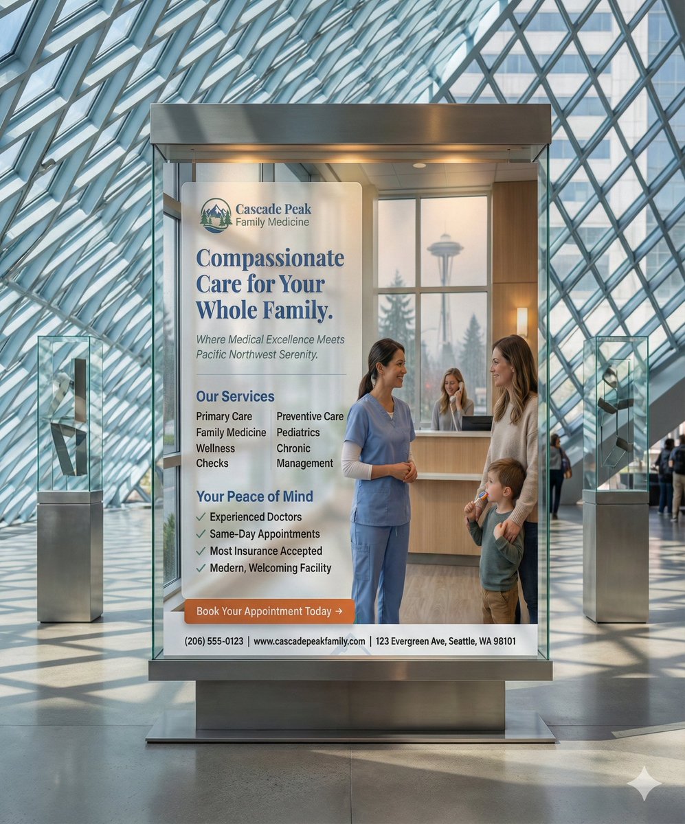
Design Brief: Promotional Flyer for a Doctor’s Office (Seattle, USA)
Objective:
Design a clean, trustworthy, and welcoming promotional flyer for a doctor’s office located in Seattle, Washington. The flyer should communicate professionalism, care, and accessibility while encouraging new patients to book appointments. It should appeal to individuals and families looking for reliable, modern healthcare in their local community.
Key Message:
Compassionate, reliable healthcare you can trust—right in your neighborhood.
Tone & Personality:
Professional, calm, friendly, and reassuring. The design should feel modern and approachable, not clinical or intimidating.
Design Direction:
•Style: Clean, modern, minimal
•Color Palette: Soft blues, greens, and white (health, trust, calm)
•Typography: Clear, legible sans-serif fonts
•Imagery: Smiling healthcare professionals, diverse patients, clean medical environment, subtle Seattle elements (optional)
Content to Include:
•Doctor’s office name and logo ( create one or use a template logo)
•Short headline (e.g., “Your Health, Our Priority”)
•Brief description of services (Primary Care, Family Medicine, Preventive Care, etc.)
•Key benefits (Experienced doctors, Same-day appointments, Insurance accepted, Modern facility)
•Contact details (Phone number, website, address)
•Clear call-to-action (e.g., “Book an Appointment Today”)
Format & Usage:
•Flyer size: A5 or US Letter
•Print and digital-friendly (email and social sharing)
•Easy to read at a glance
Success Criteria:
The flyer should build trust, clearly communicate services, and motivate potential patients to contact or visit the doctor’s office.
Deliverables:
•One print-ready flyer design
•One digital-optimized version for online use
Quote your masterpiece with the #Tarius5daysChallenge for a repost! Let’s go 👹