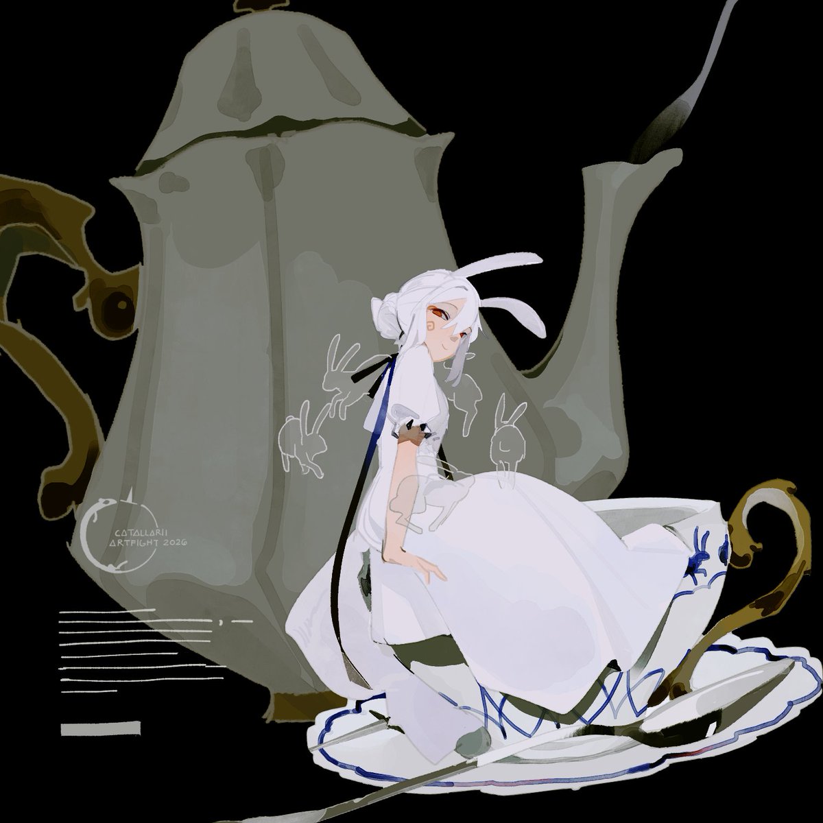
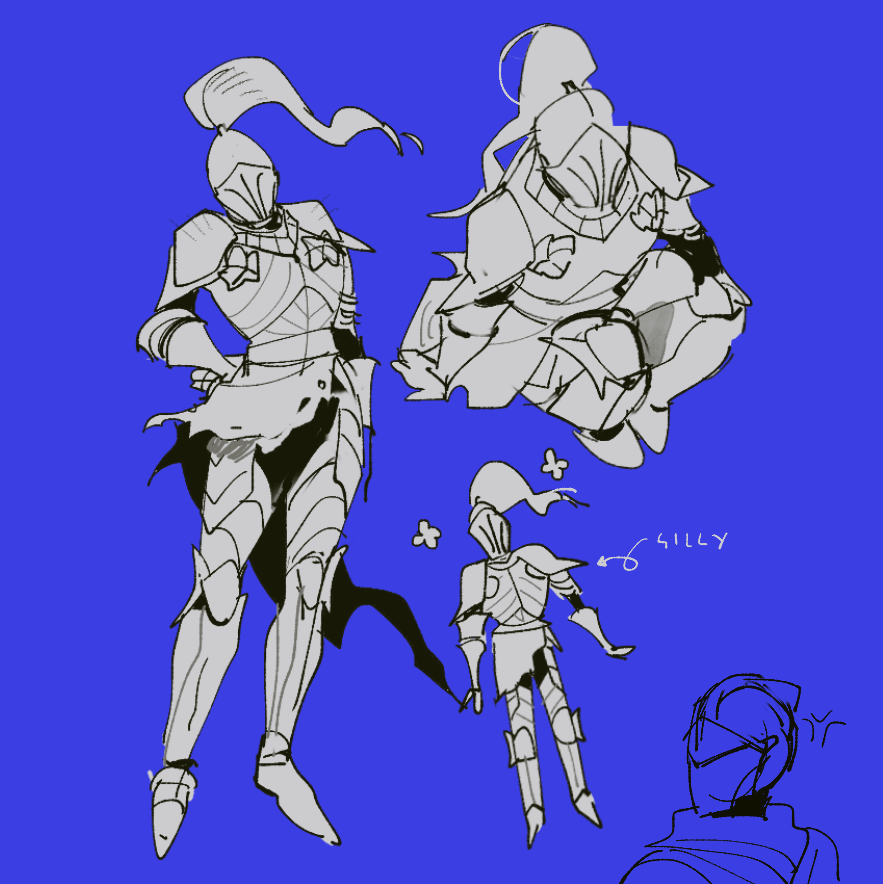
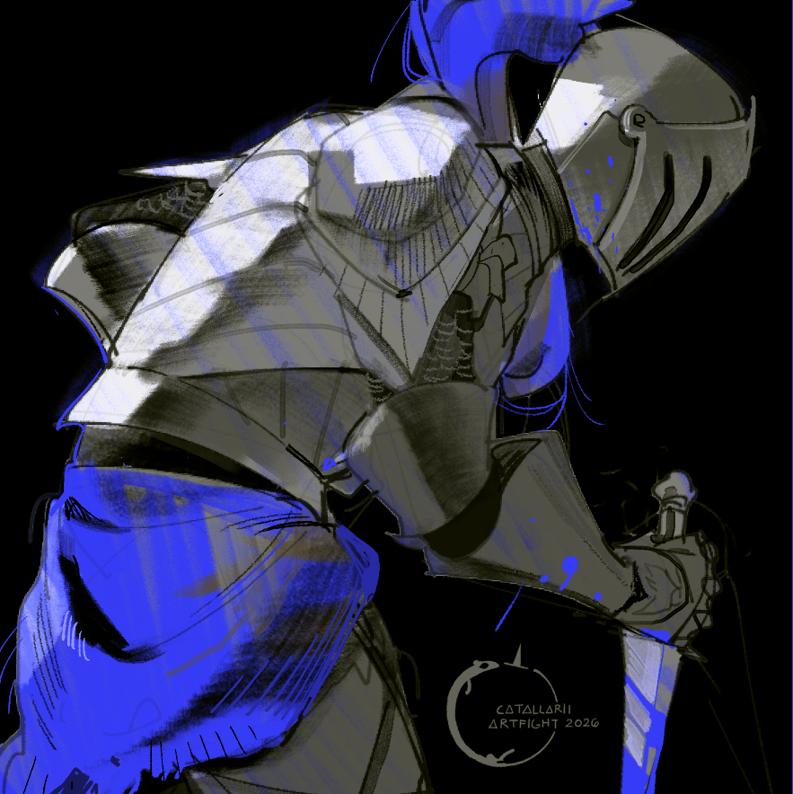
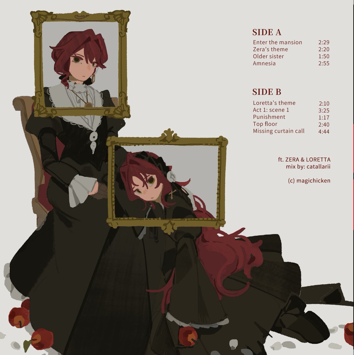
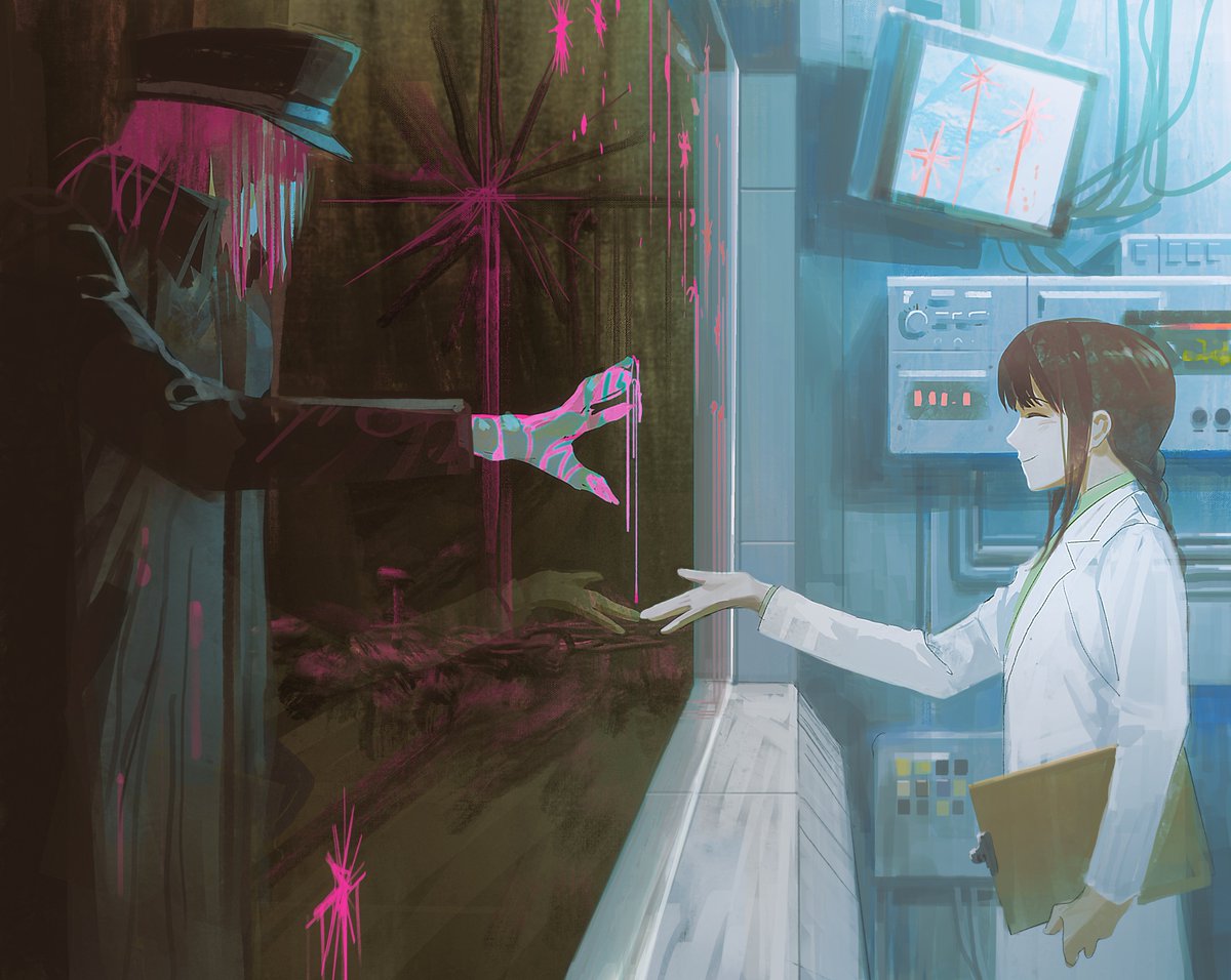
Hey guys! The Eng sub version of my class “7 Illustrations to Awaken Your Sense of Color" is now up for pre-order on Coloso (@colosoglobal)
I’ll be teaching you how to evolve your coloring skills through ideation & execution techniques!☺️
Link👉 https://t.co/h52SvwLNUt
#coloso
안녕하세요! 오랜만에 작품으로 인사드립니다!
총감독으로 참여한 애니메이션의 트레일러가 공개되었습니다! 레이아웃과 애니메이션 작업은 @hidomo7님께서 함께해 주셨습니다. 감사합니다!
공개일까지 이제 한 달도 채 남지 않았네요! 열심히 제작하고 있습니다. 잘 부탁드립니다~!☺️
Neutral or desaturated colors work well in areas where you want vibrant colors to stand out! Balancing saturated and muted colors helps create a more harmonious composition. Adding slightly tinted grays to areas that recede into the background or fall into shadow can also help create a sense of depth ☺️☺️