@NateBaldwinArt You're the best! That clears things up for me. I'm working on a way to automate the generation of color scales (and eventual changes to them) but keeping contrast ratios in mind at all times for color palette I'm working on. But I was curious why & how you guys did it. TY!
Hey there @NateBaldwinArt, I'm curious if you happen to know how the adobe spectrum color palette has been made? I'm trying to wrap my head around the generation of the color indices, e.g. red100 to 1100. Which one is the base? And why has the base the contrast ratio a:b:1?
@NateBaldwinArt I'm trying to recreate one of these palettes (e.g. red) with leonardo, but I can't seem to understand the right way to do it. I've added the lightness stops as seen here https://t.co/Vl5JXqXcKo but I get different results. Maybe you can share how you've done it?
@NateBaldwinArt Thanks a lot! What a great read. One thing that I couldn't find in there though - do you guys have a "base" value for each color (red, blue etc.) and then, based on target contrast ratios generated shades and tints?
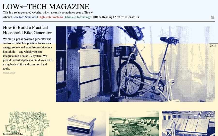
🔖 Design inspiration! Where do you find interesting websites? Below is the list of websites that I frequently visit to explore some unusual designs for inspiration:
– Minimal design (https://t.co/rbP5m46NRj) curated by Dominic Whittle and Tom Fitzgerald at Guvnor,
💙 Introducing Scroll Transforms in @framer. Design expressive landing pages with complete control over the scroll position. All powered by Motion. Create sites with incredible fidelity. Watch the video here: https://t.co/Ruu8F5aAUE
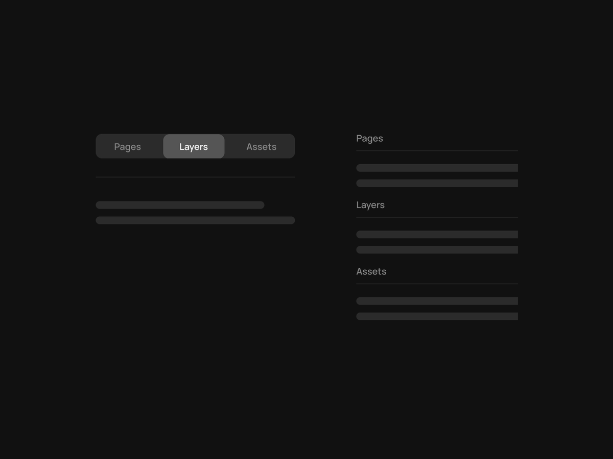
I'm constantly switching between pages and therefore layers as well, but always having to click (or pressing ctrl+1/2) is a productivity killer.
My suggestion would be to move from tabbed layout to a simple list layout. What do you think @framer ?