Explorer is now live! 🥳🌈🎉
You can use it to perform site analysis, compare locations, and measure key urban indicators directly in the browser.
Under the hood, it uses mapbox-gl, d3 and a custom data pipeline: https://t.co/hFUZWkBdva
#mapping#locationanalysis#dataviz#nyc
"Machine learning is an ostensibly technical field crashing increasingly on human questions." – Brian Christian (The Alignment Problem)
Some current readings that are shaping our thoughts:
Russia is attacking Ukraine. We are staying on the ground and bringing you the news you can trust.
Support us so that we can continue working for you
GoFundMe https://t.co/2rQHaZEpko, Patreon https://t.co/iNjWfwvs1X.
Crypto:
BTC
bc1q444wayyye4jke3ty87sdvm77dwkysz9hwcyu6u
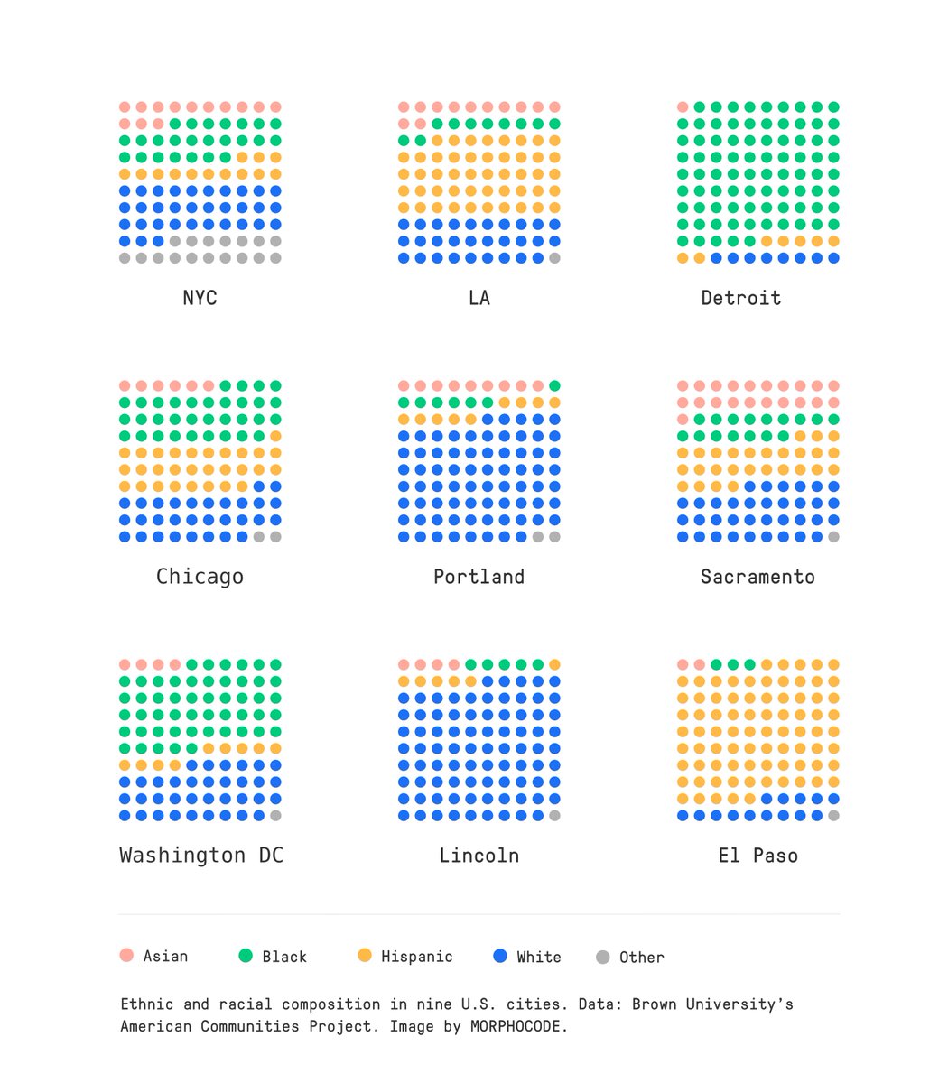
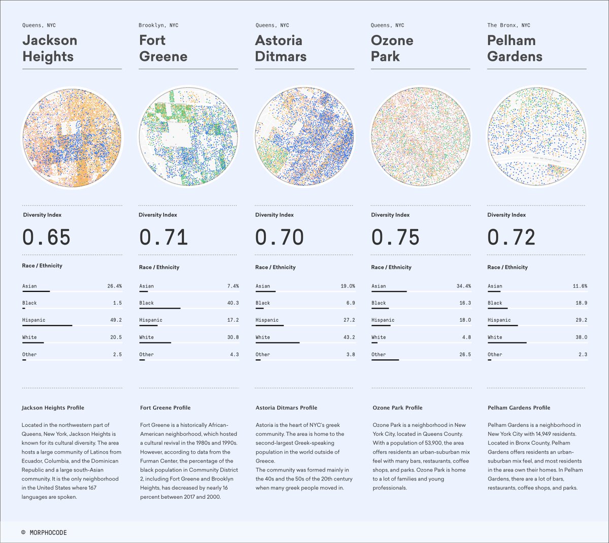
Here is a sneak peek of our forthcoming story on How to measure diversity.
Diversity reflects the variety in land use mix, income groups, and demographics within a geographic area. Paradoxically, the most diverse cities are often the most segregated.
🎬 An excellent documentary dedicated to the life and work of Douglas Engelbart - one of the visionaries of human-computer interaction of the 50s and 60s. https://t.co/96a2YVfqxC
Finished @morphocode's video course, covering the fundamentals of mapping urban data. From raw datasets + QGIS to map design in @Mapbox, and publishing through @github. Here's the published link! Feel free to play around with it🤸♀️ https://t.co/FdELatVLsh
Thursday 2/18 at 11:30am ET: Please join @NYU_CUSP and @DanOUrban (@NU_SCCJ, @NU_PolicySchool) for our next virtual research seminar on "#UrbanInformatics: From Pre- to Post- #COVID.”
CUSP Research Seminars are open to the public! Zoom link w/ RSVP: https://t.co/okVPwCmAfB
🥳 Explorer is on @planetizen 's 2020 annual list of Top Websites for Urban Planning. The list also includes other awesome projects like the MTA Live Subway Map, the 15-Minute City App, and the Transit Costs Project. Check them out!🙏Thanks @CasualBrasuell
https://t.co/bR3XPOVouv
Apollo's archives provide some great examples of interface design. Hundreds of controls and displays were located in the cabin of the command module. The four basic types were toggle switches, rotary switches, thumbwheels, and push-buttons.🚀https://t.co/j2wtCkUGCe
A couple of decades later, Charles and Ray Eames released a short documentary inspired by Boeke's 40 jumps. The movie is recognized as "culturally, historically, or aesthetically significant" and explores the notions of scale even more vividly. https://t.co/ALolDVk35B
"I began the project because of the importance of developing a sense of scale" - We love to revisit Kees Boeke's legendary 40 jumps through space. The cover is an excellent example of #smallmultiples. 👉https://t.co/fcwKplHXKd
Learn more about the design and development of the @MTA NYC Subway "live map" in a new short documentary by @gary_hustwit. Great work by @workandco via @FPlanCroissant
https://t.co/rZVmrOYfZs
Learn more about our launch of @MTA's new Live Subway Map. Geometric lines of the city meet the organic curves of nature. Try it out: https://t.co/eXwpLMUckE. https://t.co/5qPWactC9E
A wonderful tool by @ITDP_HQ explaining what walkability is, how to measure it, and why cities that are good for babies are good for the entire population.👏 https://t.co/rOByMKtM4S
"A city's racial and ethnic mix is a product of history and geography." - love this week's post by @CityObs ! It presents data on the white/non-white dissimilarity index to show the level of racial segregation in the 50 largest US metro areas. https://t.co/YuN3PDnzQn
I made my first webmap!
I've been trying to learn new skills so I built a webmap of NYC land use. I used QGIS, HTML, CSS, JS, and Mapbox to build it. I'm happy with how it turned out!
Play with it here: https://t.co/wesmyZTJN4
Thank you @morphocode your tutorial is amazing!
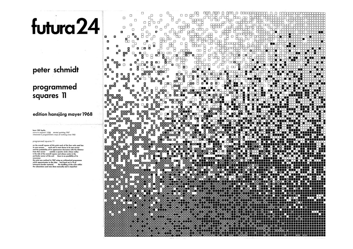
From 1965 to 1969, Hansjörg Mayer published 26 issues of an influential visual poetry broadsheet named after Futura typeface. Some of our favorite pieces include Peter Schmidt's "programmed squares," Frieder Nake's "computer grafik," and Wolf Vostell's "de coll age." 🤓
@brooklynhistory just launched their new Map Portal providing public access to nearly 1,500 digitized maps: https://t.co/kOezZBCbPZ It's a beautiful collection!👏 via @Jill_hubley#mapping
B-roll of our reconstruct piece tracing how the virus spread in the U.S.: a diagram showing New York's role in seeding outbreaks across the country. The final cut => https://t.co/rFeXBg7p1v