Magic Spoon's subscribe block.
A free bowl set is the reason to start.
Limited editions, the reason to stay.
"Change flavors anytime" answers "I'll get bored."
"Skip or cancel delivery anytime" answers "I'll be stuck."
Half the lines handle the fear of a recurring charge.
Klik's headline: "Digital camera, film feel."
The line under it carries the sale: "No film rolls, no waiting."
Those are the two chores people dropped when they left film. A nostalgia product brings the old hassle to mind. This page names it and removes it above the button.
@mwarcholinski Step 3 can blur step 4.
Ten people paying a founding discount tells you the discounted price works. It tells you less about the full price.
Do you ask them what they'd pay once the discount ends?
Magic Spoon's homepage asks for a decision on the first screen.
Under the headline: "Start building your bundle: pick your favorite." Four buttons. No product grid.
Picking a category feels small. It is still the first step of a bundle, taken before any scrolling.
@flo_at_work Strangers, if you can find them. Friends fill the gaps with what they already know about you.
A cheap version: post the two lines where your buyers hang out, no link, and ask what they think it does. The wrong answers are the useful part.
Paperlike's pop-up offers a gift, not a percentage.
Before the email field, a question: what do you mainly use your iPad and Apple Pencil for?
A code tells a new visitor the price can move. A gift leaves the price alone, and the answer tells the brand what to email first.
@NoticeMe_Media That summary is a promise you didn't write. The page still has to keep it.
If the ad says "easy to set up," show the setup on the first screen after the click. Otherwise the extra clicks are people checking a claim, then leaving.
Copy the summary. Find each phrase on your page.
@ryanmurphy1800@dtcprophet And the second order gets decided during the first one. If nothing in the box or the first email names the next purchase and when to make it, a low AOV buyer has no reason to come back.
@abdullahcro_x Filters fit that slot. The shopper already said yes to the plunge and to a first extra, and they'll need filters anyway, so it reads as finishing the setup.
Did you test an unrelated item in the same spot? That one asks for a new decision while they're typing a card number.
Many stores put accessories on their own pages, or in the cart after the buyer has decided.
Ridge puts them next to the button, while the buyer is still looking at the wallet. If you sell accessories, test your best one as a checkbox under the main button.
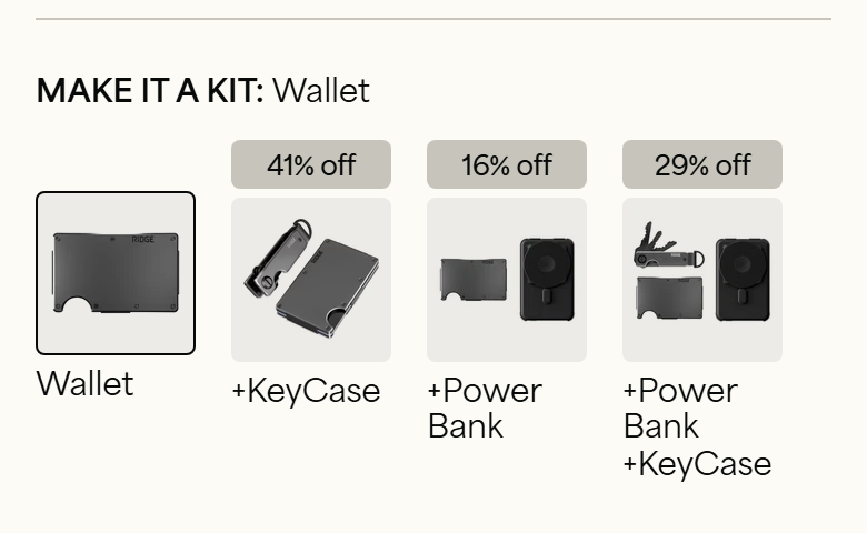
Ridge sells a $95 wallet. The first thing under the add to cart button is a row of kits, each with its discount in a grey tag: 41%, 16%, 29% off.
The buyer has just accepted $95. Each kit is now priced against that number.
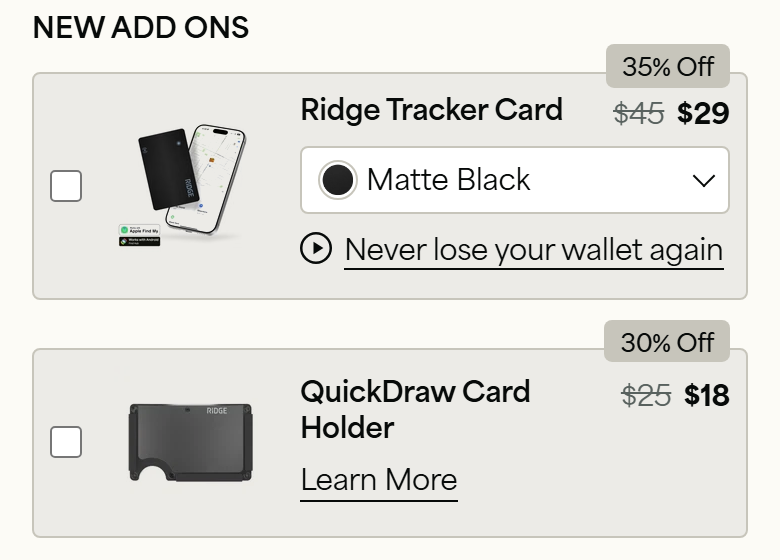
Below the kits, two add-ons with a checkbox. One tap adds them, no new page.
Read the line under the tracker card: "Never lose your wallet again." It sells the fear of losing the thing you are about to buy.
Uproot's first product photo carries a banner: "New packaging. Same great product."
That line is for the person reordering. They know the old box. A new one can look like a changed formula, or a copy from another seller.
Changing your box? Answer that doubt on the first image.
@ecomchasedimond The structure gets the open. The first sentence under it decides whether the reader feels tricked.
A curiosity headline followed by a product description reads like bait. Whatever structure you pick, the next line should pay off the exact thing the headline promised.
@AdamKitchen_co Then the default effect sits inside each plan. If you switched the default on at some point, compare order-2 churn on the same plan before and after that date.
Same product, same price. Only the toggle changed.
@copywriter_adam The 90% that carries over is usually the structure: who the reader is, what they already tried, why it failed.
The 10% you rewrite is the proof. A supplement buyer and a beauty buyer doubt different things.
Which part do you change first when you port one?
@alex_momeni The renewal terms sit right under the toggle. Most subscribe boxes bury them.
One line looks off in the after version. The installment text says 2 payments of $25.00, which matches $49.99, while the button says $34.99. Is that line tied to the one-time price?