Your UI is missing one thing: motion
See what you can build in seconds:
Motion Animation Examples - https://t.co/OT0ixTzNKu
Get started with Motion in 2 minutes - https://t.co/27KPbZEzMy
Why your UI feels cheap
It’s not colors
It’s not typography
It’s missing motion
Static = unfinished
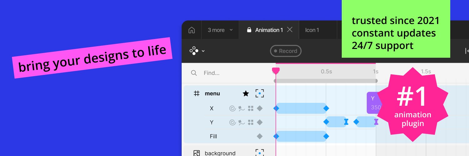
Made in the Figma Motion plugin https://t.co/5oMkJOT0sy
Easing
Same animation, different easing
One feels off, one feels natural
That’s what users notice (even if they can’t explain it)
Made in the Figma Motion plugin
https://t.co/27KPbZEzMy
How to animate a button in the Motion Plugin (1 min):
1. Select element
2. Add keyframe
3. Apply easing
Done.
Motion makes it stupid simple.
https://t.co/27KPbZF7C6
This tiny animation makes your UI feel alive.
Most designers skip motion. That’s why their designs feel flat.
What do you think about it?
See how its made in the Figma Motion plugin https://t.co/ZZPD5W3PRw
Before / After
Static UI → Motion UI
Same design. Different feeling.
Built in Figma using the Motion plugin.
Which one would you ship?
https://t.co/5oMkJOT0sy
Still exporting to AE just to render animations?
This was made entirely in Figma using the Motion plugin. 🎥
Clean, smooth, handoff-ready.
Save hours → see how it’s done:
https://t.co/EcDqtvc76B 🚀
Just made a fun animation test in Motion 🌴🚙
A smooth SUV ride through Miami Beach — fully animated inside Figma 🎬
You can open the source file and see exactly how it’s built:
https://t.co/YRHLc4bUA7
All done with Motion ⚡
#Figma#MotionDesign#UIDesign