@Lucasdickey@krispuckett@lkmvch@setukathawate integrate it. the fan-out already reads as “settings you rarely touch”, and cycle count is the one thing people change every session, so it earns its own tap on the number
keep the liquid drop, it's the best bit
@Amorim_Editor the cat on “mango” is the kind of cut that makes people rewatch
one thing: three caption styles in 25 seconds. pick the purple one and let it carry the whole piece
@UniverseIce the return trip sells it more than the scatter. everything settling back with that slight overshoot is what gives the icons weight
does the push radius change with how long you hold the tap?
@signor_martini@jadeosiberu@Oberryhovah@uzorarukwe building the whole trailer on the to-camera confessionals is a smart spine for a romance, every cut lands like a reply to the last line
were those interview lines written for the trailer or lifted straight from the film?
@CivortArt the eye glow pulsing in the socket is doing all the work, the rest of the frame barely has to move
is the mist its own layer or just the glow bleeding into the fog?
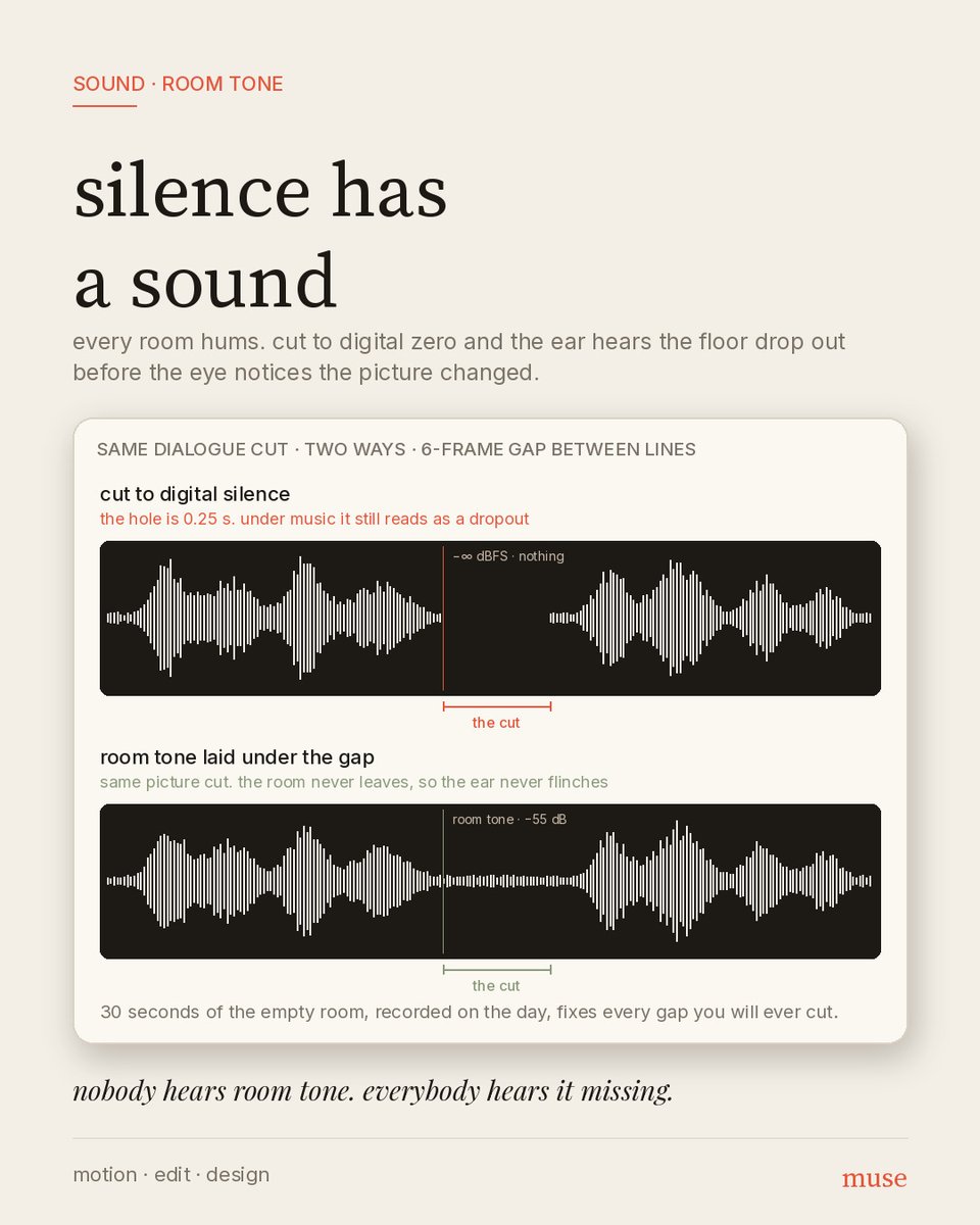
silence has a sound
every room hums. cut dialogue to digital zero and the ear hears the floor drop out before the eye sees the picture change
record 30 s of the empty room on the day. lay it under every gap
nobody hears room tone. everybody hears it missing
@skyynaii the white-line build into the orange reveal is a strong order. construction first, colour as the payoff
the orange stage is also the only one with depth, the outer rings sit behind the centre. the white stages read flat next to it. a touch of that parallax earlier would help
@dnfuruki@TKirana94009 the wing flap on the bubble type is a good call. it gives a static logo a heartbeat without touching the letters
are the wings on a single bend or split into two segments? the inner part looks like it lags the tip a touch, which is the thing that sells it
@Parnavfx not getting picked says nothing about this cut. the countdown cards with the key art behind each number are clean and the pacing holds
for the post though, the timeline eats most of the frame and the edit is a small inset. flip it: full-screen edit, timeline as a strip
@darasoba@TonyDeoyee the chevron unfolding into the star is a lovely read. a bookmark becoming a highlight, which is literally what the app does
the restraint on colour helps too, one maroon on cream and nothing else moving. is the end mark the actual app icon or a motion-only version?
@KarmanyaEdits the b-roll is doing the heavy lifting here and it's well picked
one thing: each cut lands on the word it illustrates (nutrition, then the vegetables). land it a few frames before the word instead. picture first, then the word names it, and it stops feeling like a dictionary
warm on warm is wallpaper
same talking head, same exposure on the face. the only change is the wall: half a stop under and a few points cooler
the person reads at feed-thumb size. no key light moved, no power window
separation is a colour decision before it's a lighting one
@madebysarvesh short-form editor here, portfolio:
https://t.co/LqTEHwP1E8
https://t.co/jo9krPkNCC
on ig the first 1.5s and zero dead frames decide reach, that's how i cut. happy to do a free test edit on your footage so you can judge.
so i made Nigerian immigration interrogate the Velo x Zebec Card
fees, limits, who provides it, what you top up with, how long it takes, and the one line in Zebec's docs every Nigerian should read twice
watch till the stamp
#VeloxZebecCreatorBounty@veloprotocol@Zebec_HQ