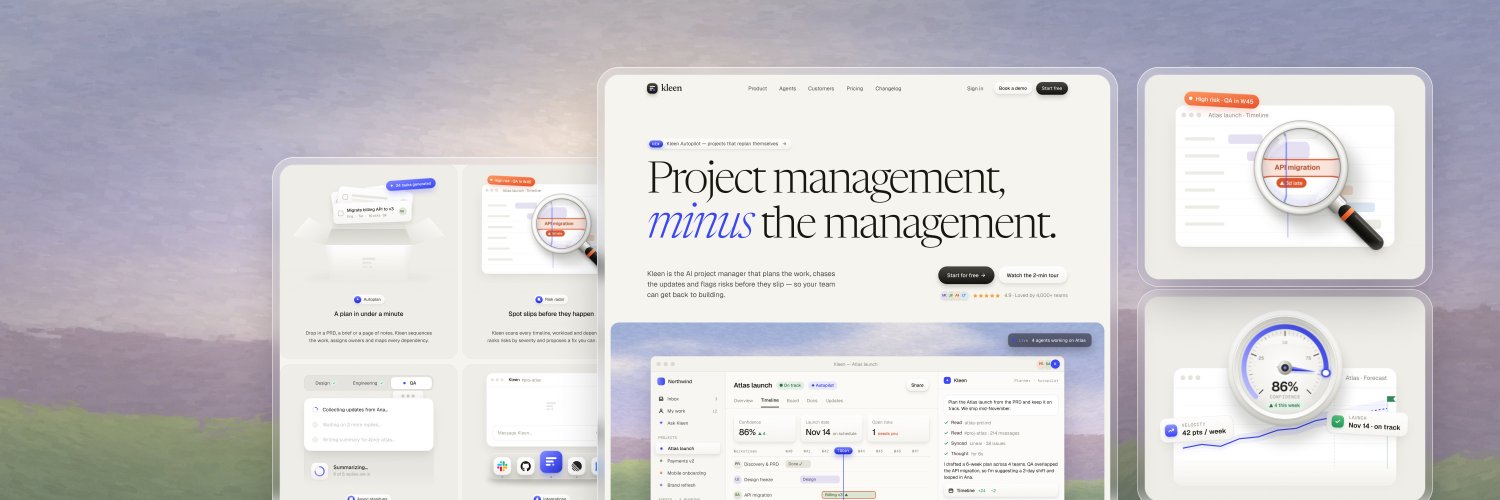
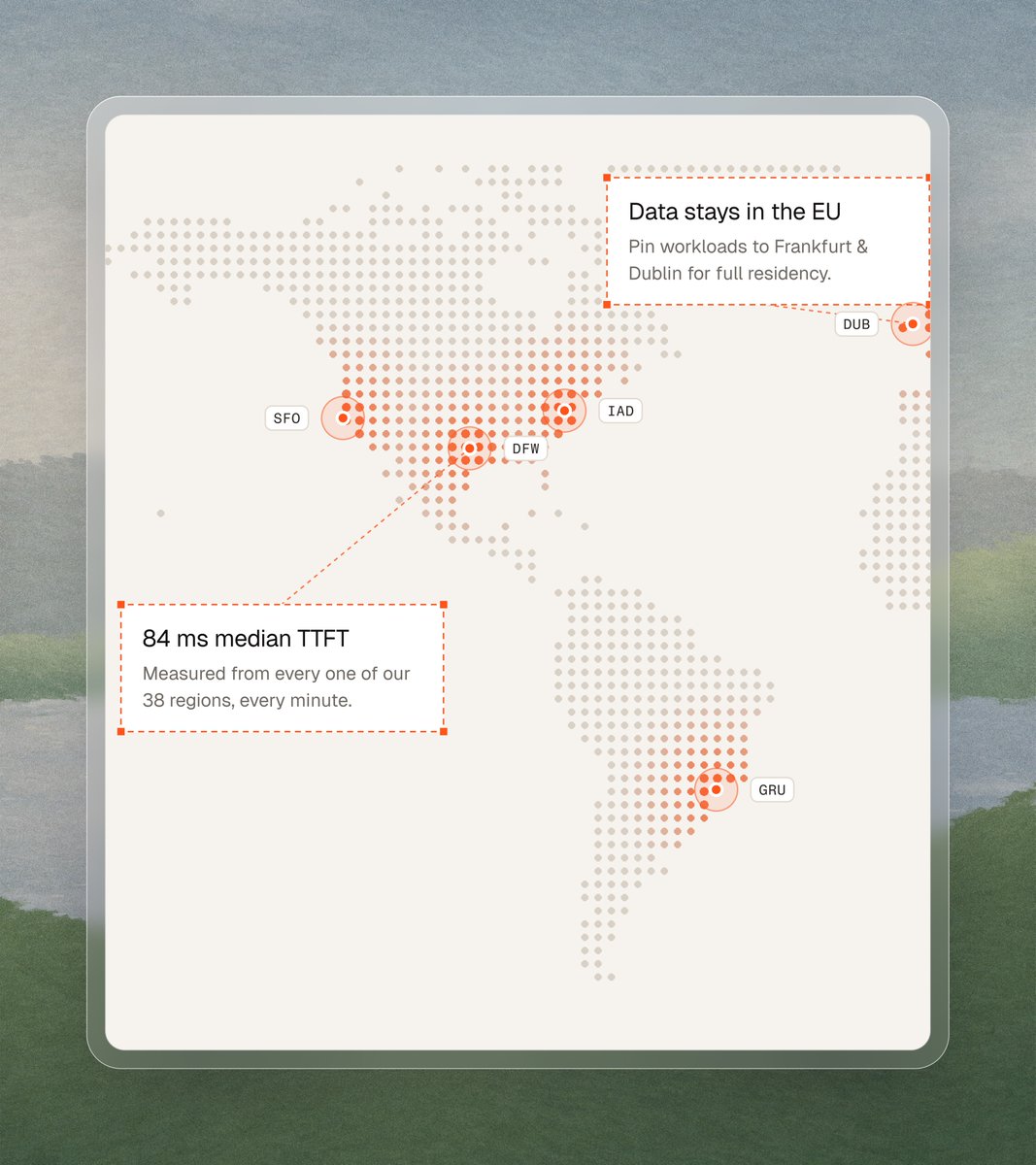
@1Aakib the painted mountains behind the two product cards make an ops tool feel calm. the isometric tiles in the workflow grid keep it from looking like every other ai agent page
@nizamdesign tying every problem and constraint back to a timestamp in the call is the part that sells it. "unknowns" as its own column is smart, that's usually what blows up a scope
@UiRahMan92 the serif headline is a nice break from the usual tts look. i'd put a play button with a real voice sample right in the hero card. for a tts product, hearing it in the first second sells more than any line
@GreySaurabh the green pixel field one is the one i'd ship. it feels like whatsapp before you read a word, and "your job agent, right inside whatsapp" doesn't need anything else next to it
@stevelauda_ 3.1 with the blurred runner might be my favourite of the series. the torn edge and crease lines make it look like it's been on a wall for a month
@uikuba the 2025 one is centred and decorated, the new one lets the photos and type do the work. left-aligned headline with the small captions under each photo is such a jump in restraint
@adriankuleszo describing the flow instead of keyframing it is the real unlock. what used to be a week in after effects is now a quick check before the build